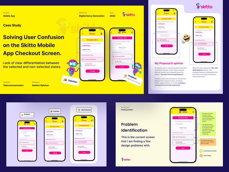
Solving User Confusion on the Skitto Mobile App Checkout Screen.
In the Skitto mobile app, there exists a user experience issue related to the visual distinction between two critical options during the data purchase process.Specifically the 'Purchase from Skitto Balance (Buy with skitto balance)' and 'Reload from Other (Buy with reload )' buttons.
The issue stems from a lack of clear differentiation between the selected and non-selected states of these buttons, leading to user confusion.
Work Inquiries 👉 ashikxql@gmail.com | Book a Free Call
Pick Your Unlimited Design from Here: www.designpicko.com
Check My UX UI Case study: Medium
UI/UX Design Tips - Instagram
UI Design Kit - Gumroad
Check My Linkedin | Twitter | Instagram | Facebook | Behance
More by Design Picko View profile
Services by Ashikur Rahman
Like


