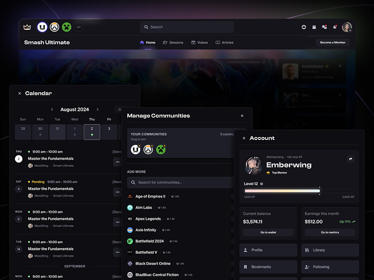
Navigation Y
A few months ago we launched a rethink of our Navigation (dubbed Nav X). After a few months and a major shift in our conception of what Metafy is and will be, we felt the need to go deeper, and to rethink our Navigation even further.
As with all of our projects at Metafy, this project took place entirely in public in our Discord. Check out our Project Posts to keep up with any of our upcoming work!
New Metafy, new nav
Our navigation redesign wasn't an easy project to get off the ground. After months of work designing, iterating upon, and building our previous navigation X, starting over from scratch was a daunting task.
However, while our previous navigation was an iteration of an iteration of an iteration, our new navigation comes with some big changes: a whole new Metafy.
While over the past year we worked towards turning Metafy into "a members club for gaming" focused primarily on a single Membership, we quickly realized that direction wasn't working for us.
Our mission for Metafy is centered around three core pillars:
1. Make a million jobs in gaming
2. Build cool shit to change culture
3. Help gaming communities become self sufficient
To help us realize these goals, we've shifted our focus away from memberships, and towards communities to help folks find the people, content, and resources they need, while helping creators earn a living through their passion for gaming.
Pain points
The new navigation addresses a few pain points I outlined in my announcement post which ran into after using our new nav for a few months, namely:
Reducing visual redundancies
Simplifying and trying to minimize complexity of an ever-changing nav
Moving away from the concept of collections as sub-pages, and towards collections as discovery/recommendation mechanisms
Moving towards centralized areas: YOUR Metafy, shaped by you
Diving deeper into communities
Games acting as new hubs for community
I began exploring new visual designs for the navigation, as well as an entirely new Information Architecture to help us identify how users should navigate Metafy in relation to our games and communities.
However, after lots of explorations, Cam (our VP of Design) asked an important question that entirely changed the course of this project:
"Are we shying away from a top nav because we want to look like an app instead of a website?"
That question, and the jam sessions that followed, led us to something clean, feature rich, and consistent across our entire product.
Enter: Navigation Y
Our new navigation features a few moving parts to make navigating Metafy, a HUGE platform with lots of different areas and features, easier than ever:
Primary & Contextual Nav
Our new navigation is made up of two sub-components:
Primary Nav: This is a global nav, entirely within the control of the user, where they can shape their experience and access everything that's relevant to them at all times
Secondary Nav: This is a contextual nav, one that provides additional context, navigation options, and actions based on the user's current context
Drawers
As part of our design system, we developed and refined a pattern based on drawers that allowed us to make navigating and interacting with global sub-areas, easy and accessible from anywhere in the product.
If you want to try the navigation out for yourself, it's live now on metafy.gg, so hop on over, and see where you can break it, and then shoot us a message on Discord ;)
Happy designing ✌️


