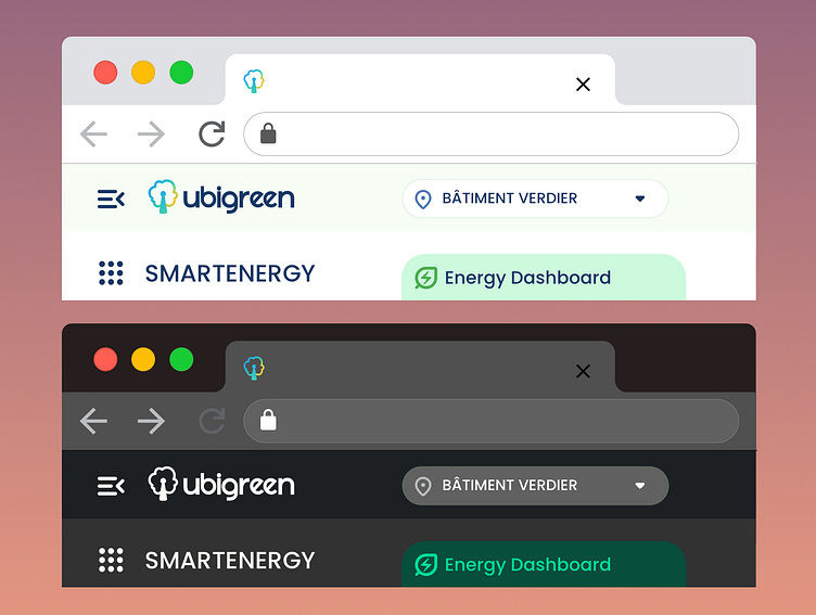
Ubigreen Dark theme
Dark Themes and User Interface Design
Dark themes, which provide a dark background with light text and elements, have gained popularity for several reasons, one of which is their impact on accessibility.
In fact, beyond the dribble effect and aesthetics of the design, dark theme are first easier on the eyes, especially in low-light environments. Users with visual impairments, such as photophobia, find it less straining, leading to a more comfortable reading experience.
Secondly, they improved legibility by enhancing text legibility because of the high contrast between dark backgrounds and light text.
One of the main aspect that motivates me is the Energy Efficiency: In applications and websites with dark themes, particularly on OLED or AMOLED screens, pixels that display black require less power. This can extend battery life for users, a valuable feature for people with disabilities who may rely heavily on their devices.
Last but not the least is customization: Dark themes often offer customization options for users. They can choose between light and dark modes, allowing them to select the theme that best suits their preferences and needs.
To my opinion, in the ever-evolving world of UI design, accessibility has rightfully taken center stage. Creating a user-friendly interface that caters to all users, regardless of their abilities or disabilities, is not just a moral imperative but a strategic advantage. Dark themes, with their benefits in terms of reduced eye strain, improved legibility, and energy efficiency, have become a valuable tool in this endeavor.
