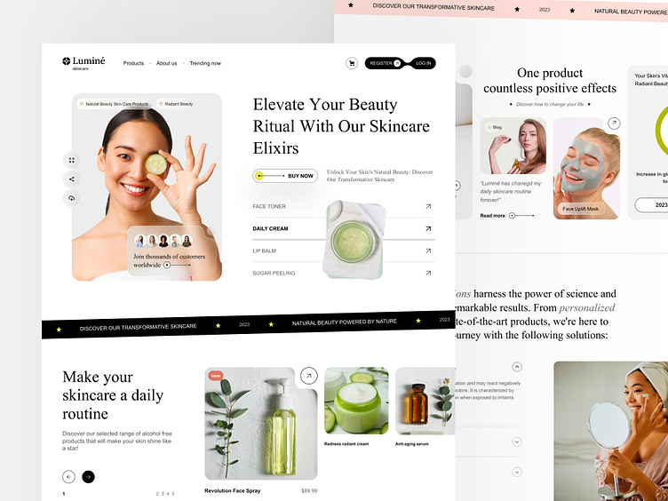
Lumine - clean landing page UI concept
Hello! 👋
Following up on my previous shot, I found some time to play around with this design, add some new components, and discover another way of presenting it on Dribbble!
Whilst working on this UI concept, I struggled a bit with the choice of typography. You might be surprised to know, but the fonts I used are Times New Roman and Arial. So well-known, yet sometimes underappreciated classic fonts can add a fresh and stylish look to our work! I highly recommend exploring them in your designs 🎨 You can take a closer look at these fonts and how they combine with the whole UI concept below!
More by Bejamas View profile
Like


