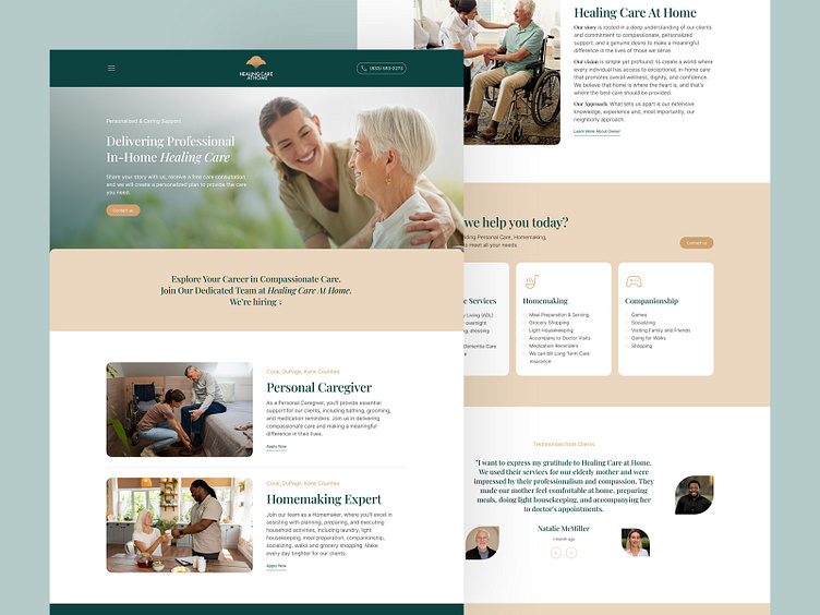
Website Design for a Medical Company
From Research to Successful Implementation
Our task was to design a website for a small local company that provides home care and treatment services. Since the deadlines, as always, were yesterday, we utilized the UX methodology JTBD. In the development brief, the key points were to highlight the employee hiring block on the website (as it is crucial in this field) and a services block for clear presentation. The company's brand colors and logo were also specified.
So, we started with competitor research, identifying and studying them. We found it mandatory to add a service area, client reviews, and detailed information about the head doctor/founder to enhance trust in the website design. Secondary research revealed that visitors to the company's site experience emotions of sadness, anxiety, and fear. Their needs include dignified care, empathetic staff, pain treatment, emotional support, a peaceful environment, and assurance for tomorrow. Their goal is to ensure comfort and treatment for themselves or their loved ones.
Potential barriers could be a lack of empathy: if the website's tone and content fail to evoke empathy and match visitors' emotions, it may seem cold or insensitive. Additionally, the absence of information about the cost of treatment and care and how to pay for them.
Therefore, based on this data, we identified the needs of the target audience:
Information about treatment programs: Users seek detailed information about treatment programs, their duration, methods, and approaches. Why it's important: Users need to understand available methods and programs, their effectiveness, and timelines.
Convenient access to contacts: It's crucial to have quick and easy access to contact information for urgent inquiries and consultations.
Job position information: It's necessary for potential employees to familiarize themselves with their key responsibilities, where they will be working, and information about their salary.
Barriers for the target audience:
Financial limitations: Problem: Some people may lack the financial means for treatment. Solution: Information about programs and financial support resources, as well as transparency in the cost of treatment.
Unawareness: Problem: Low awareness of existing treatment methods and a psychological barrier for the first step. Solution: Easy access to information about treatment programs and the effectiveness of different methods.
Lack of empathy: If the website's tone and content fail to evoke empathy and match visitors' emotions, it may seem cold or insensitive.
Critical information for users looks like this:
Programs and methods of care and treatment: Why it's important: Users need to understand available methods and programs, their effectiveness, and timelines.
Contact information: Why it's important: Transparent and accessible contacts for urgent inquiries and questions.
Financial information: Why it's important: Information about the cost of treatment and opportunities for financial support.
Job position information: It's crucial for potential employees to understand their key responsibilities, where they will be working, and information about their salary.
Based on this information, we created a prototype, incorporating service blocks, reviews, and other essential elements. We also designed a contact page and feedback form, a job application page, a page for the head doctor/founder, and other necessary pages, including legal pages and a 404 page. Testing the prototype with users allowed us to identify potential issues and make corresponding adjustments.
After successful testing, we moved on to designing with consideration of brand colors and logo. Product testing and identifying and fixing errors were key stages before implementation. We wrote content for the site with the help of Chat GPT, confidently stating that we gained a new skill: prompt engineering for Chat GPT for content writing.
Check it live healingcareathome.com
Don't be shy! Hit "L" if you like what you see and don't forget to leave your thoughts in the comments ❤️
💌 Have a website idea? Let's bring it to life together!
Call us (302) 265-4218, or email us at info@resultsfactory.com


