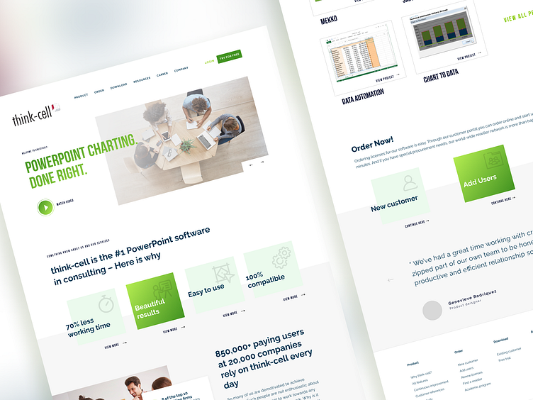
Landing Page Design for Think-Cell
🚀 Excited to unveil my latest project - a dynamic landing page design for think-cell! My goal was to mirror the innovation think-cell represents in their powerful presentation software, right on their homepage. 🌟
From the initial UX wireframes to the final UI elements, every step was crafted in Figma, ensuring a seamless blend of aesthetics and functionality. I focused on creating an intuitive user journey, highlighting think-cell's groundbreaking features like automated data visualization, smart text boxes, and their versatile charting capabilities. 📊✨
The color palette reflects think-cell's brand identity, while the layout is structured to guide visitors effortlessly, encouraging them to explore and engage. Every scroll brings a new burst of knowledge, urging users to dive deeper. 🎨👨💻
Swipe right to witness a landing page that's not just a destination, but a journey of visual storytelling.
And yes, don't forget to share your thoughts and press L to share some love.
I love your feedback! 💬❤️
As for the development phase at dee7studio, we harnessed the power of Webflow to transform our website design into a fully functional reality.
