Analytics & data visualisation dashboard
🖥️ Here we offer a glimpse of the analytics dashboard, found within our return management application.
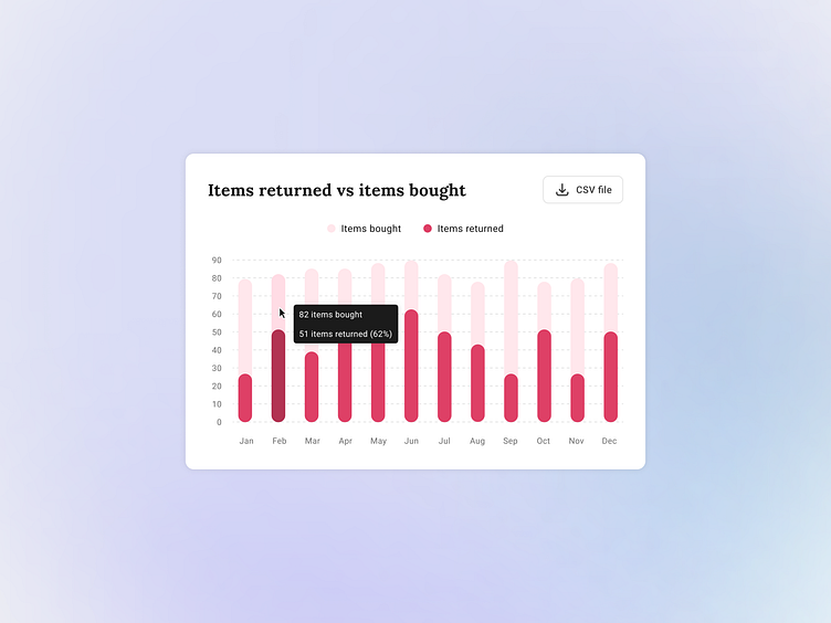
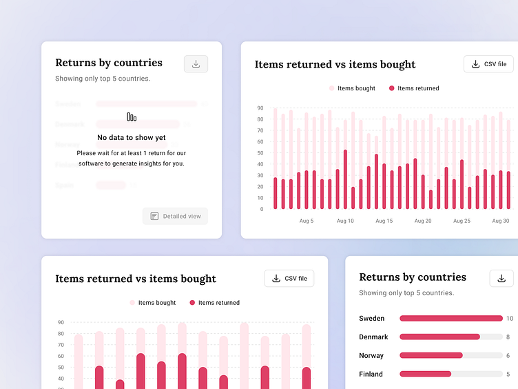
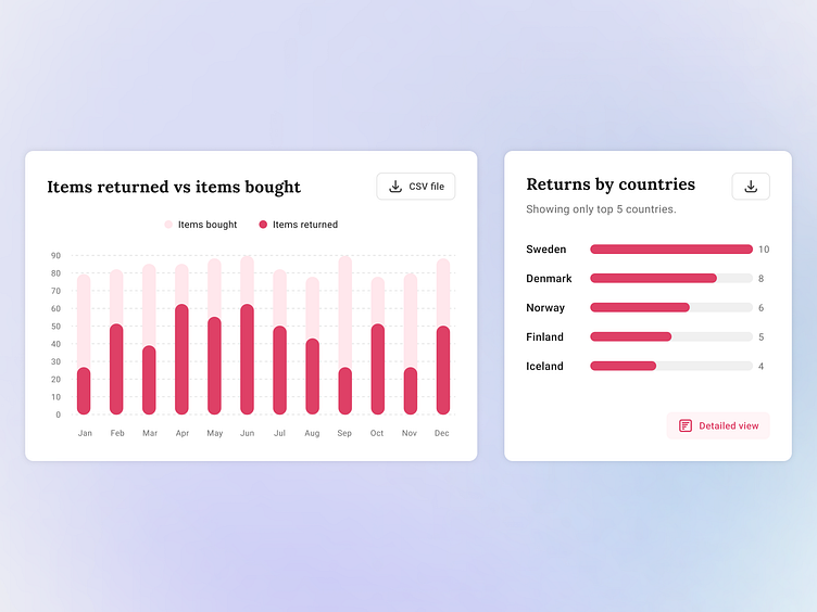
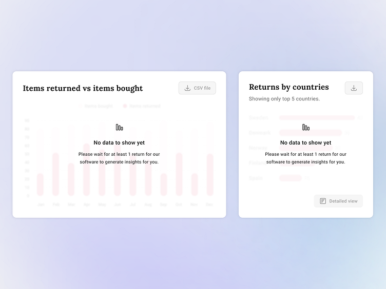
📲 The block on the left presents a comparison between items purchased and items returned within a specified time frame. This graph equips merchants with valuable insights into their operational performance, aiding in the identification of emerging trends.
🌍 In the second block on the right, we present data on returns originating from various countries, specifically focusing on the top five most frequently encountered. A more detailed view is available and will probably be presented at a later time.
🧮 The required timeframe can be set up and adjusted by the merchant, the most popular being 1 year and 1 month.
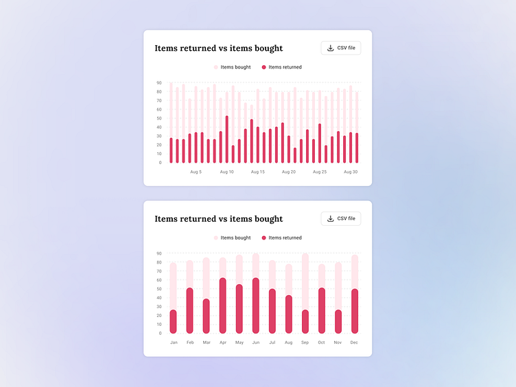
🪧 Once hovered over a specific column - it provides a more detailed information, such as the exact amount and the percentage of items that have been returned.