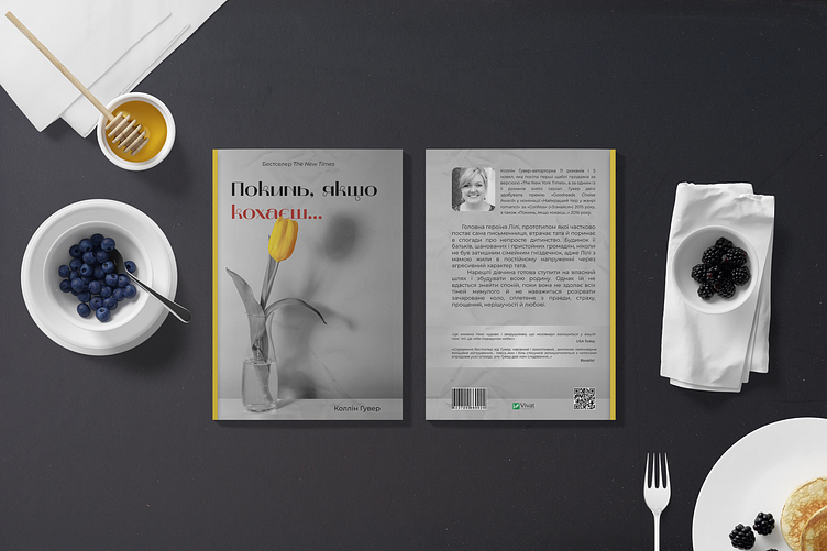
Book cover design
The book cover looks like an asymmetric graphic composition. The background of the cover is gray, which creates a sense of the seriousness of the theme of the novel. In the center of the cover is a vase, also gray, holding a yellow tulip. This yellow tulip stands out against the background due to the bright yellow accent that gives the cover dynamics and expressiveness. The red accent is displayed in an isolated word near the vase, creating an interesting contrast and drawing the reader's attention.
The cover with a tulip and a gray and yellow scale was created with a female audience in mind.
Check out my Instagram, there's a lot more interesting stuff there.
Subscribe to me on Instagram.
If you have a potential project that needs to be done, send me an email: krist.butenko@gmail.com
