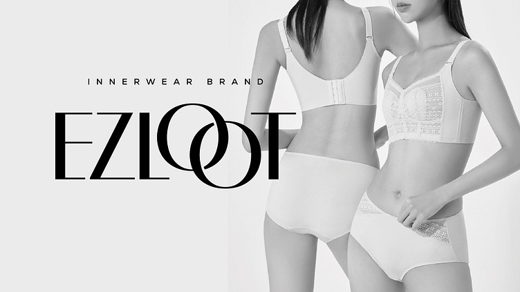
EZLOOT
At Bow & Arrow Design, we thrive on creative challenges, and when our client entrusted us with the task of crafting a brand identity for EZLOOT, an exciting undergarment brand, we eagerly embraced the opportunity! Our objective was crystal clear: to elevate EZLOOT into an internationally recognized brand infused with meaningful ideas.
Through numerous brainstorming sessions and design explorations, we honed in on refining the font style of the logo, imbuing it with a contemporary flair. Our aim was to create an identity that exudes modernity and sophistication, instantly captivating fashion enthusiasts worldwide.
By streamlining the typography, we achieved a clean and bold aesthetic that perfectly encapsulates the essence of EZLOOT.
Now, let's delve into the heart of the brand identity. We dared to transform the double "o" into something extraordinary—a hook. This clever twist injects a playful touch into the logo while symbolizing the brand's innate ability to captivate and "hook" its audience.
We take immense pride in our collaboration with EZLOOT on this transformative journey, and we eagerly anticipate witnessing the brand's meteoric rise on a global scale.
THANK YOU FOR WATCH
If you like this work, Please don't forget to
APPRECIATE
Are you looking for logo design/brand identity design?
Say Hello! on
Email: hello@bowarrowdesign.com
WhatsApp: (0)9033206409


