iPad Login screen
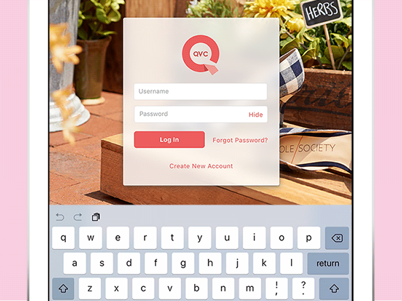
Good UX design is in the details. Good tips from Luke Wroblewski:
1. Keyboard’s up by default. One less tap needed.
2. Keep continual context with floating inline input field labels that are visible even after the user enters their credentials.
3. Show the password by default with the option to “hide”. Easier to catch typos. Move your screen to avoid curious eyes.
4. Use the best keyboard. This keyboard’s “return” key jumps to the next input field. Keep the user’s fingers on the keyboard.
5. Avoid using similar link titles like “Sign Up” & “Sign In” together.
6. Notification doesn’t demand words. The fun “shake” animation lets you know there’s a problem with the entry.