COYG
Rooted in tradition. Adapted for the future. An Arsenal Football Club crest redesign.
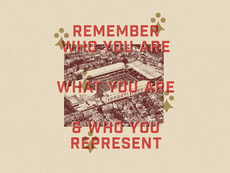
As a fan for 20 odd years, but also a designer, I’ve wanted to refresh the outdated crest from 2002 for awhile. If I have learned anything from similar projects these last couple of years is that you do NOT ignore tradition. So the redesign is firmly rooted in the club's industrial history. From the type above the entrance to Highbury to the details of the cannon & symbols in past crests. ’Remember who you are, what you are and who you represent’. But also where you are going. Modern football is global and so is our fanbase. What makes us Arsenal is a belief in certain values & the inclusion of everyone.
Colors, crest, club symbols & other graphics created carefully balance tradition with modernity. Local with global. Digital with physical. With the goal of futureproofing the brand representation seamlessly across all applications. As the club motto goes: Victory through harmony. From the arsenal factory in Woolwich, to the stone terraces of Highbury. From today and for all future time the cannon confidently aims forward. It’s North London forever.


