Premium Web Design for Coaches, Speakers & Influencers

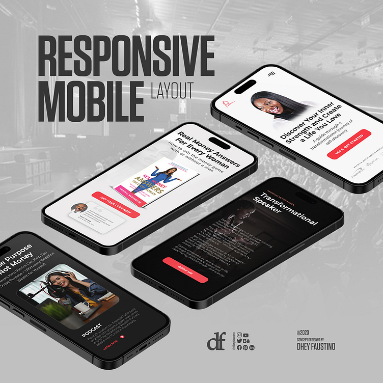
Mobile Responsive Layout
A mobile-responsive website design layout is an approach that prioritizes adaptability and user experience, allowing a website to look and function effectively on a wide range of devices, from small mobile screens to large desktop monitors. This adaptability is crucial in today's digital landscape, where users access websites from a variety of devices with varying screen sizes and capabilities.
Make your brand stand out! Let's chat!