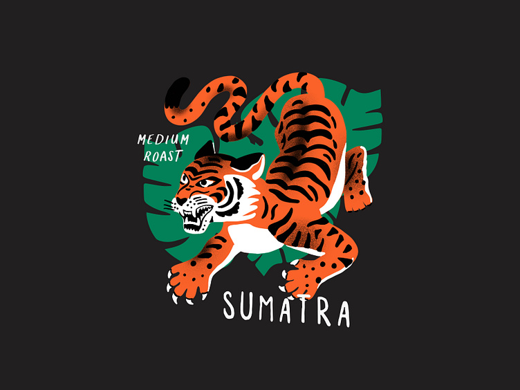
Illustrations: Coffee Packaging
Most of my work these days revolves around end-to-end brand identity. But from time to time I like to take on more unique, focused challenges that solve more specific problems.
This one ultimately turned out to be an exercise in illustration philosophy, technique, and how it relates to a larger brand vision. The overarching goal was to zero in on an illustration style for coffee packaging that was flexible enough to allow for a certain level of artfulness from bag to bag, but cohesive enough to create a strong brand continuity through 22 different roasts.
The idea was to make the illustrations feel a bit whimsical. Instead of direct, literal interpretations of each figure… I wanted to think of how to put new perspectives on each figure. So, if the focus is a tiger… How do tigers move, what do they look like when they are in motion? I purposely played with proportion, pulling inspiration from vintage textile prints, hieroglyphics and tattoo art.
These layouts were ultimately not used but were intended as creative direction for internal teams. Instead of letting these get buried in my archives, figured I’d share!


