Responsive website design and case study
Responsive website UXUI design and case study
Google UX Design Professional Certificate Project.
Photos credits: unsplash.com
Skills: UXUI design, responsibilities in user research, competitor studies, wireframe, prototype and conduct usability studies.
Tools: Adobe Xd . FigJam . Miro
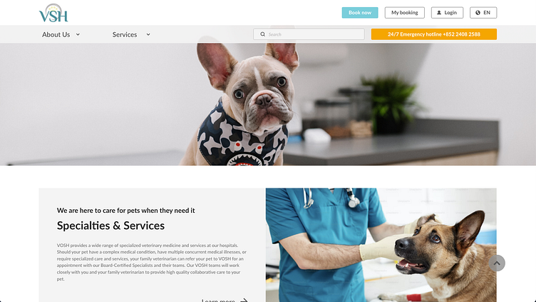
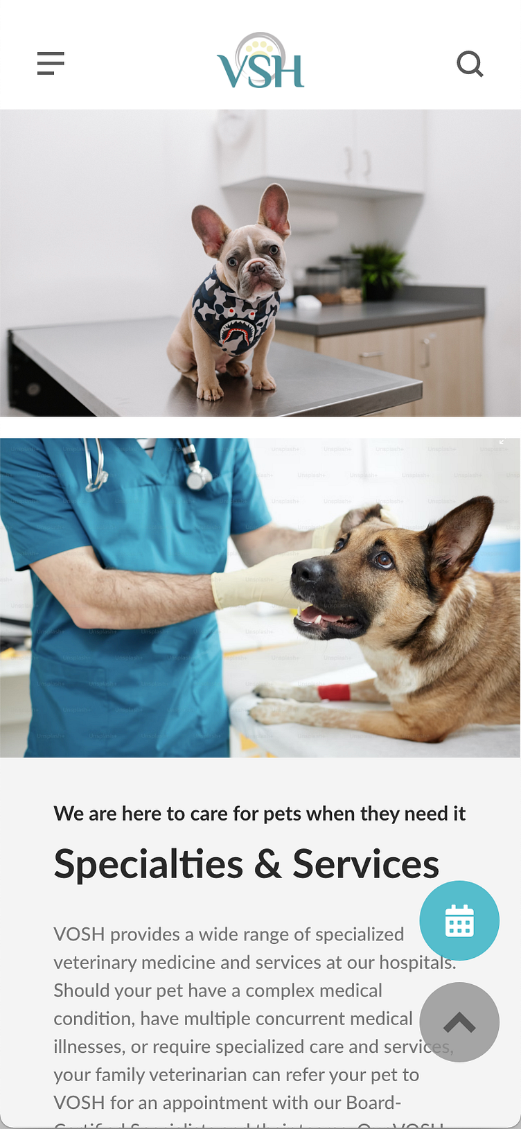
The product
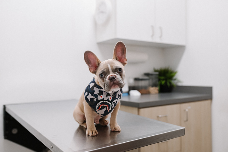
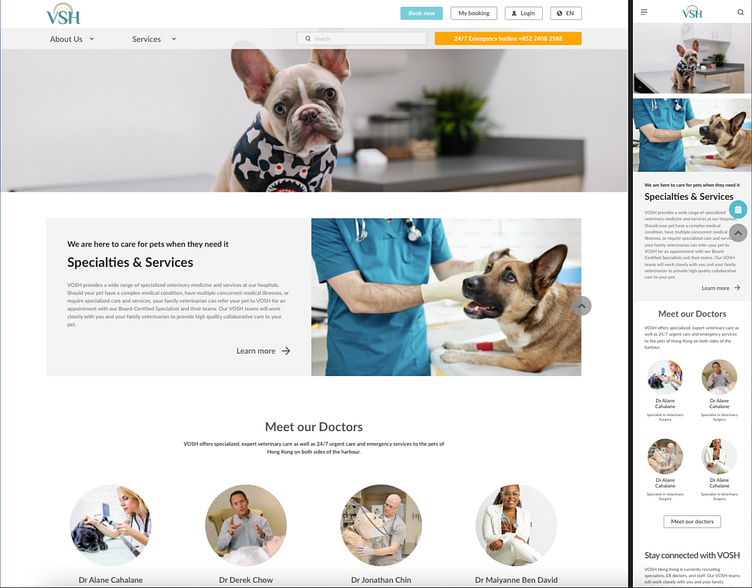
Design an online-register website for pet clinic, located at Hong Kong. VOSH is a local clinics, providing exceptional care and compassion for pets by our primary care, emergency and specialty services.
The problem
There are often too many pet owners and pets waiting at the front desk for registration and consultation, making the corridor unusable. The waiting time is very long, and they lose patience. The high number of registration also makes clinic staff prone to errors.
The goal
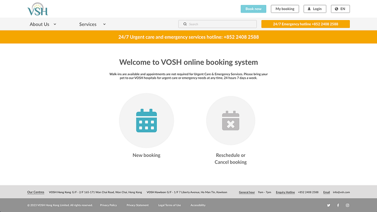
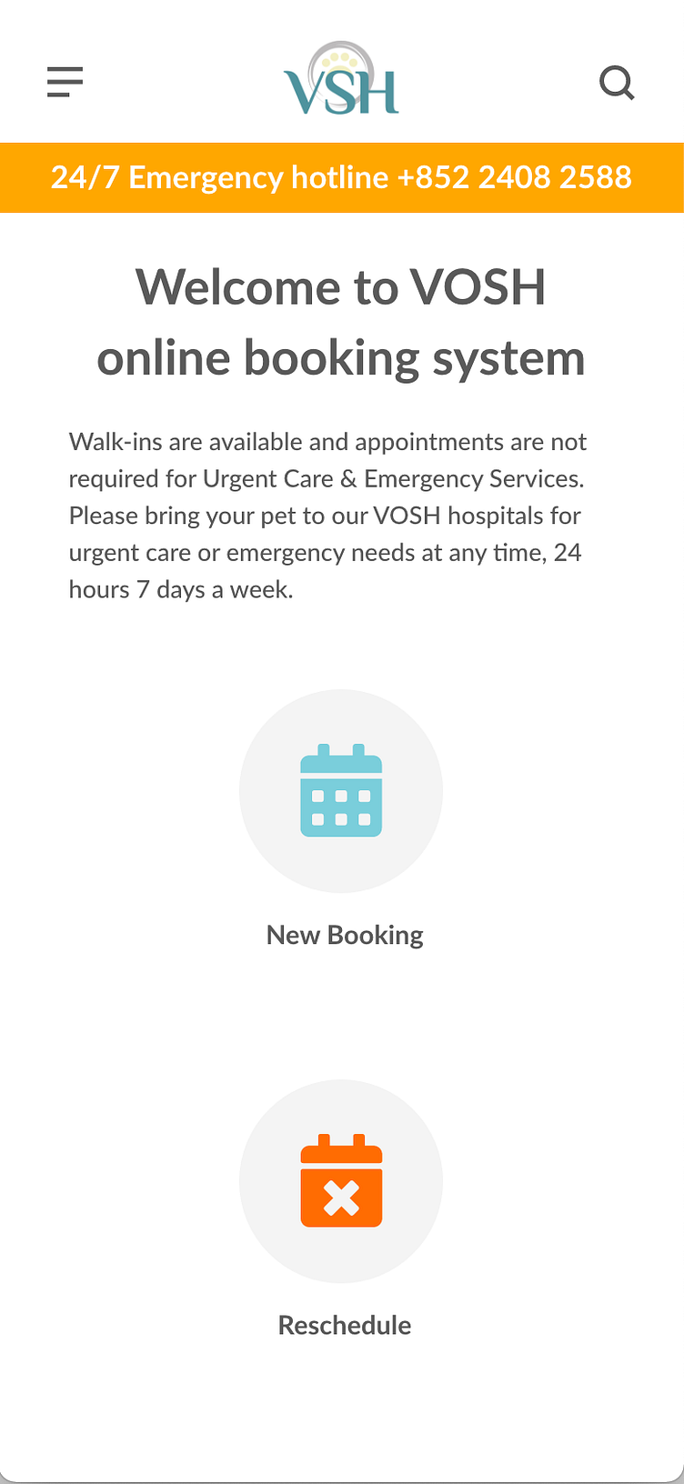
1. Skip the counter wait line and saving pet owner’s time
2. Improving the registration and navigation experience
3. Allow user reschedule and cancel appointment
4. Medical record history
User Research Summary
To help understand better VOSH’s customer problem and how to solve it, I conducted interviews. I created empathy maps to understand the users I'm designing for and their needs. A primary group identified through research was working adults in the city who didn't have time to wait at the vet reception.
This user group confirmed initial assumptions about VOSH's customers, but research also revealed that time was not the only factor limiting users' visits to the vet. Other user problems included service type, pet habits or challenges that make it difficult to reserve the vet service or attend vet registration in person.
User Pain Points
1. Time consumption
2. Accessibility
3. Difficulty when making the registration
4. Special care needs
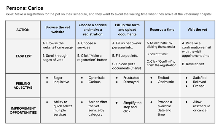
Persona - target audience study
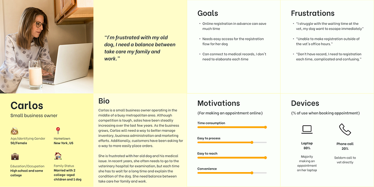
Problem statement
Carlos is a busy working adult with 2 children and a dog lover who needs easy access to online registration services on her own schedule because she has no time to wait at vet reception.
User journey map
Mapping Alan’s user journey revealed how convenient it would be for users to order food with an app.
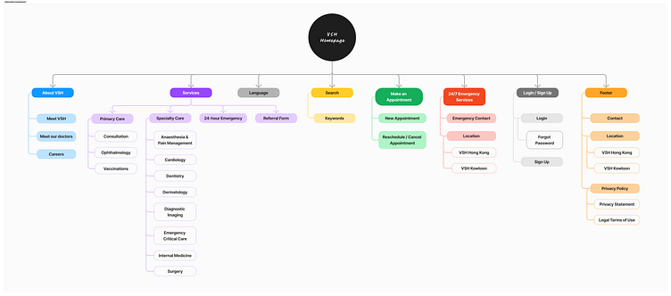
Information architecture (Sitemap)
Difficulty with website navigation was a primary pain point for users, so I used that knowledge to create a sitemap.
My goal here was to make strategic information architecture decisions that would improve overall website navigation. The structure I chose was designed to make things simple and easy.
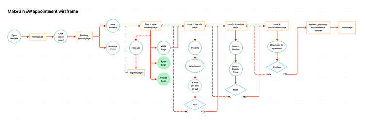
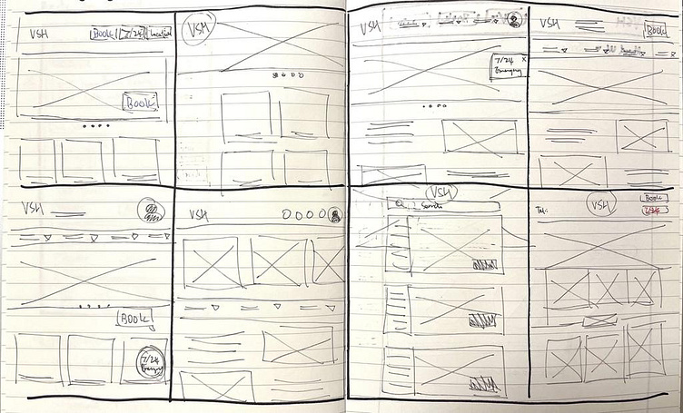
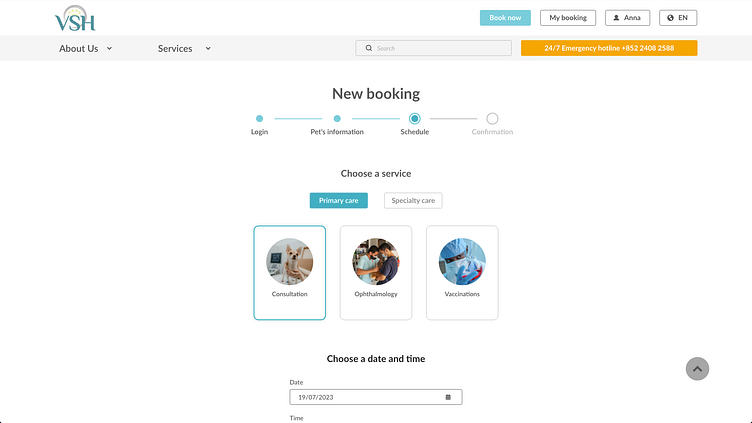
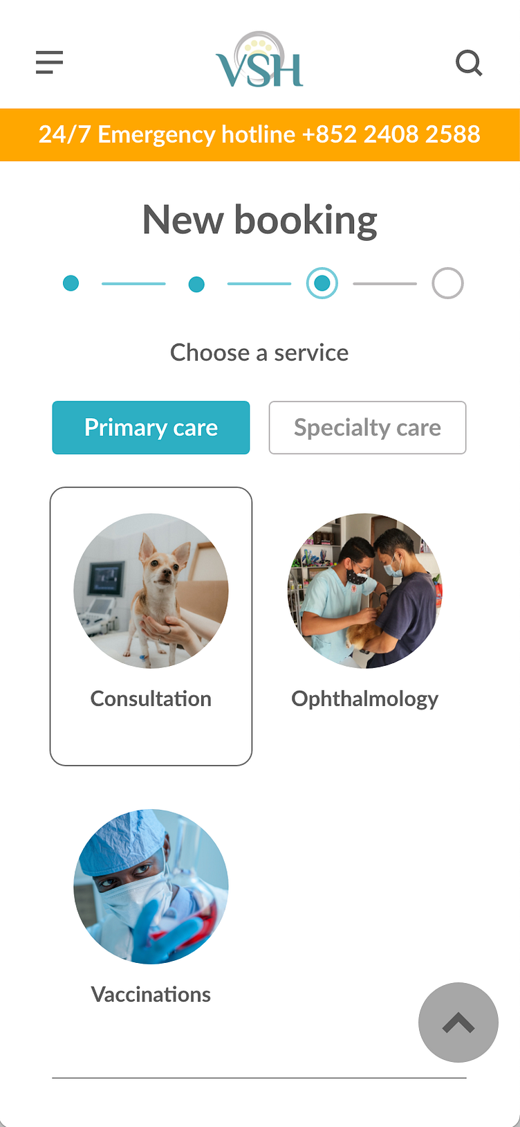
Paper wireframes
I sketched paper wireframes for different landing pages for my responsive website, keeping the user pain points about navigation, booking appointments and booking history flow in mind.
The home screen paper wireframe variations to the left focus on optimizing the landing page browsing experience for users.
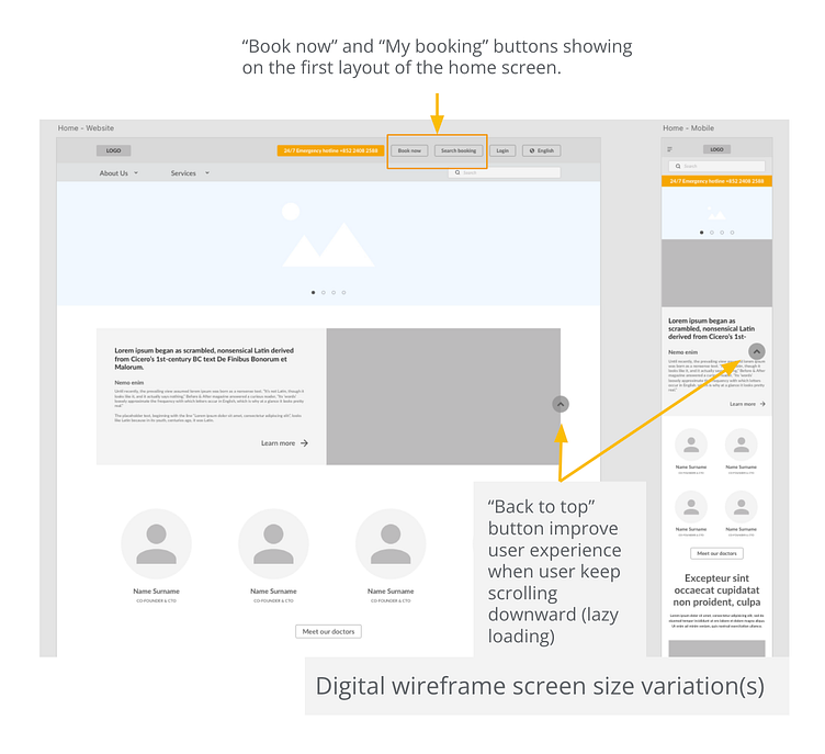
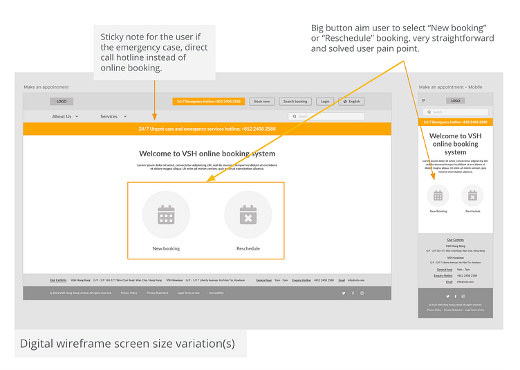
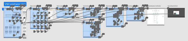
Digital wireframes
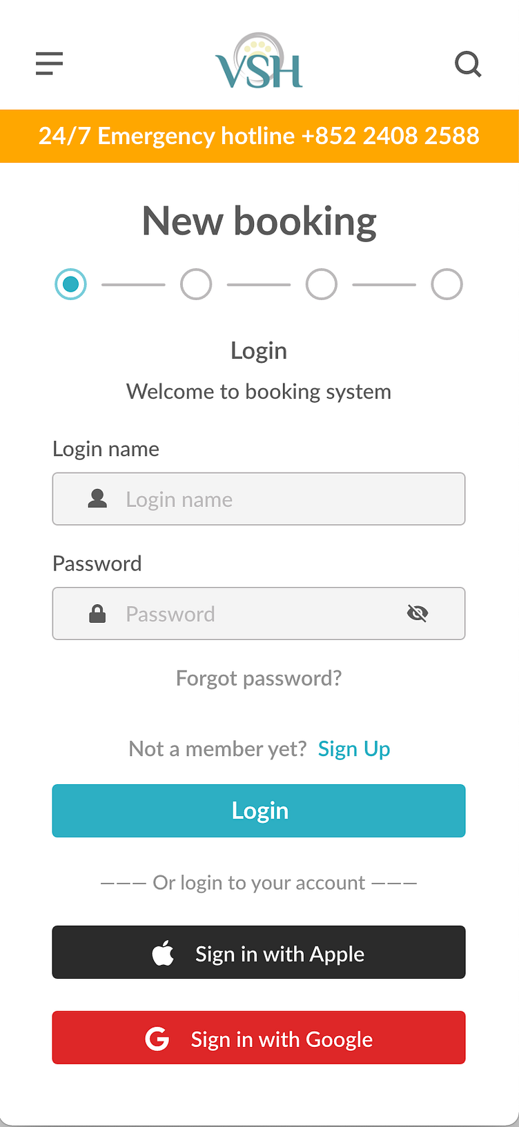
Shows how the redesign could help address user pain points and improve the user experience. Prioritizing proper button locations and visual element placement on the navigation bar was crucial to my strategy.
After clicking the “Book now” button, they will be directly user to the booking page. Showing how the redesign could help address user pain points and improve the user experience. Prioritizing the call-to-action button at the centre and visual element placement was a key part of my strategy.
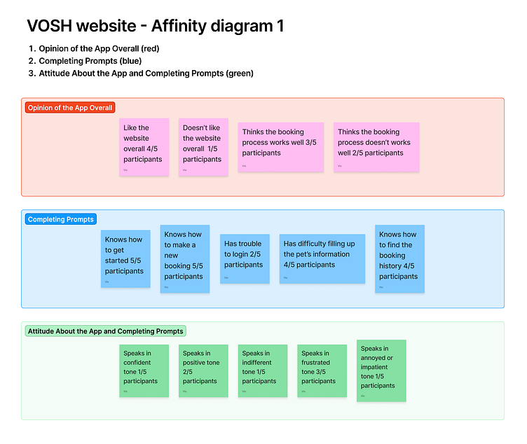
Usability study: Findings
Study type: Unmoderated usability study 丨 Location: Hong Kong 丨 Participants: 5 people 丨 Length: 30 mins
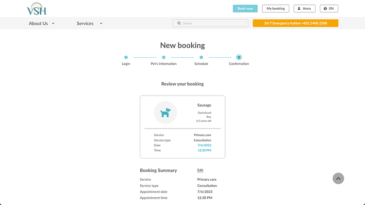
1. Booking flow
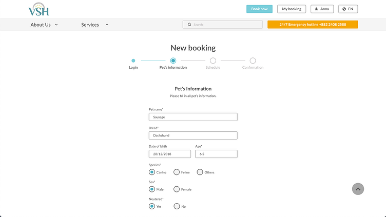
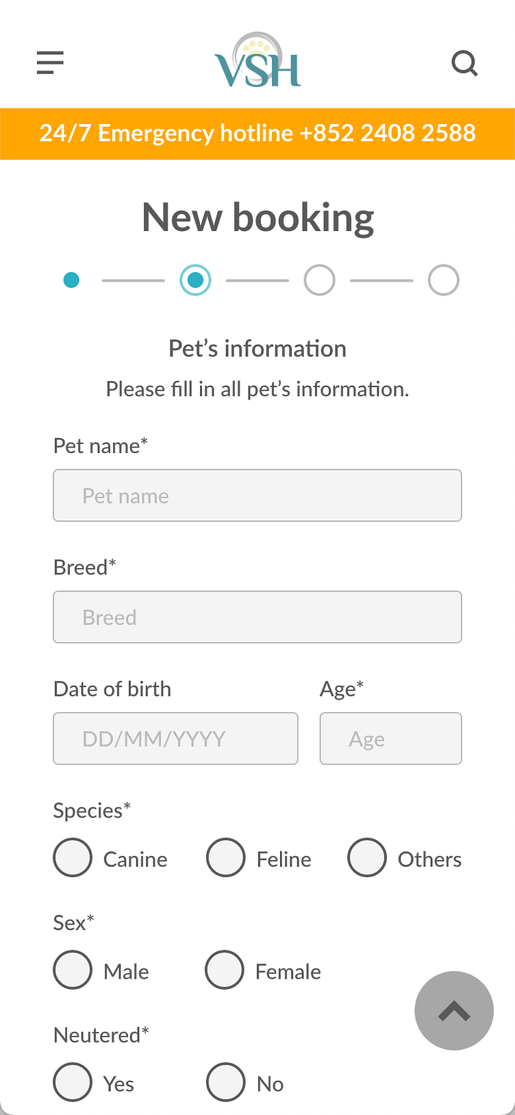
During the booking flow, most of the users struggled with step 2: the pet’s information page. Users don’t have a way to skip some questions they don’t know how to answer.
2. Lack of spacing, divide and text-heavy
2nd issue was found on the same page, booking flow step 2. Users felt text-heavy and hard to read.
3. Confused about button text
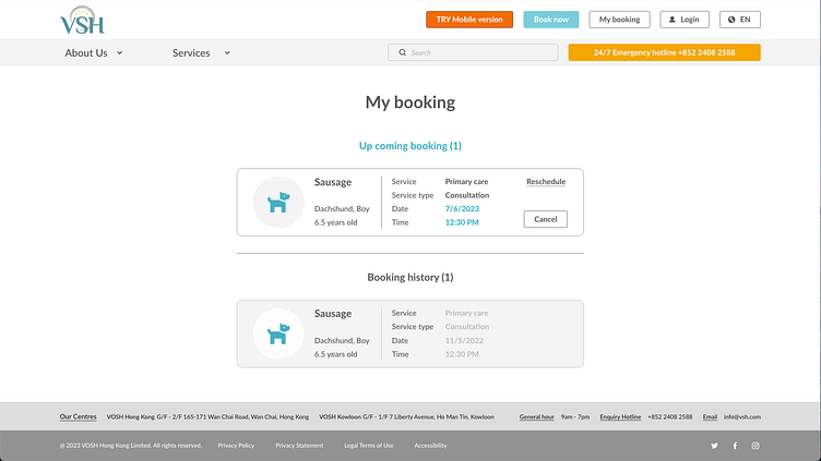
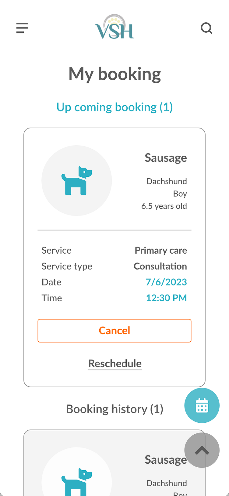
“Search booking” might confuse some users. They might not immediately apparent where is the booking history.
4. Linked with social media account
Users are looking for a simple way to create a new account.
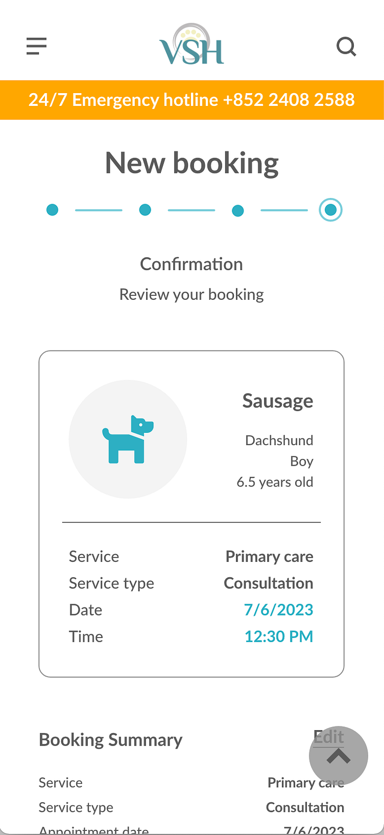
Mockups
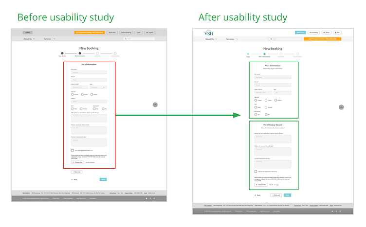
Based on the insights from the usability study, users are frustrated with the pet’s information form. Users don’t have a way to skip, and users felt hard to read this form. I changed "Options", allowing users to skip some questions. Also, I increased the text size and spacing, added a title, and divided it into two groups to make it more organised and easy to read.
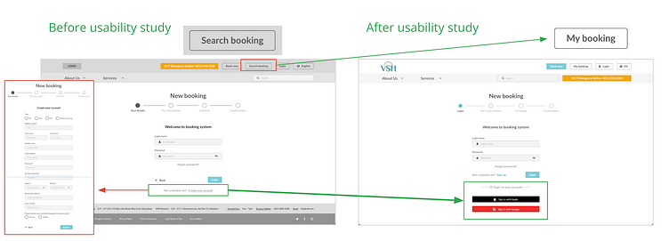
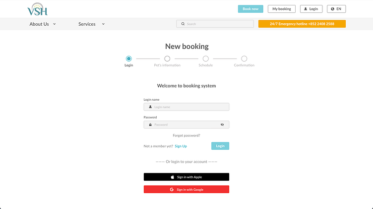
Based on the insights from the usability study, users are looking for a simple way to fill up their personal information during the create account. I made changes to the login method to improve the login flow. Prompt users to log in via their Google or Apple account if they have one. Also, users cannot immediately apparent where is the booking history. I changed the text button from “Search booking” to “My booking”.
Mockups for desktop website
Mockups for mobile website
Screen size variations
Based on my earlier wireframes, I included considerations for additional screen sizes in my mockups. Because users make an appointment from various devices, I felt it was essential to optimize the browsing experience for a range of device sizes, such as mobile and tablet. Hence, users have the smoothest experience possible.
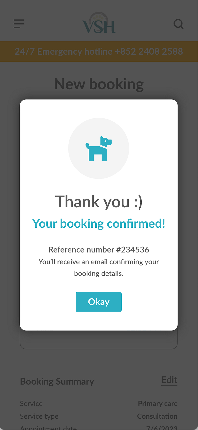
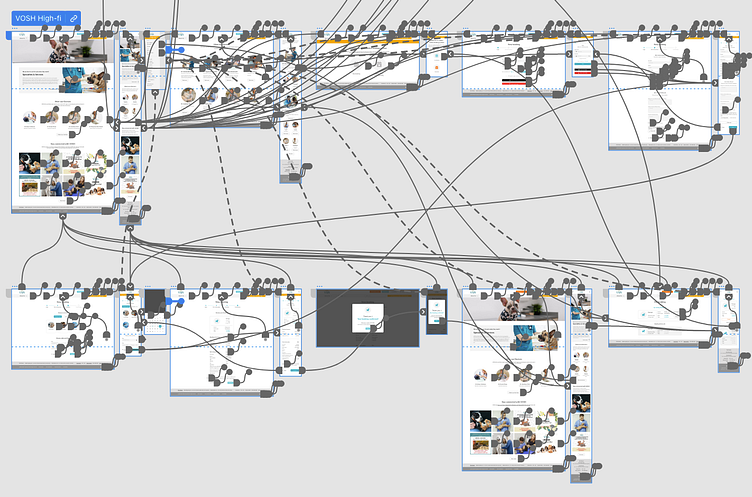
High-fidelity prototype
My high-fidelity prototype followed the same user flow as the low-fidelity prototype, and included the design changes made after the usability study, as well as several changes suggested by end user and teammates.
View the VOSH website and mobile site link click here
Takeaways
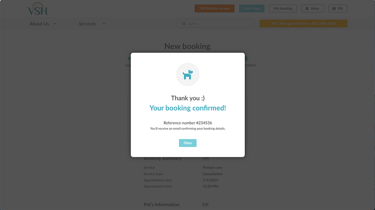
Impact: The website makes users saving their waiting time, VSH really thinks about how to meet their needs.
What I learned: During the case study and usability study when designing the VOSH website, I learned the importance of UX research, after collecting much-valued input and feedback, how designers influenced each iteration, digested it and took action.