Cafe order app design and case study
Mobile order app UXUI design and case study
Google UX Design Professional Certificate Project.
Photos credits: unsplash.com
Skills: UXUI design, responsibilities in user research, competitor studies, wireframe, prototype and conduct usability studies.
Tools: Figma . Miro
The product
Design a mobile-ordering app for cafe located at Hong Kong. This cafe is a local micro roaster offer seasonal direct trade coffee beans, fresh roasting and different brewing.
The problem
Since the COVID-19 pandemic hit the world for the last 3 years, local cafe have rethought their strategies in the face of these changes. Because of the epidemic, many people have changed their habits from dine-in to takeaway. To prepare for the shift, cafe had to devise a strategy to adapt to the change.
The goal
1. Improving the ordering experience.
2. Reduce the interaction in the cafe.
3. Skip the in-store order line and saving user’s time
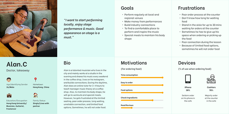
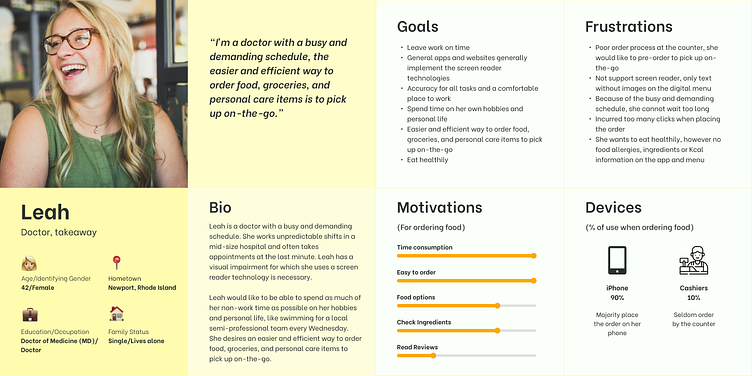
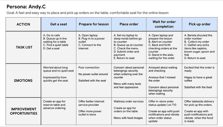
Persona - target audience study
Enter your text here...
User journey map
Mapping Alan’s user journey revealed how convenient it would be for users to order food with an app.
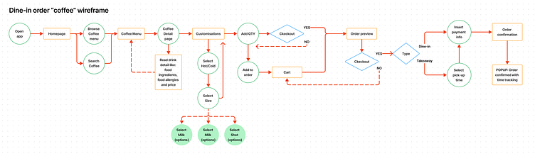
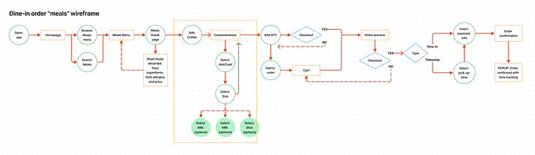
Ideations and define
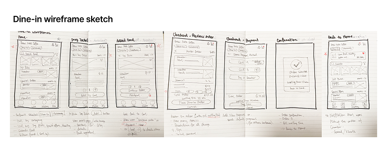
Paper wireframes
Drafting iterations of each screen of the dine-in ordering process on paper ensured that the elements that make sense and transfer to digital wireframes would be well-suited to address user needs and their pain point.
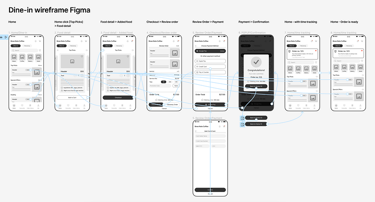
Low-fidelity prototype
The low-fidelity prototype connected the primary user flow of dine-in ordering food process, so the prototype could be used in a usability study with users.
Usability study: Findings
I conducted 2 rounds of usability studies. Findings from the first study helped guide the designs from wireframes to mockups. The second study a high-fidelity prototype and revealed what aspects of the mockups needed refining.
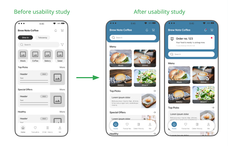
Round 1 findings: 1. Users want simplify home screen. 2. Users want fast and simple way to order food. 3. Users want time tracking feature
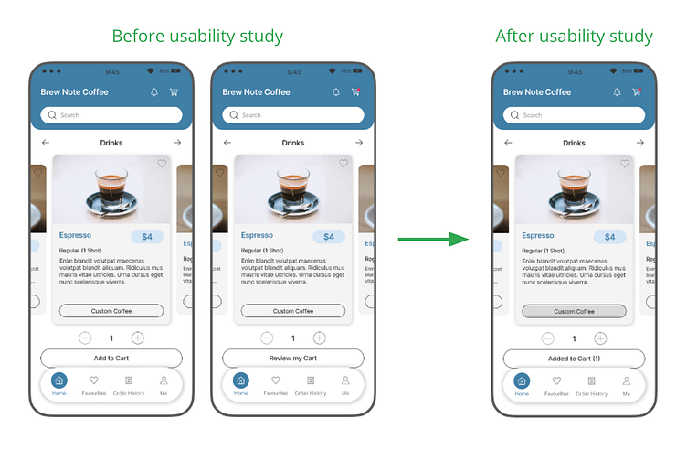
Round 2 findings: 1. Redefine the “Add to cart” and “Review my cart” user-flow. 2. Enhance the visibility of “custom coffee” button
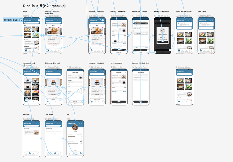
Mockups
Early designs allowed user to switch [Dine-in] or [Takeaway] is the home screen, and many options for user to select, but after the usability studies, I simplified the design by removed the unnecessary buttons. I also revised the padding space, increase the menu button size, and added the order status update. So users focus the main menu on the home screen.
The second usability study revealed confusion with the [Add to Cart] and [Review my Cart] buttons and enhance the visible of [Custom Coffee] button. To streamline this flow, I removed [Review my Cart] step and changed the button words to [Added to Cart (#)], so users got a response on the button. Users can review the order by clicking the “Cart” icon on the top right. Also, I changed the [Custom coffee] button color.
Takeaways
Impact: The app makes users saving their waiting time, cafe really thinks about how to meet their needs.
One quote from peer feedback: “The app looks nice and Fun with a time tracking feature which can solve the user's needs.”
Takeaways
Impact: The app makes users saving their waiting time, cafe really thinks about how to meet their needs.
One quote from peer feedback: “The app looks nice and Fun with a time tracking feature which can solve the user's needs.”
