Brand Identity For Inucha Ceremonial Matcha
INUCHA, where the essence of matcha meets the philosophy of the Japanese tea ceremony. As a health-conscious individuals disenchanted with coffee's aftermath, Inucha embarked on a quest for a cleaner, more enriching beverage. Enter matcha - a vibrant, healthful revelation. Drawn to the Japanese tea ceremony's wisdom of savouring each moment, INUCHA was born. The open bar concept shatters barriers, mirroring the ceremony's egalitarian spirit. Rooted in Scandinavian design, the brand reflects a commitment to relaxation. INUCHA offers not just matcha, but a mindful journey, inviting you to experience the present anew.
一期一会
One life, one encounter
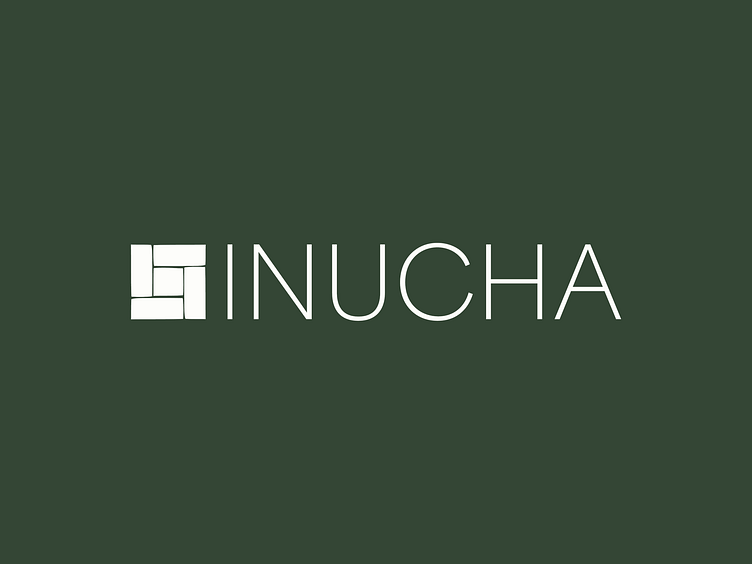
The Inucha logo draws inspiration from the tatami flooring used in traditional Japanese tea rooms. The lines in tatami mats are used as a guide for placement, and the joins serve as a demarcation indicating where people should sit. The flooring forms T shapes to ensure good fortune and no four corners of the mat should touch.
The lines of each shape are edited to be more organic and fluid. This represents the brush strokes of the Calligraphy found in Japanese scrolls. Scrolls, often written by famous calligraphers or Buddhist monks, are hung in the tokonoma of the traditional tea room.
The idea accurately represents Inucha’s mission to break down social barriers, mirroring the tea ceremony's egalitarian spirit.
See our work at: www.studiomiyabi.co.uk
Connect on socials:
Full Project On Behance: Inucha Ceremonial Matcha
Instagram: @miyabi.studio


