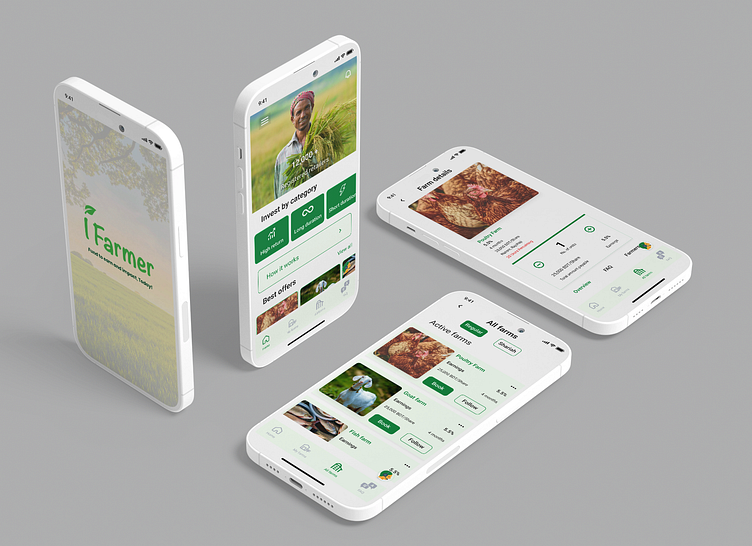
iFarmer mobile app redesign concept
iFarmer Mobile App Redesign Concept
This redesign concept of the iFarmer mobile app focuses on four key areas:
Reduced real estate space of general information: The new design condenses general information into a more concise and visually appealing format, freeing up space for more important features.
Clear placement of CTA buttons: Call-to-action (CTA) buttons are now prominently placed and easy to find, making it easier for users to take the desired action.
Implemented color hierarchy using the 60/30/10 principle: The new design uses a 60/30/10 color hierarchy to create a visually balanced and appealing interface.
Used red to impose a sense of urgency on users: The color red is used sparingly to highlight important information and create a sense of urgency for users. Overall, the new design is more user-friendly and visually appealing, while still retaining all of the essential features of the original app.
Available for crafting your ideas...
📪 Email: adnan.nidal@gmail.com
All materials were used for non-commercial purposes and belong to their owners.
