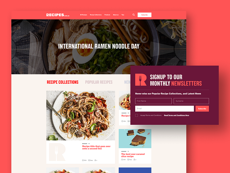
Recipes.com.au — UX Update
The previous website for recipes.com.au provides a problematic user experience due to its excessive vertical scrolling, which makes it difficult for users to navigate and find content. To address this issue, we have implemented three navigation functionalities that allow users to easily access recipe collections, popular recipes, and new recipes, along with a new set of rectangular cards to support a fresher interface. The goal is to enhance user satisfaction and make the website more user-friendly
----------
✌️Got a project in mind? Let's chat! Reach out here or learn more at taplink🚀
More by Carl Aquino View profile
Like

