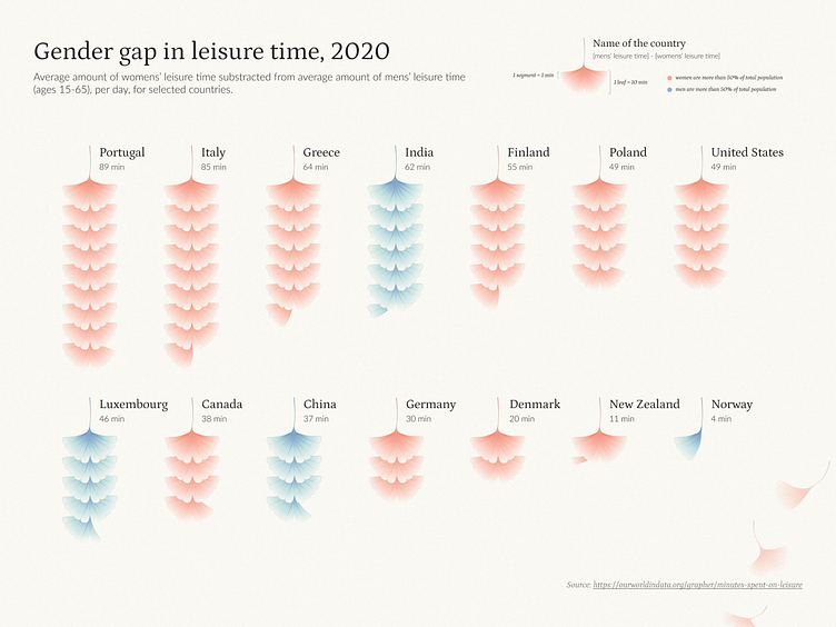
Gender Gap in Leisure Time - Data Visualization
This is a data visualization of the gap between men's and women's leisure time in different countries.
I made it (in Figma) as my final project for this course by Federica Fragapane:
https://www.domestika.org/en/courses/data-visualization-and-information-design
It's very much inspired by her style, so if you like this, definitely check out her work.
Source:
https://ourworldindata.org/grapher/minutes-spent-on-leisure
Hope you enjoy!
More by studio2wx View profile
Like
