Self Rebranding


Rebranding of my identity I designed in 2014.
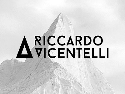
This is not a simple triangle. It starts from the letter V (initial of my last name) written in the typeface Baron, then vertically reflected, because it recalls the shape of a mountain. The mountain has several meanings for me. In addition to being a great lover of snow and cold, the mountain means: the summit, the uniqueness, the peak, the roof of the world.
You can find out more about the concept and see the complete project on Behance: http://on.be.net/1nDHpGC
Thanks!