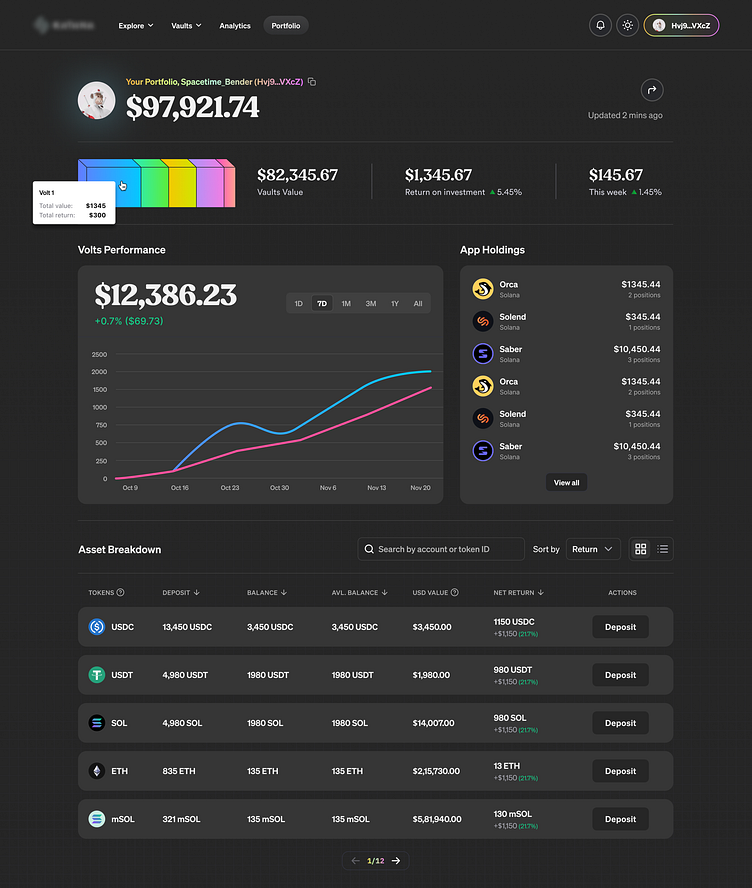
De-fi Portfolio - Dark Mode ✨
The De-Fi Portfolio Breakdown UI, meticulously crafted, embodies a seamless fusion of minimalism and functionality. Embracing a sleek, dark-themed aesthetic, it offers users a clean and intuitive experience. With a comprehensive array of user-centric features, it empowers effortless management and analysis of diversified De-Fi portfolios. Its refined design ensures swift access to critical data, enabling users to make informed investment decisions. This UI sets a new standard for clarity and user-friendliness in De-Fi portfolio management, serving as a sophisticated tool for the modern investor.
De-fi Portfolio - Blue Mode
Same thing as above, but not sure which direction to go with. The upper seems flat at times while the bluish one seems a bit too much at times. But bluish one also gives me positive vibes as the background is not flat and it consists of blurry blob gradients.

