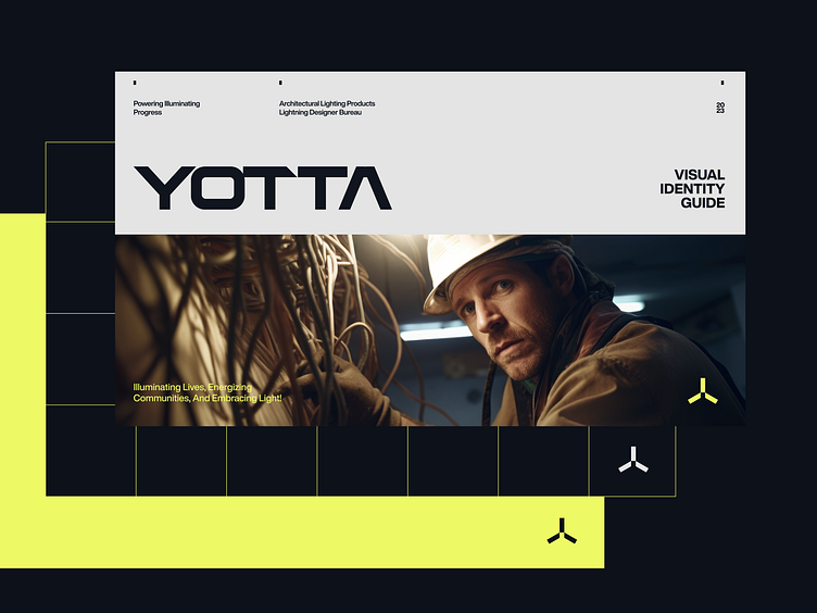
Brand identity concept for YOTTA

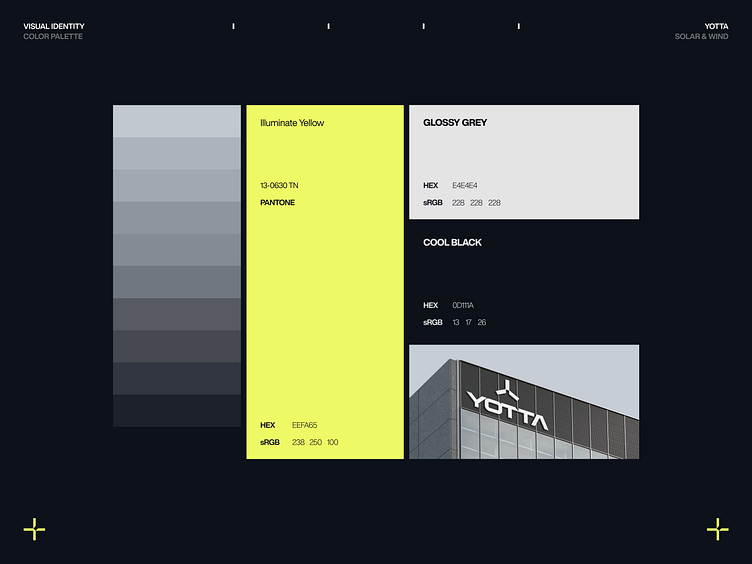
The YOTTA design concept encapsulates the cutting-edge essence of a company at the forefront of green energy generation through windmills. The modern and sleek design, primarily using a monochromatic palette punctuated by vibrant yellow highlights, reflects the innovative and clean energy solutions that Yotta promises. The minimalist layouts, characterized by sharp geometries and clean lines, resonate with the precision and efficiency inherent in wind energy technologies.
The YOTTA logo and typography reveal a thoughtful approach to design, which harmoniously aligns with the company's innovative essence.
The Yotta logo comprises an icon with the letter "Y" reflecting windmill blades or a turbine's rotation. The icon's symmetry and geometry exude balance and stability. Its compact and bold design provides versatility, making it suitable for varied applications, from digital platforms to physical branding.
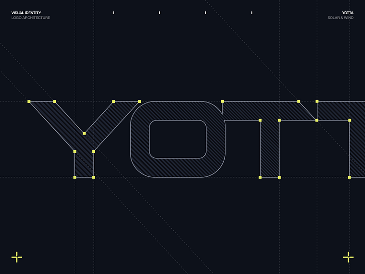
The linear and straightforward nature of the font aligns well with the brand's identity as a reliable and efficient green energy provider.
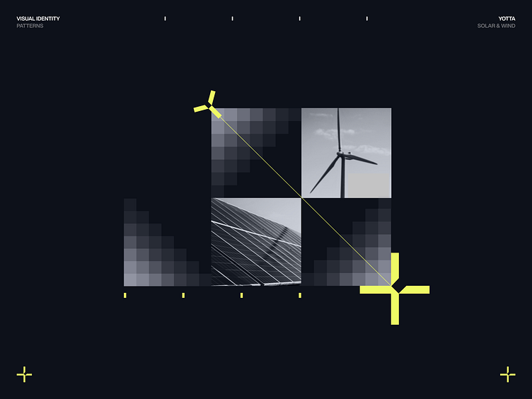
The seamless blend of abstract designs with tangible images paints a comprehensive picture of a technologically advanced and environmentally conscious brand.