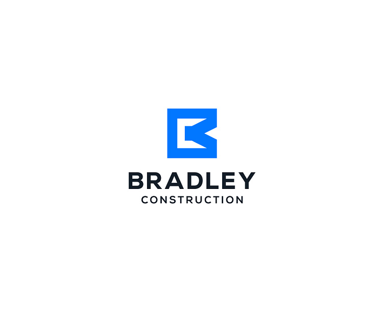
Bradley Construction Logo Design
Personal logo design project for Bradley Construction, a leading home building company that specializes in custom home construction.
The logo features an icon that combines the letters "B" and "C" from the name in a sleek and sophisticated design. The letter "C" is represented as a negative space inside the letter "B," which creates a sense of depth and dimensionality. The use of negative space also adds a subtle element of surprise and creativity to the design.
The blue color used in the logo represents trust, professionalism, and reliability, which are key values of the construction industry. The black color symbolizes strength, stability, and sophistication, reflecting the company's commitment to providing high-quality construction services.
In need for a distinctive and enduring visual identity? One that brings you closer to your business goals by attracting your ideal customers? Send me a message or email me at vigodesigns2019@gmail.com


