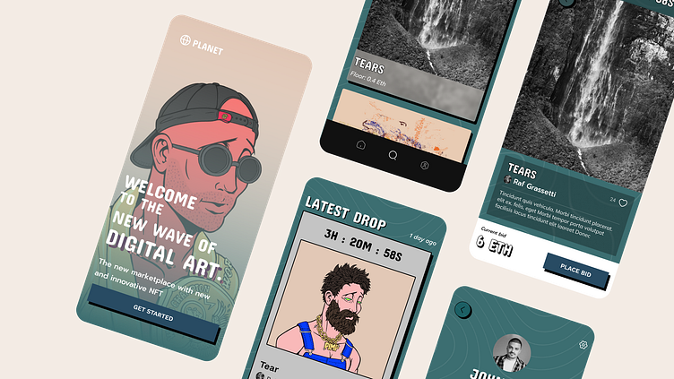
Dribbble UI Design 101 Course - Case Study
Moodboards
As part of the curriculum for the UI Design 101 Course offered by Dribbble, we were asked to design a mobile app for an NFT marketplace called "Planet".
I started the project by creating a moodboard with examples of other NFT marketplaces. I primarily used these for understanding the requirements in terms of functionality. I didn't want to copy the overall aesthetic since it seems a bit overused (ie., very dark and modern).
Playground
I tried two different distinct styles initially. One was more traditional e-commerce vs the more frequently used "dark and modern" crypto aesthetic. After a few iterations, I landed on a retro + neo-modern-brutalist vibe that seemed to be a bit unique vs traditional crypto-native products.
Design System
Here is the final design system I came up with. I like the retro green colors and really liked the "Concert One" font but it was hard to find a body font I really liked.
Finished Product
After locking down the design system I was able to finish the screens and create an interactive prototype (here)
Lessons Learned
Overall I thought this was a good exercise and I learned a lot about some of the figma features I had not used previously, like auto-layout and the component system. Moving forward I will spend more time up front on the research/moodboarding part of a project as I think that is the most important to create a good foundation for a design system.


