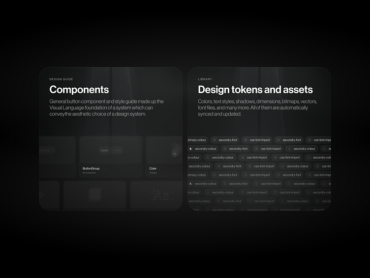
Bento Cards for Design System Landing Page
Hi People 🙅🏻♂️
We have prepared a design system project for an airline company in 🇹🇷. We also designed a landing page for it and used bento grid to direct users to the relevant areas. We will try to tell you about the bento grid design process superficially.
As I mentioned, my client is in the airline industry and we wanted to build a relationship using airline objects. This could be a flight control stick, flight board, cockpit part, aircraft wheel or something like that.
We've been experimenting with a lot of different shiny cards lately, and we started thinking about the relationship between shine and aircraft headlights, and after a few experiments we came up with a card like this.
We look forward to sharing other sections soon.
Let's Talk 🙅🏻♂️
We are a full-service agency, busy designing and building enchanting digital products, brands, and experiences. We specialize in helping startups and young companies grow. We don't claim to know everything, but we know everything about helping big brands think about even bigger ideas. There is a pile of energy accumulated in us, we spray it into the work we do, and the result is good work and happy customers at the end of the day.


