Horizon - A HR initiative rebrand

Objective:
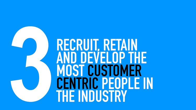
The objective of the Vitality (previous name) revitalisation project is to enhance and reinforce our third organisational pillar through the redesigning of the program dedicated to employee evaluations.
Background:
The previous iteration of the program simply featured the word "Horizon" in italics across an A4 sheet. The minimalistic approach, while straightforward, is considered outdated and lacks the visual and functional elements necessary to align with the organizational vision. A comprehensive redesign is required to give the Horizon project a more contemporary and impactful presence.
The pillar on which the program was built
Logo Colourways
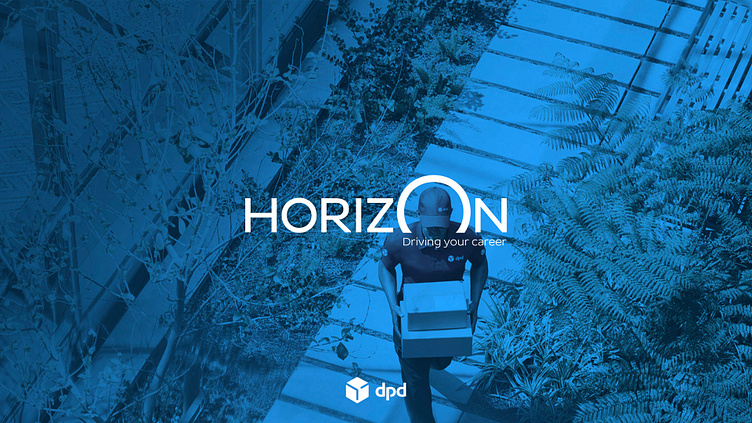
The conceptualisation of the Horizon logo aims to evoke a visual metaphor that aligns with the department's commitment to growth, progress, and the elevation of employee performance. The incorporation of a rising sun within the letter 'O' symbolizes new beginnings, optimism, and the dawn of fresh opportunities for both the organization and its employees.
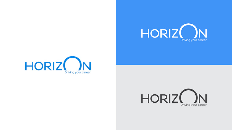
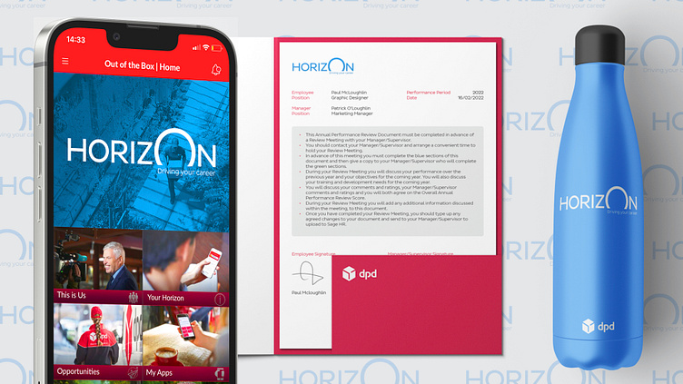
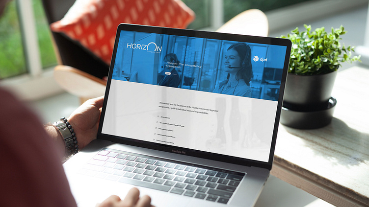
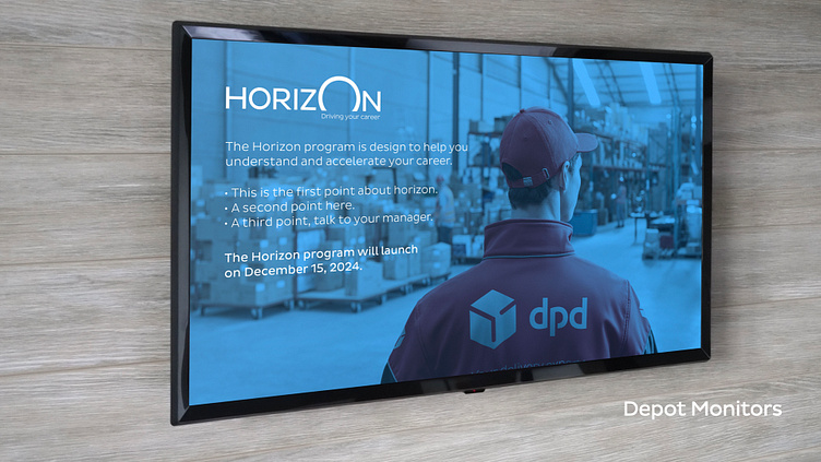
The HR department emphasized the need for the redesigned version to seamlessly apply to diverse mediums, ranging from traditional paper documents to digital screens and even merchandise.
The objective is to ensure a cohesive and adaptable visual identity across these different platforms, fostering a unified and professional representation of the program across various contexts.