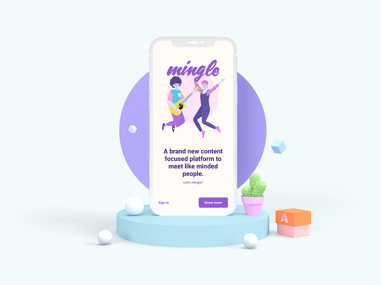
Mingle
Chatting with friends that recently started working abroad, they noticed a lack of means to chat about themes of interest with like-minded people nearby. The difference in time zones between friends means chats will be experienced more like exchanging emails and less like chatting.
Thinking about it, I decided to design an app exploration in order to solve this issue.
Defining the problem
People have trouble getting in touch with like-minded people. Conversation at core to setup new kind of interactions.
Wireframes & Userflow
After some research on dating apps, social media, and questioning some people which would fit the personas as possible users, I concluded that the features had to be basic and keep it simple. The objective was to keep a simple and intuitive structure with access to all pages actionable at any given moment so you can focus on the main reason of using the app.
Onboarding
Since the core principle was the content of the chatting, making it the first step to select the theme you feel like chatting about feels only appropriate. The onboarding screens are meant to elicit attachment and empathy, hence the use of illustrations and copywriting adequate to both clarify how to work with the app and also make it more relatable, also a button to skip the onboarding is ever present, so you can jump in and get started with the chatting.
Walkthrough Experience
After setting up your profile, you just pick a interesting theme through careful curated options (still allowing you to suggest new themes and improvements on the existing ones), a search through the GPS with adjustable radius in the settings present you the available nearby candidates to chat with. This search option should be considerably fast, taking a minimum of 2s during which the user should experience a search animation. The candidates are able to edit their profile page to write a Bio, choose picture, show occupation and pick interests they usually search for using the app. Pick a person and get in touch! Let the chat flow!
There’s no need for second party confirmation as users can always opt to answer or even delete the chat. On the bottom navigation the three buttons assigned let you at any given time: update or profile and settings, search candidates through the list of your interests and go back to previous chats. The chat icon would have a status indicator on new messages so the user can easily know if there are already conversations to start or rekindle!
End goal
The three goals are therefore secured! During the design process, other subjects which the app would be appropriate for came to mind such as intercultural information exchange and even, finding participants for user research exercises.


