Raging Vitality: The AngrySupps Logo
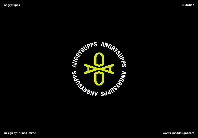
The AngrySupps logo is a bold and dynamic representation of the brand's ethos. The design centers around two stylized letter 'A's, cleverly transformed into fierce, glaring eyes. These eyes convey a sense of determination and intensity, embodying the brand's commitment to providing potent and effective nutritional supplements.
Between the intense gaze of the 'A's lies a powerful symbol of health and vitality: a pill. This pill is not just a symbol of supplementation, but a testament to the brand's dedication to delivering products that empower individuals to take charge of their health and well-being.
The choice of vibrant, energetic colors further reinforces the logo's message. A neon green dominates the design, representing passion, energy, and the transformative power of nutrition. Accents of bold black add a sense of strength and authority, highlighting AngrySupps' position as a leading force in the nutrition industry.
In crafting this logo, the goal was to encapsulate the essence of AngrySupps - a brand that empowers individuals to channel their inner strength and determination towards achieving their health and fitness goals. The design is a visual call to action, inviting customers to embark on a journey of transformation and self-improvement.
For more logos that ignite inspiration, click this link