Sunset Name Logo
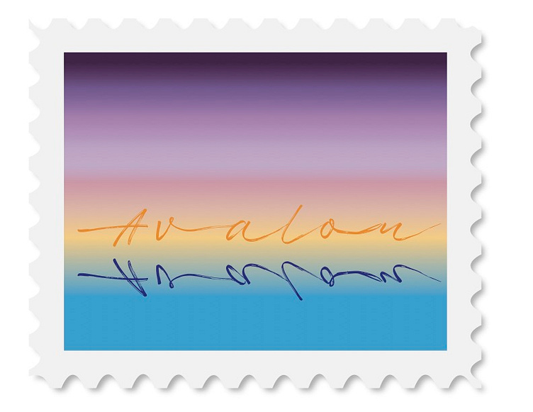
For this assignment I have chosen a typeface that best represents who I am. This typeface, called “Fast”, has so much beauty that one can miss some vital characteristics about it.
The way the typeface flows from one letter to the next shows the side of me that is gentle and kind, and that I am one that likes to go with the flow. Now take a look at the spacing of the letters. Even though I am one that likes to go with the flow, I often tend to distance myself from others around me, and sometimes, I can cut myself off of others completely, as shown by the A in the beginning.
Next let’s focus on the speed the typeface gives off. As the name of the typeface states, the typeface gives off a calming, yet fast feeling to it. As the brush strokes flow with each other, it looks as though the name was written in a hurry. This speed represents how quickly I learn things.
The typeface is meant to look like handwriting, which can be seen as elegant, and sometimes it can feel a little stuck up. This represents my facade that I put on for people I am not close with. As you look a little closer, in between the brush strokes, you can see that there are cracks. This represents the windows to my inner self that the people I let in get to see, in other words, the real me.
Lastly, the colours i chose represents my favourite times of the day. I love watching the sunrise and the sunset. The golds and purples are my favourite colours and the way they blend so well together during these times of the day make me realize that even the most opposite of colours can still look beautiful together. To tie it all together I made it into a stamp to symbolize my love for travel.
