Moon: An NFT Marketplace (Case Study)
Design Brief
Goal and Scope
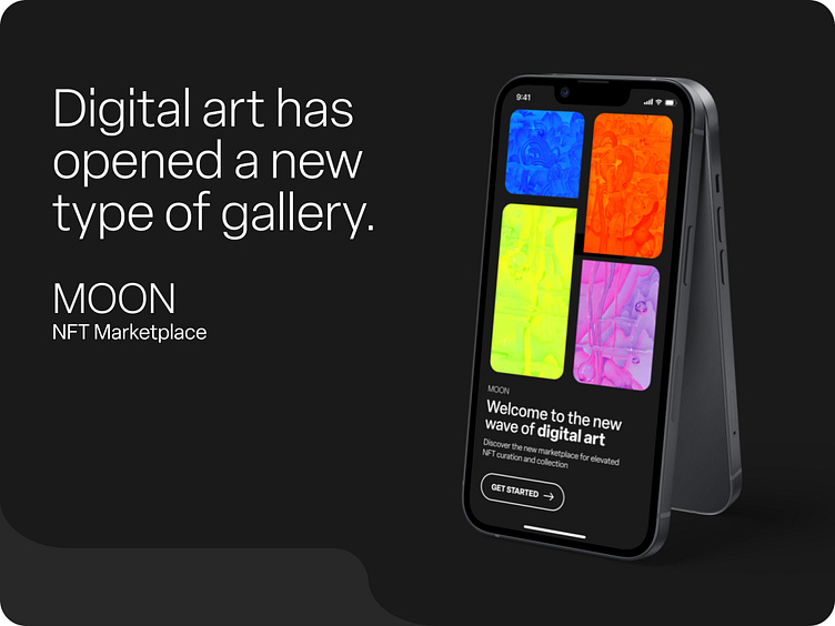
MOON is a pioneering NFT marketplace platform uplifting a new wave of digital artists using a design-first UI approach. By creating a distinctive visual identity for MOON's chronically online Gen Z users, these assets can then scaled for application onto selected mobile app wireframes. Assets are then organized into a UI library and translated into functioning Figma prototypes.
Deliverables
Visual identity system
High fidelity prototypes (iPhone 13, 390 x 844 pixels)
Functional Figma prototypes
UI library
Over a period of three weeks, the preceding deliverables were iterated to explore new brand voice + tone, accessible + legible solutions, and animated interactions.
Primary project challenges include creating a design interface for a mobile space that is neutral enough to host unpredictable NFT images and naming conventions, while still maintaining a distinct brand voice and tone.
Target Demographic
MOON's target demographic centers Gen Z users familiar with the NFT landscape and cryptocurrency, as well as driving an ease-of-use onboarding experience to introduce new users to the marketplace.
About Me
As a collaborative and detail-oriented graphic + brand designer passionate about designing for social change through a human-centered approach, I have naturally become increasingly interested in the field of UI and its intersection with UX design. Engagement in the 6-week Dribbble UI Course has introduced me to the powerful capabilities of Figma (as a user of Adobe XD) and how to develop mobile user flows and functioning prototypes.
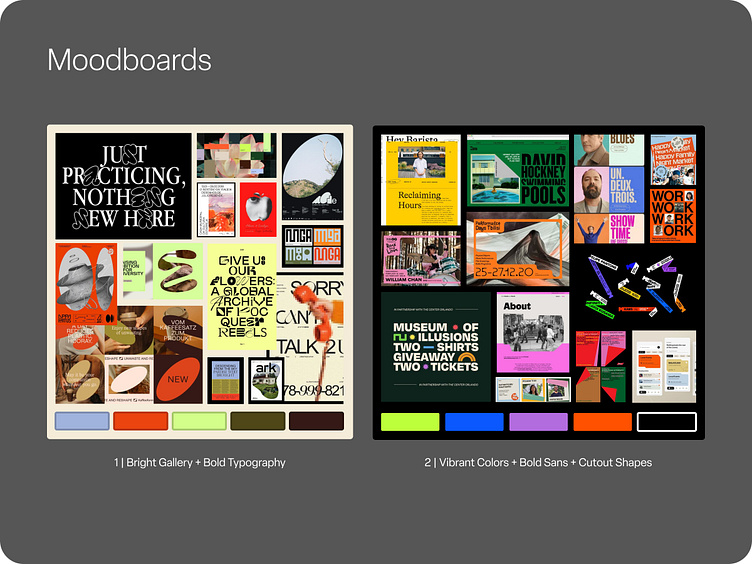
Moodboards
Research and visual exploration is a foundational part of my design process. The inception of MOON's visual identity thus began where all good ideas do, in the visual archives of Pinterest, Behance, and Dribbble.
Exploration included: bold and experimental typography, abstract ways to mask images, creative interactions between text and type (icons and photos between letters), and expressive color ways that prioritize legibility while maintaining a clear brand voice.
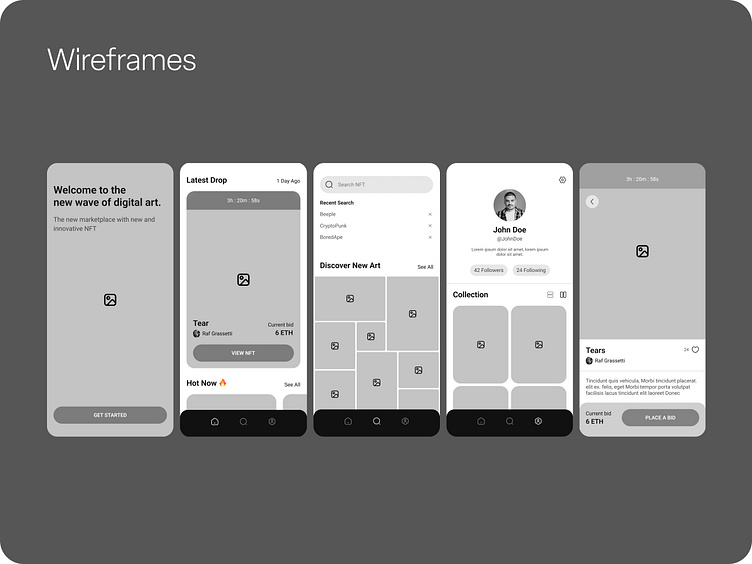
Wireframes
Basic wireframes and content structure were provided by Dribbble. This initial product exploration primarily centers on the development of the visual identity and as an introduction to designing and prototyping in Figma.

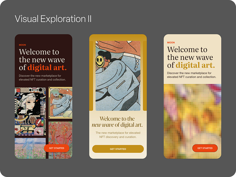
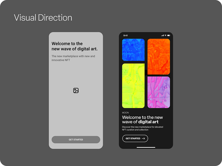
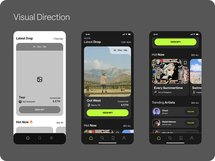
Visual Exploration
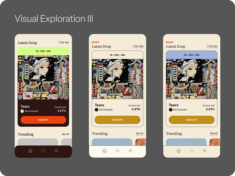
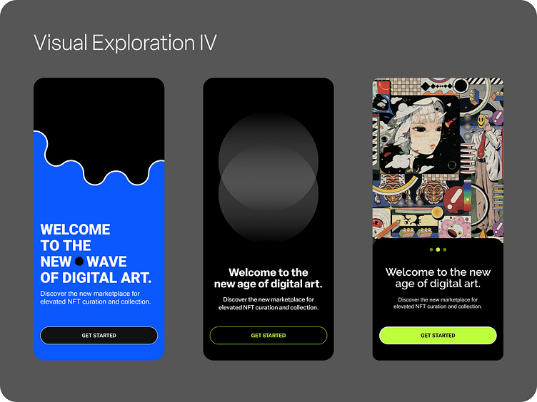
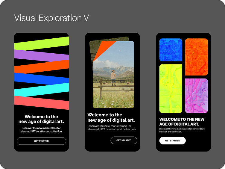
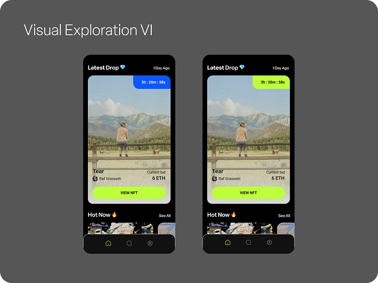
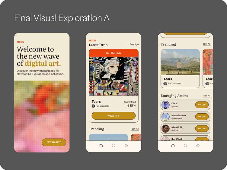
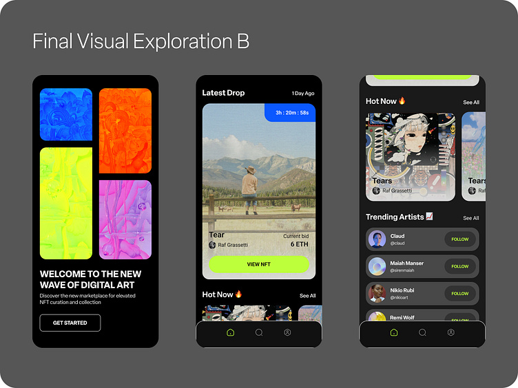
Final visual explorations included two opposing variations:
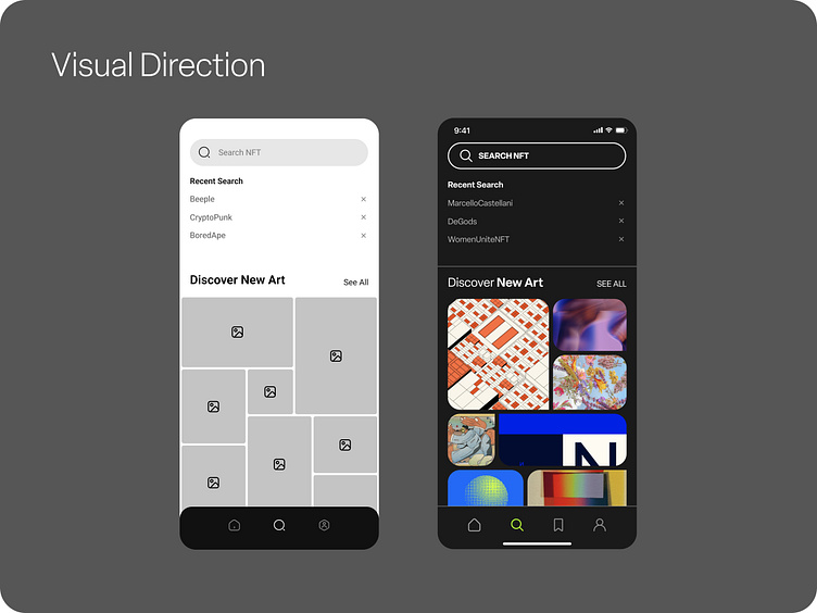
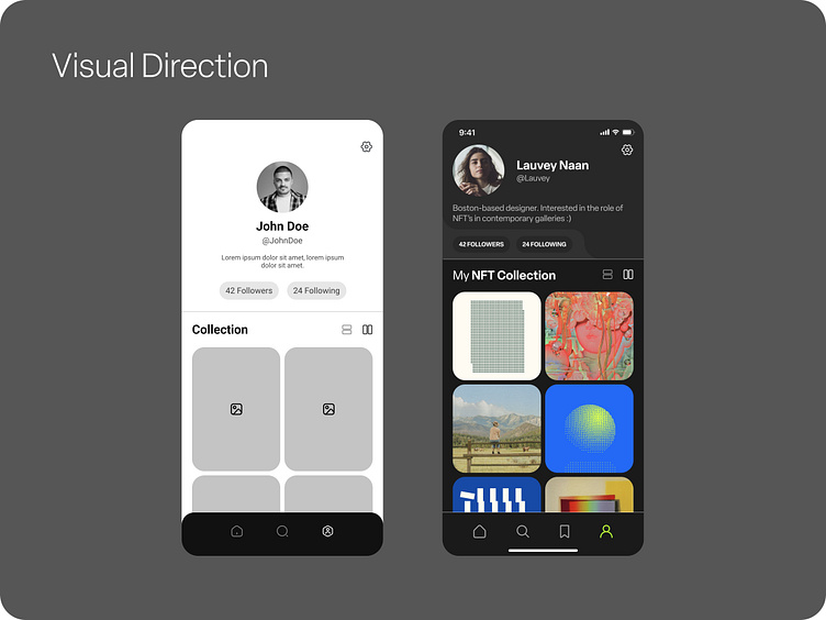
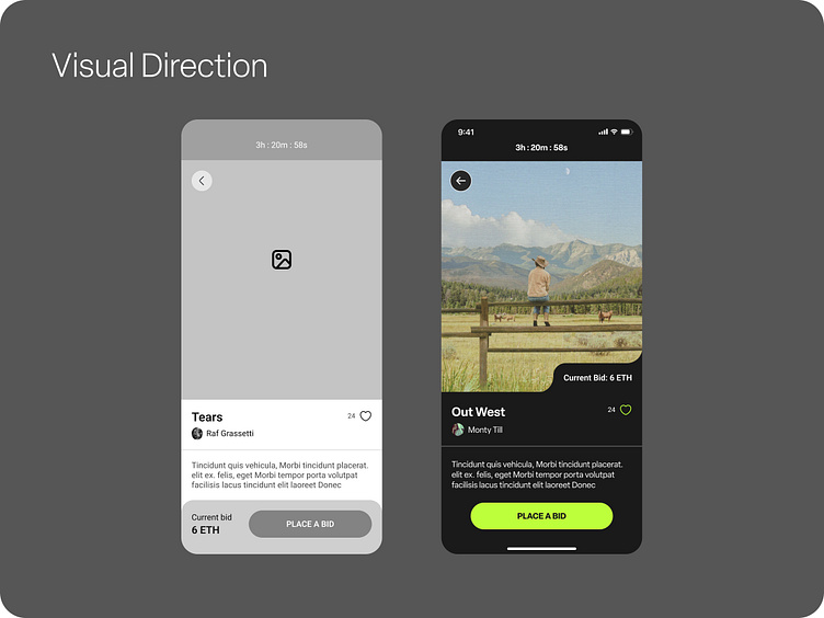
Exploration A uses a bright UI with a serif typeface. The primary color palette is cream and brown with secondary colors of golden yellow, persimmon, and tints of brown. Strokes are implemented to create distinction between visual elements within NFT and profile cards — as well as CTA buttons. The splash screen takes creative liberties to abstractly pixelate in-app NFT images to animate across the screen. This macro introduction to the artwork within MOON helps to ease the user into the experience without overwhelming onboarding with the full NFT marketplace.
Exploration B is dark UI interface using white sans serif type in a variety of weight and case iterations. This typeface provides clarity to the UI by becoming nearly unperceivable — blending into the background to provide supporting information to the NFT listings. The primary color palette is black and white with secondary colors including bright green (CTA's and icon highlights) and shades of gray. Other in-app spot colors include purple, blue, and orange. The splash screen provides a level of animation to the onboarding experience. Rounded and rectangular shapes house different NFT images as they flex and flow across the screen. New NFT's are introduced through overlays of the brand color palette. This image editing process establishes a brand color palette and visual language in combination
Priorities include:
Clean content that elevates NFT artwork and art + artist names
Simple and legible typefaces that do not overwhelm the user — must have a variety of weights to encourage type hierarchy
Icon language that collaborates with type and image
Minimal in-app colors to avoid hierarchy combat between UI and NFT's
Content spacing
___________________________________________________________________________________________________________
Final Design + Prototype
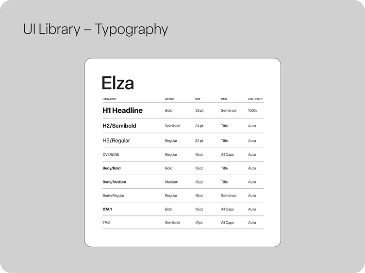
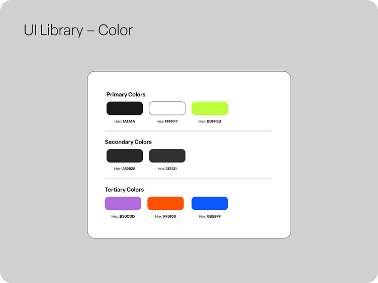
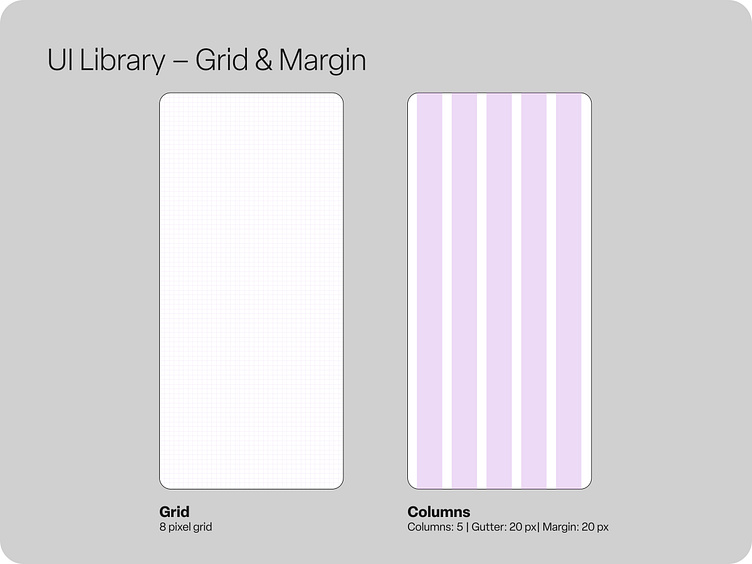
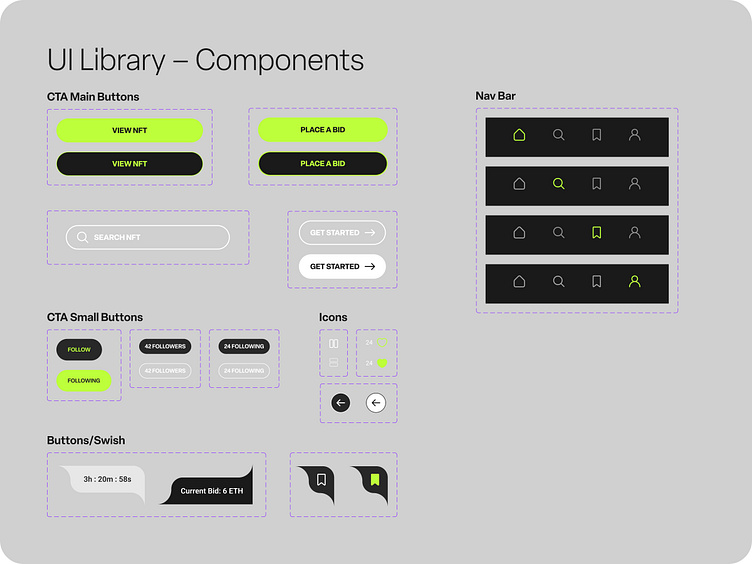
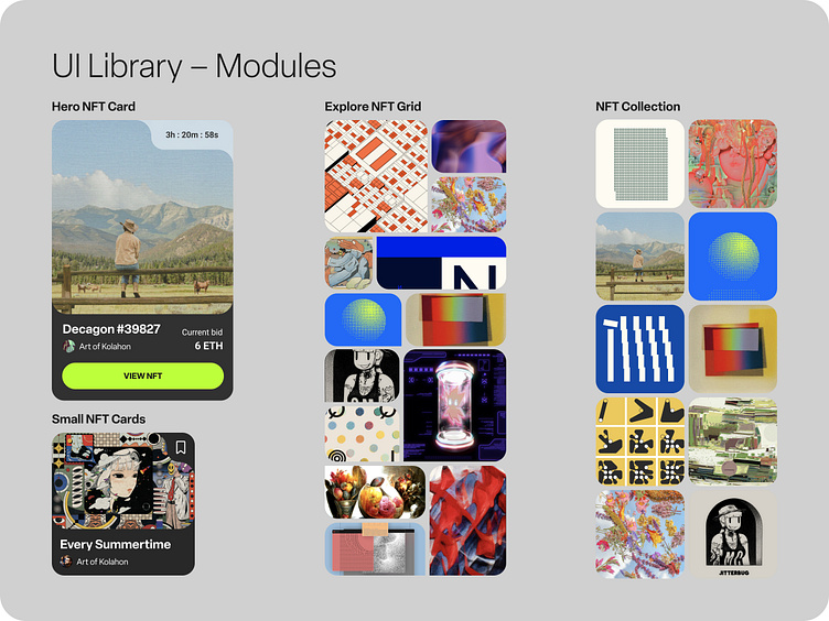
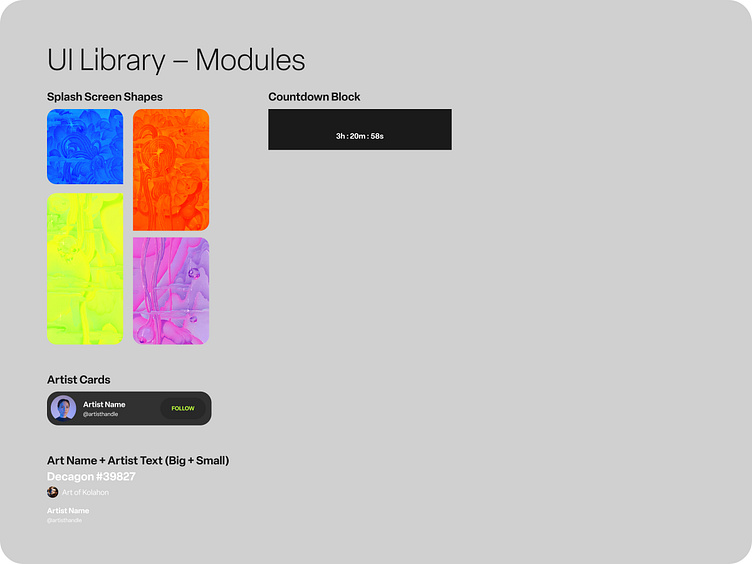
UI Library
Typography styles, color palettes (primary, secondary, tertiary), grid and margin guidelines, and master components and modules for use within the MOON NFT marketplace.
Takeaways and next steps
Exercise Reflection
As my first foray into building out a functioning mobile prototype within Figma, I am proud of these five screens and the preceding case study! I am excited to say I can now add the skills of building out UI libraries and their accompanying components into scalable screens through an iterative process exploring visual variations.
Next Steps
However, I know I have so much more to learn and want to acknowledge the above project as an exercise. As my next steps, I would like to build out my own app — to find a need and create an application solution through the combination of both UI and UX learnings. This process will include intensive research (ethnography, case studies/app critiques of other apps, moodboarding, etc.) and the creation of wireframes for a fully functioning application.
Audience Impact
While previously not familiar with NFT's, cryptocurrency, and blockchains, this UI introduction experience allowed me to better understand the space and it's potential demographic of users. Targeted at Gen Z users, MOON's dark UI and ease of use experience allows for immediate focus on NFT marketplace offerings. Icons and CTA's use interactive buttons during their clicked states to show their embedded secondary states and recognize when an action is taken. By taking visual and interactive cues from other successful apps and media for similar audiences, MOON can establish a usable NFT marketplace presence for a new generation of collectors.
Let's Connect!
A selection of my graphic design and brand work + my resumé can be found on www.darbishaw.com. I can also be reached via email for freelance or job opportunities at darbi.shaw14@gmail.com