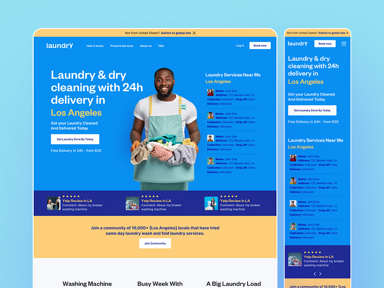
Online Laundry Pickup Service Website UI/UX Design & Case Study!
Pain Points.
Washing Machine Out of Service!
Busy Week With (too) many Chores!
A Big Laundry Load You Need Help With!
User Research:
Conducted user interviews and surveys to understand pain points:
Users expressed frustration with unclear navigation and complex scheduling processes.
Concerns were raised regarding the security of their items during pickup and delivery.
Design Goals:
Improve website navigation for intuitive user interaction.
Enhance transparency and build trust regarding the security of items.
Simplify the scheduling process for a seamless user journey.
Design Solutions:
Clear Navigation:
Reorganized the website structure with intuitive labels and a simplified menu for easy navigation.
Trust-Building Measures:
Implemented a dedicated "Security Center" section detailing robust security measures in place, alongside customer testimonials.
Service Information Overhaul:
Introduced a comprehensive "Services" page with clear details on offerings, pricing, and turnaround times.
Real-Time Communication:
Integrated a notification system to keep users informed about the status of their laundry, providing updates on pickup, washing, and delivery.
Streamlined Scheduling:
Redesigned the scheduling process, reducing steps and incorporating a user-friendly calendar interface.
Results:
Enhanced User Experience:
Users reported a more seamless and enjoyable experience navigating the website.
Improved Trust and Confidence:
Trust in the service increased as users gained insights into security measures.
Increased Engagement:
Users spent more time exploring services, resulting in increased service engagement.
Optimized Conversion Rates:
Streamlined scheduling led to a decrease in drop-off rates, optimizing the conversion funnel.


