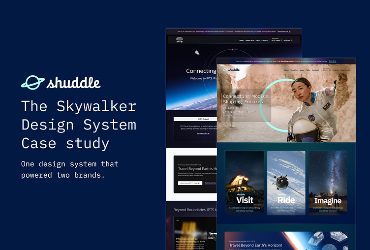
The Skywalker Design System | Scaling Design Systems Case study
Role: UX/UI designer, UX Research Lead, Art direction
Duration: 2 Weeks
Deliverables: 1 Design system, 3 product homepages powered by the design system, 1 reference/documentation site for the design system and brand.
The journey begins
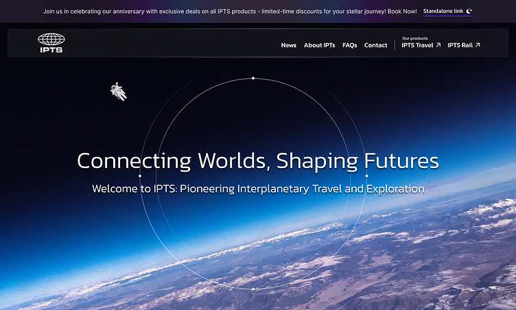
The launch of IPTS, an interplanetary travel network, presented us with a unique challenge as we simultaneously introduce three distinct digital product homepages: IPTS.org, IPTS Travel, and IPTS Rail, in the time span of two weeks.
The products included:
IPTS.org, an informational website where you can find the latest news and happenings with the IPTS.
IPTS Travel, a website where you can browse and book travel to and from multiple destinations within our galaxy. Like Expedia for space.
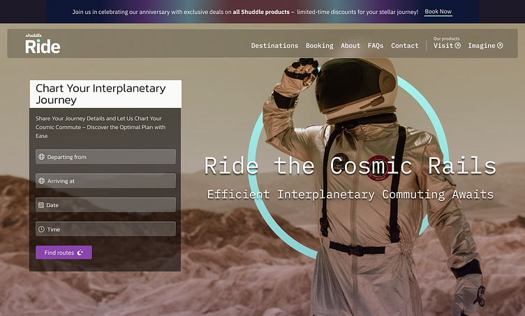
IPTS Rail, a real-time updated web app where you can view lines, routes, and times for all the different commuter lines. Think NYC Subway or the London Underground, but for interplanetary travel.
A way forward
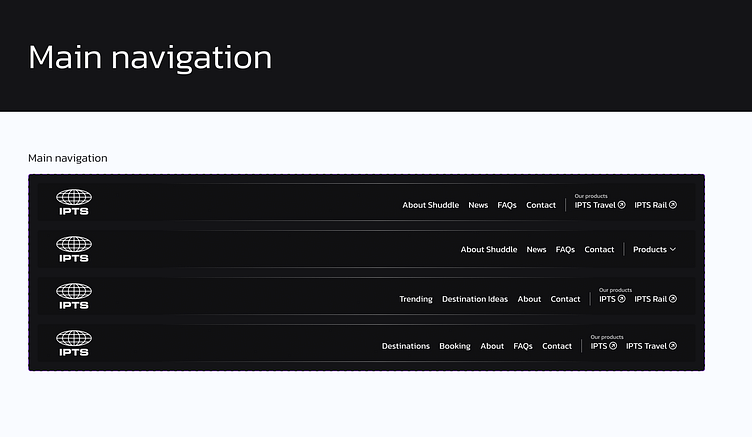
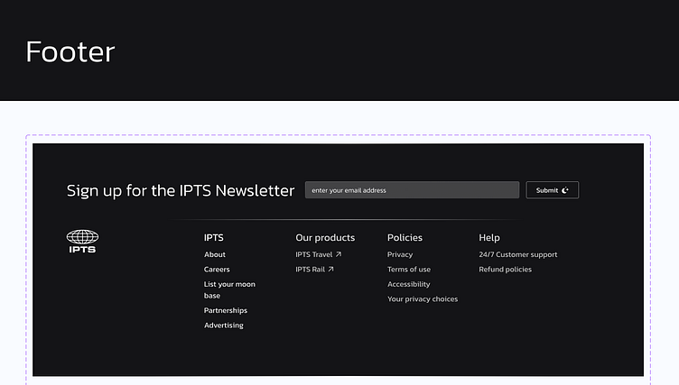
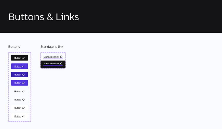
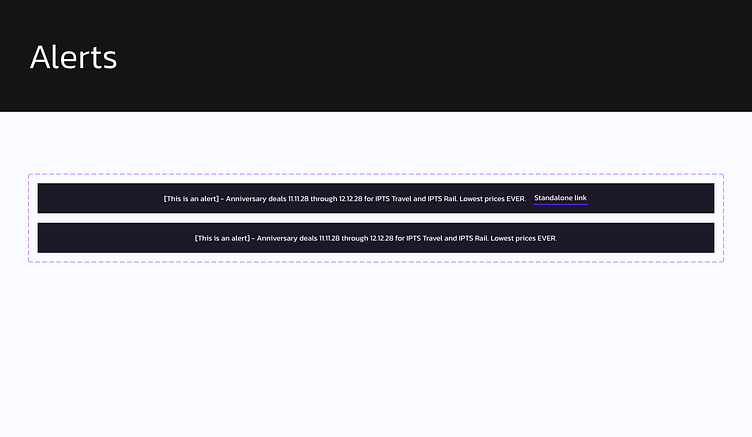
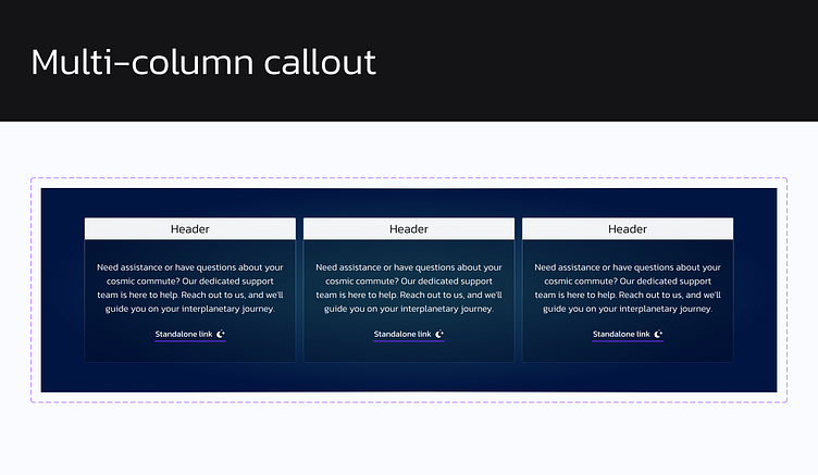
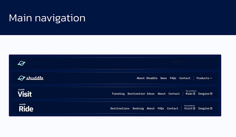
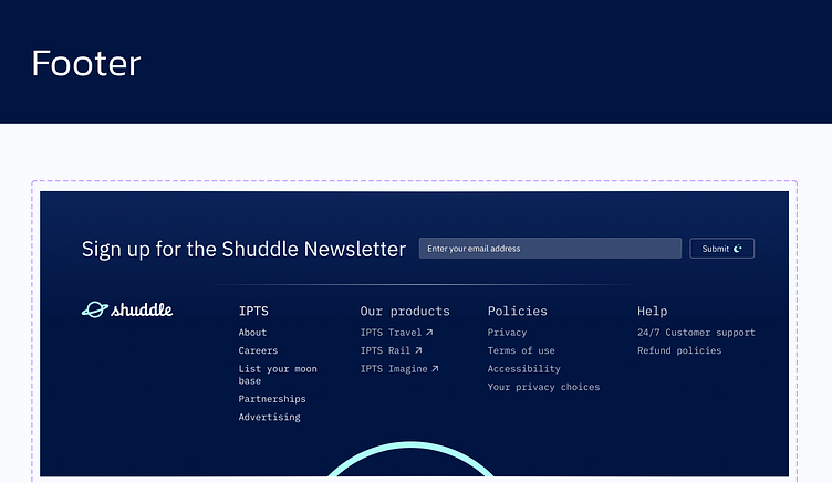
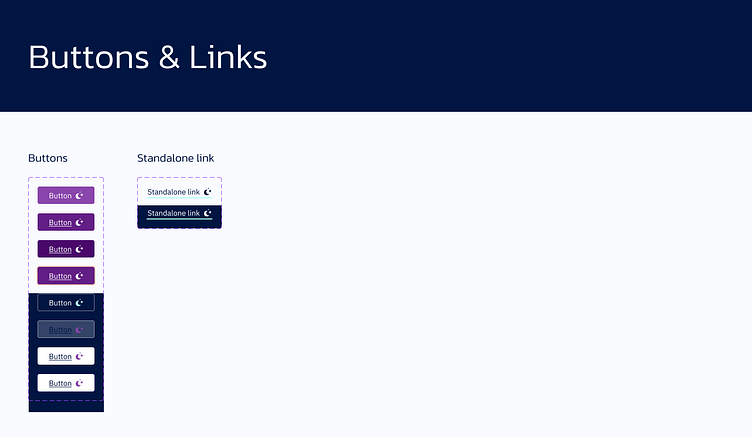
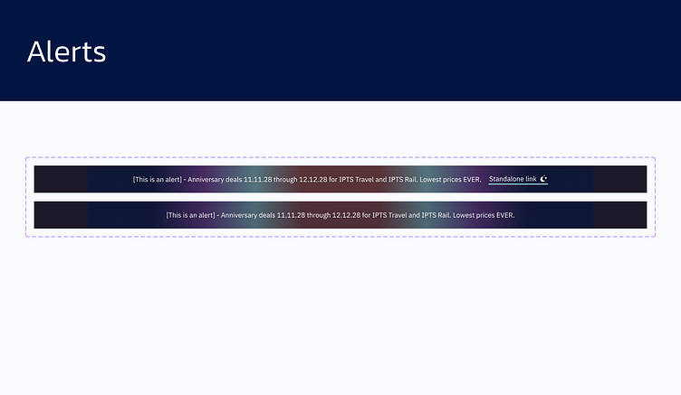
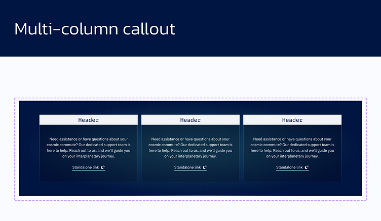
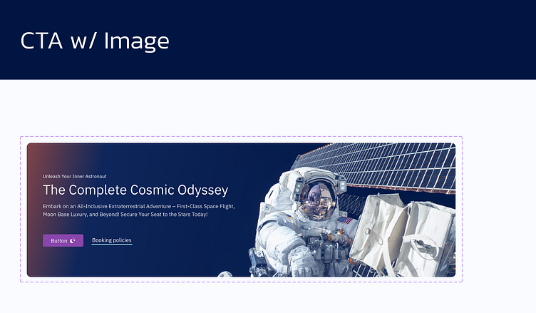
To speed up the process and create a clear and consistent visual language across all three products, I started by building a design system to help lay the foundation. This was the beginning of the Skywalker Design System.
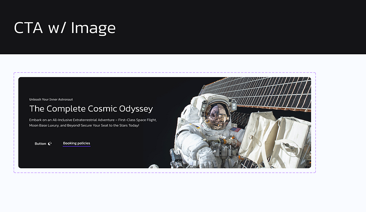
With these building blocks I was able to quickly layout the three product homepages and then build off of those components to finalize three unique, but consistent homepages simultaneously.
Starting with a few key components in the design system helped me start setting the visual language clickly and let me adapt them over time as the rest of the products took shape.
A disturbance in the force...
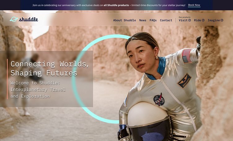
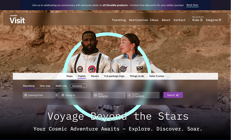
One week into the project, the IPTS Leadership pivoted the company philosophy and wanted to reach a younger audience as well, they introduced a completely new brand developed by a well known branding agency MegaBrand. IPTS has now evolved into Shuddle, and it’s products were now Shuddle Visit, Shuddle Ride. The new brand came with new logos, typography, colors, photography rules and more, which meant our previous visual language was to be erased.
A new hope: The power of design systems
While a complete rebrand is a daunting task in most cases, implementing one with such a tight turnaround is even worse. Luckily, the design system framework we started with was able to bear the burden of this challenge, and help us overcome this challenge.
The design system, while still a work in progress, was far enough along where we were able to implement the rebrand seamlessly, and make the appropriate updates in a timely manner. Because we had those building blocks in the design, we could easily update the color palettes, typography styles, and visual language to match the new branding quickly, and we could make any necessary additions or subtractions without feeling the heat of the time crunch too much.
The design system allowed us to spend the rest of what little time we had, enhancing some of the non design system components such as the hero’s or the product experiences and we were able to make those better.
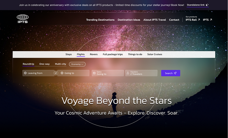
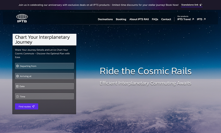
Before and after snapshots
To view the full homepage of the Shuddle products, view the Figma prototype link.
Looking to the future
In addition to the design system and product homepages, we utilized Zeroheight to create a home for Shuddle’s storytelling and documentation. Here we were able to document the components that make up the design system as well as guidance on how to structure/approach future product’s using the Skywalker Design System, read the documentation here.