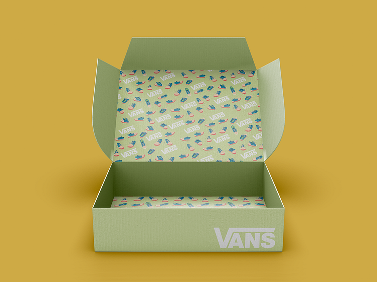
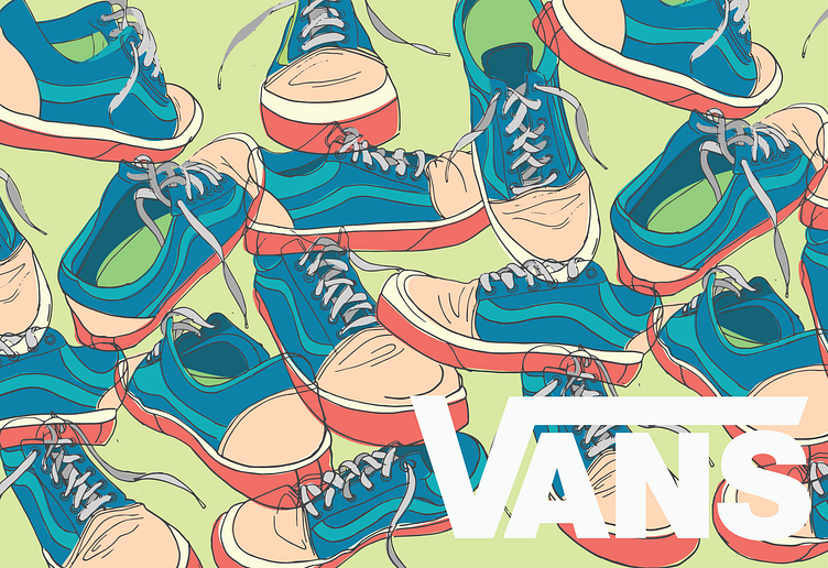
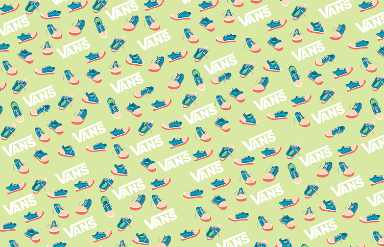
Vans Shoe Box
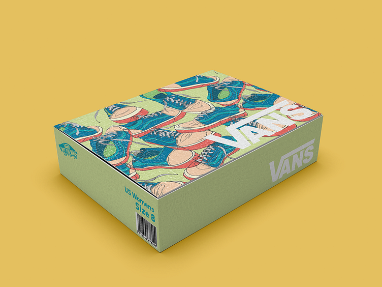
To incorporate the original sketches, I scanned them into illustrator and image traced them. I then added color to the sketch in a “color outside the lines” fashion because I still wanted it to look playful and edgy. I thought the drawing was a good fit for the box because it displays the product in multiple angles right on the outside. I then pulled apart the shoes without the sketch lines to create the patterns, where I arranged the shoes in a fun composition with the Vans logo sprinkled in. For the color pallet, I went with super bright and saturated colors that are a contrast to the brown cardboard and deep red typically seen on Van's shoeboxes.