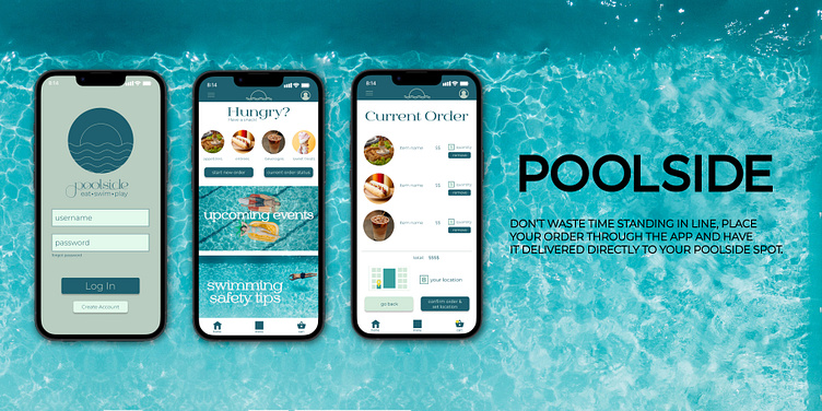
POOLSIDE: a UX design course project
Problem:
Standing in long lines takes away from a fun experience...
1. Users want a convenient way to order food and beverages without losing their poolside location.
2. Users don't want to have to read lots of text in order to understand what they are ordering.
3. Not all users read or understand English.
Solution:
User Research:
I conducted interviews and created empathy maps to understand the pain points of the users I’m designing for.
The primary user group I discovered was working adults who were looking to relax at the pool and not worry about interrupting their fun time to go wait in a line to order food.
Having to wait in a line and lose out on fun or relaxation time was not the only concern when developing this app.
The users also have children who are not able to read or the user themselves may not be proficient in English, this lead me to ensure that we were including other ways of ordering besides just reading text.
Beginning Designs:
When designing the initial wireframes on paper, I really wanted to make the ordering and location setting simple and strait forward.
Usability Testing:
Round 1:
1. Users want a way to add an item to cart without being sent directly to the cart page
2. Users want a separate space to set the delivery location
3. Users like the flow of the app overall and think it is easy to use
Round 2:
1. Users want a way to monitor the delivery time and check on their current order
2. Users wanted high contrast on the create account/account pages
3. Users think the app is easy to follow and use
Visual Elements:
When creating the branding for this project, I was inspired by water. The app is called "Poolside" so I wanted to include colors you would find in pools.
I wanted the typography to feel fun, summery, and whimsical - much like a day at the pool with your family and friends.
The design needed to feel cohesive and inviting, drawing the user in to not only complete the tasks, but to also learn more about the pool they are at.
What would I do differently next time?
This was my very first UX design project and it taught me an incredible amount! I have a background in graphic design and traditional art, but I had a lot to learn when it came to Figma and prototyping. I was excited to jump right in, but I knew that it would be a large learning curve.
1. Research is really important. When you are designing projects, the user needs to be front and center, so utilizing the research and data is going to help you make the most informed decisions and create designs that work best for the users.
2. Accessibility needs to heavily considered. I definitely wanted to keep accessibility at the forefront of my design, and I had to learn how to incorporate into my designs. This project is not perfect, but I'm working towards utilizing more WCAG concepts as I grow.
3. Mistakes are going to happen. Failure is something we're all going to experience, but it's how you respond to the failure and mistakes that matter. Being open to feedback and critiques is important to becoming a better designer. I was glad to have received advice on mistakes in my UX choices and people who push me to be a better designer.


