Pecan Squares desserts
Pecan Squares
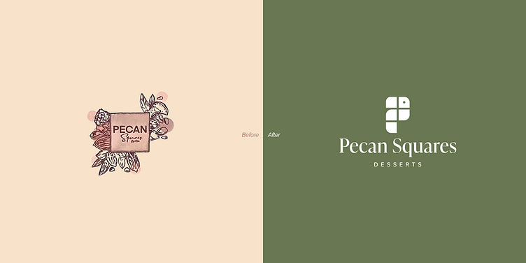
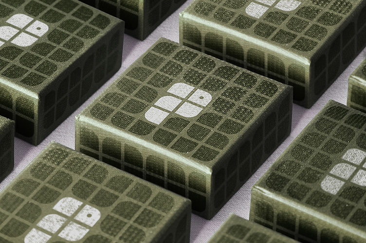
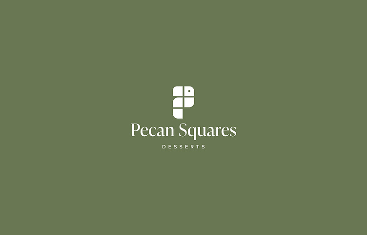
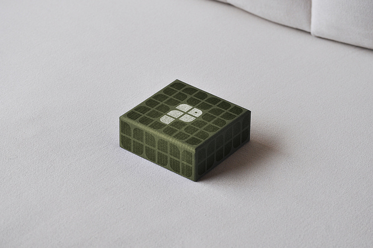
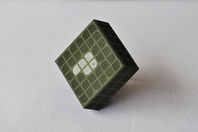
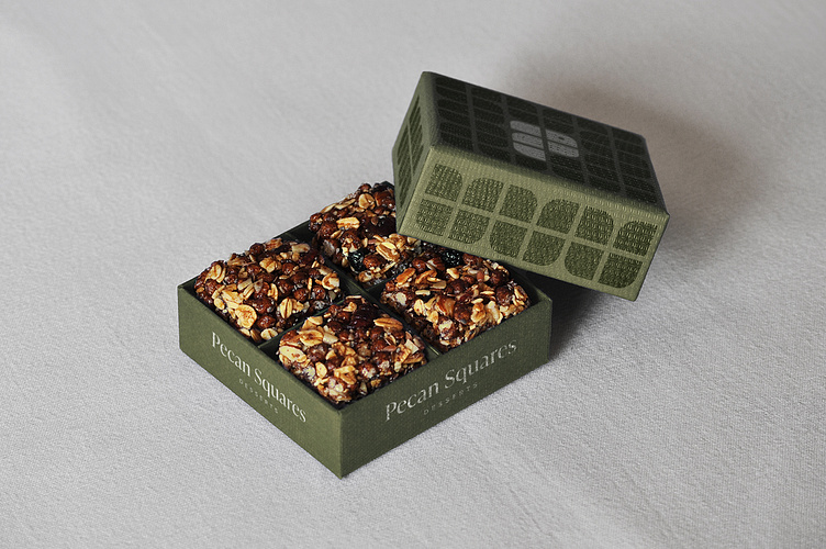
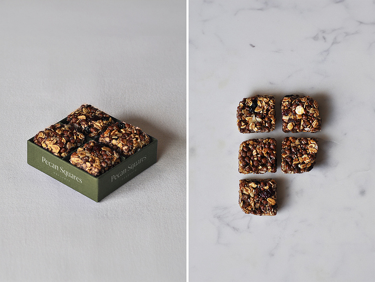
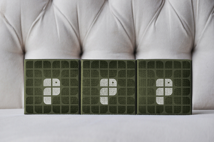
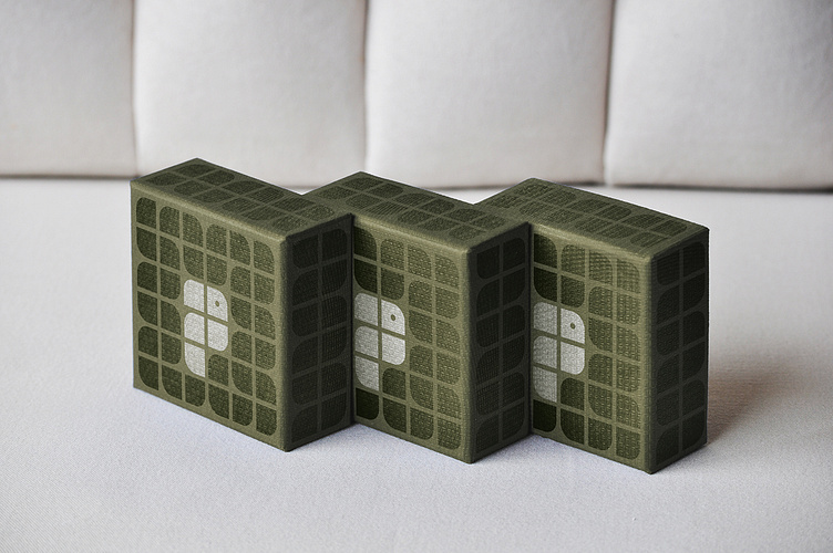
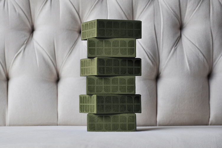
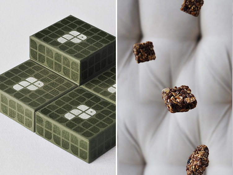
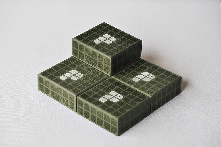
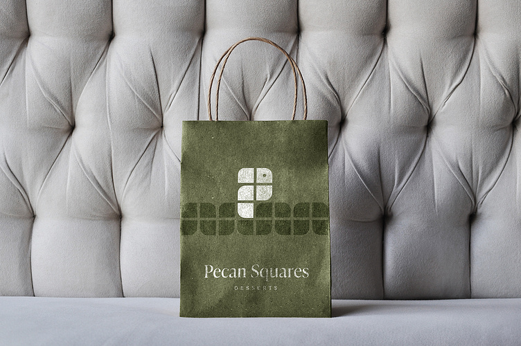
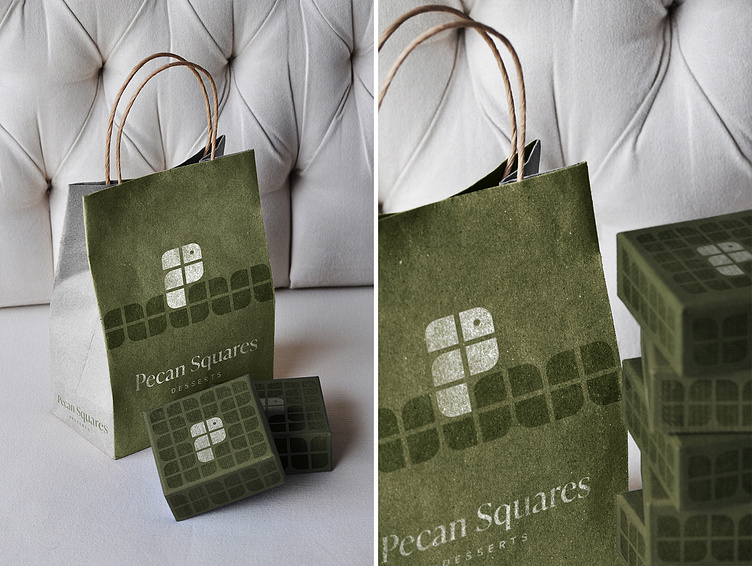
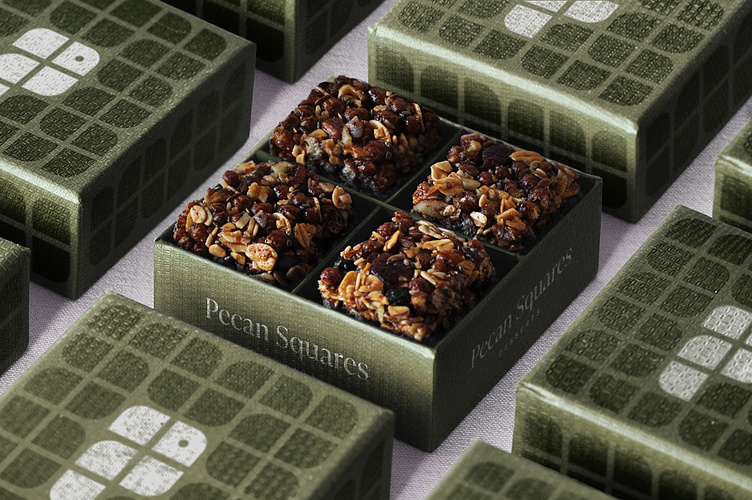
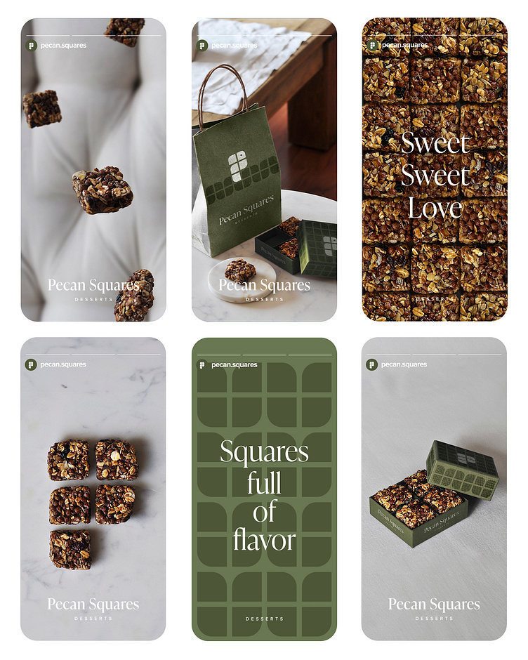
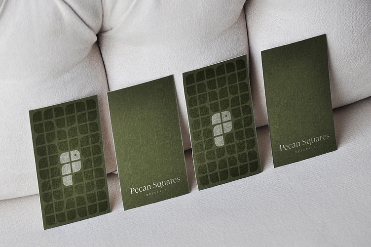
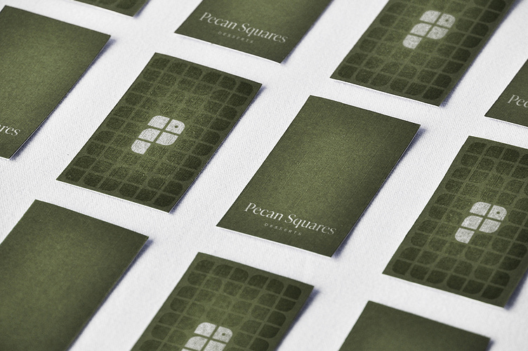
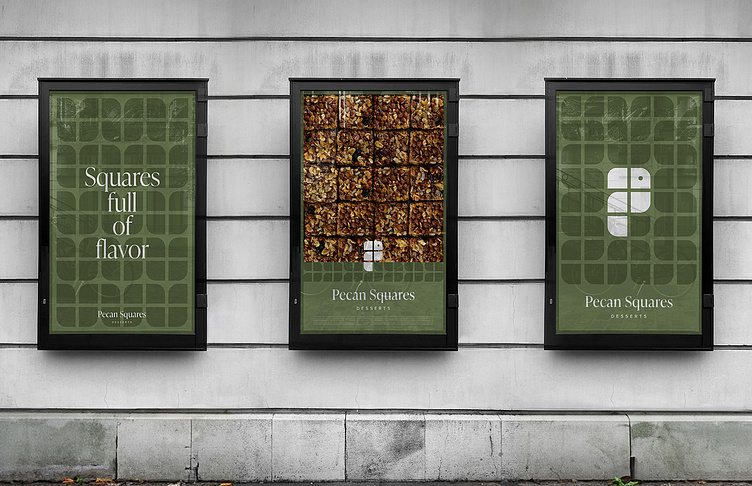
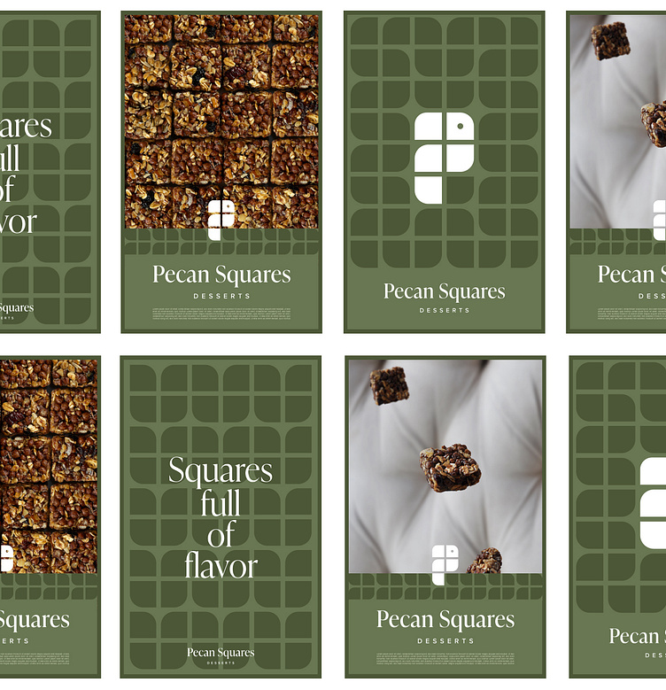
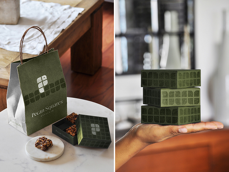
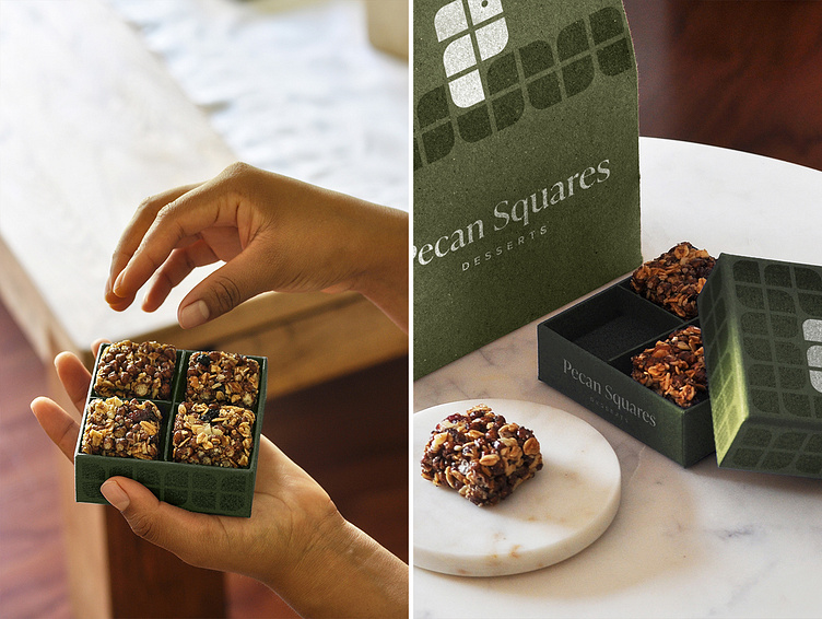
In the process of updating the "Pecan Squares" brand, I obtained a warm and expansive proposal, because in addition to having the letter “P” of “Pecan” implicit in its shape, it presents versatility when it comes to being used in various supports, without mention that its entire construction grid is based on the grid obtained from the "Pecan Squares" of the packaging. In addition to the interesting meaning of the logo, a concept is added that gives dynamism and creativity to the design, this concept is a bird. Through research it was found that there are birds that love the “Pecan”, for this reason I included the shape of a Bird. By using an animal we are giving the brand personality and identity. The live presence of an animal is a good resource to generate warmth and, as an effect, trust. In the materials used for the construction of the branding, the texture stands out. The goal is simple: to add to the visual and gustatory experience of "Pecan Squares" the sense of touch. The color used (customer's choice) is sage green.
Indentity - Branding - Packaging - Photography - Photo editing - Art Direction
En el proceso de actulización de la marca "Pecan Squares" obtuve una propuesta calida y expansiva, pues además de tener implícita en su forma la letra “P” de “Pecan”, presenta versatilidad a la hora de ser utilizada en diversos soportes, sin mencionar que toda su retícula constructiva se basa en la cuadrícula obtenida de los "Pecan Squares" del empaque. Además del interesante significado del logo, se agrega un concepto que le da dinamismo y creatividad al diseño, este concepto es un pájaro. A través de una investigación se obtuvo como resultado que existen aves que aman la “Pecana”, por esta razón incluí la forma de un Ave. Al utilizar un animal le estamos dando a la marca personalidad e identidad. La presencia viva de un animal es un buen recurso para generar calidez y, como efecto, confianza. Los materiales utilizados para la construcción del branding son texturizados. El objetivo es simple: agregar a la experiencia visual y gustativa de "Pecan Squares" el sentido del tacto. El color utilizado (a elección del cliente) es verde salvia.
Identidad - Branding - Empaque - Fotografía - Edición fotográfica - Dirección de arte


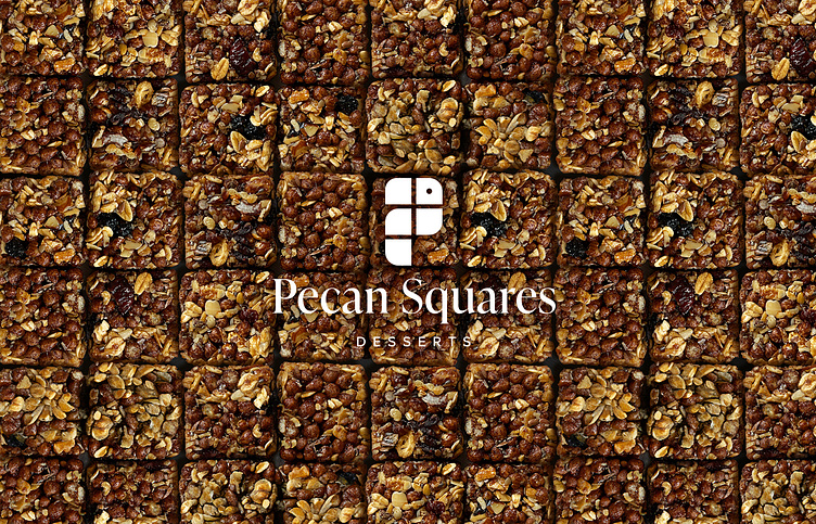
In this simple comparison you can see the update of the logo, obtaining as a result an element with greater simplicity, modern but warm and versatile when it comes to being applied on various supports.