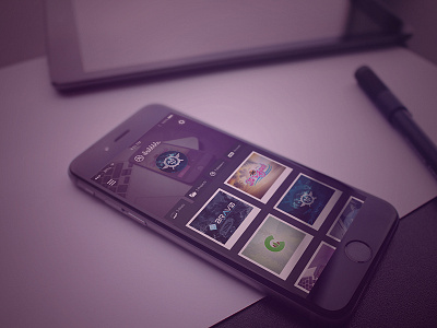
Dribbble App Home Page
Here is the mock-up for the user screen, The player profile would be in the center and the player card would become the background in the top section. I'm also trying to bring back tabs! Check the attachment for a closer shot.
I went a darker route for now, even though the Dribbble site runs on a light theme. Might try mocking it up with the inverse to see how that looks too.
Once again this is just a mockup, and a quick design to help generate ideas for future UIs down the road. Comments / critiques / criticism is always appreciated.
More by Matthew Timmons View profile
Like

