Job Management Product UI (B2B)

Improved UI for a managing your jobs operational data.
Helping users to move through their operational tasks easier and at speed. Iteration #01.
This was part of a larger product transformation initiative. Where we re-architected the whole product to simplify usage, rearranged existing features based on tasks to create the foundations for standardised workflows and built new features to support those operational tasks and increase effciency so as to ultimately help minimise revenue leakage. See ux case study here
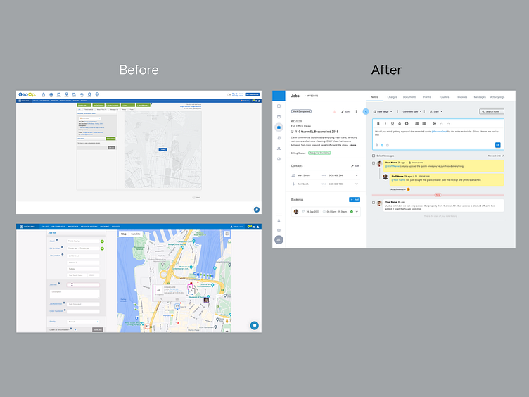
Problems, problems - problems!
The main problems was that the legacy product had been built at a time with;
🚩No thought to the overall experience to the customer and different user roles.
🚩Inconsistent UI.
🚩Job data was hard to find.
🚩Usability was clunky.
🚩The interface was unresponsive.
🚩Customer complaints were mounting up.
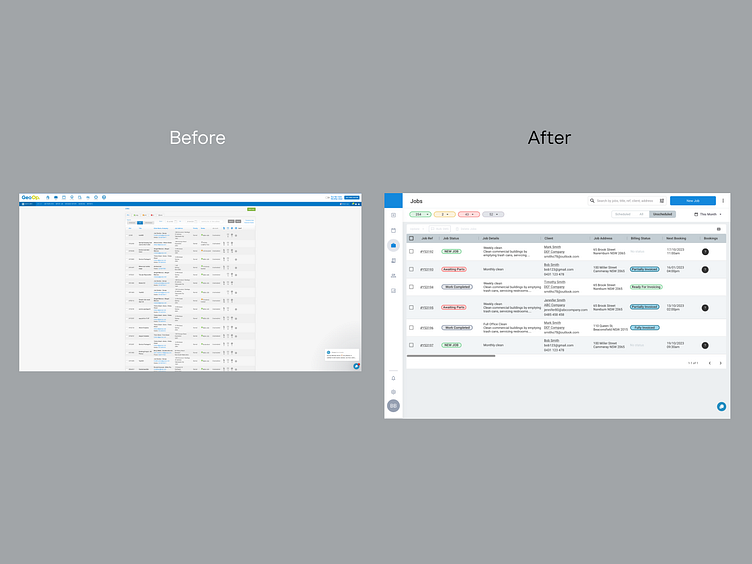
Featuritis & Cognitive Overload
The product was mostly unorganised. A previous attempt by the business had massaged some information to be loosely structured (but not enough). Symptomatic of feature creep; the navigation was complicated with many levels to it. Users had to tunnel down into different pages to do simple tasks which fractured their focus and added stress to their workload.
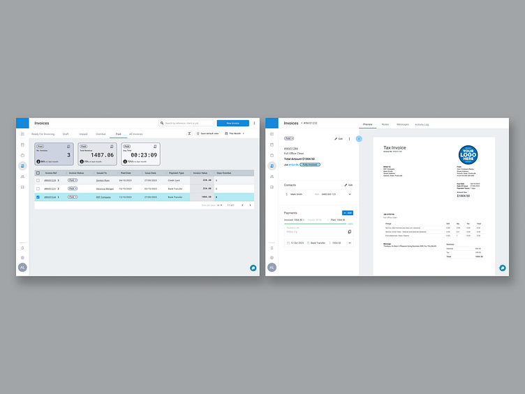
✅ New UI
An evolved UI was developed and structured into a new design system. The changes were derived from the long standing use of the legacy system > to transition users into similar but new and consistent views based on core tasks > that brought accessibility, scannability of data, and standardised workflows to the forefront.
Wholesale changes were developed and delivered in a step change plan so as not to change too quickly for the users. Utilising a new design system, we rebuilt the main workspace first so as to improve where users spent most of their time.
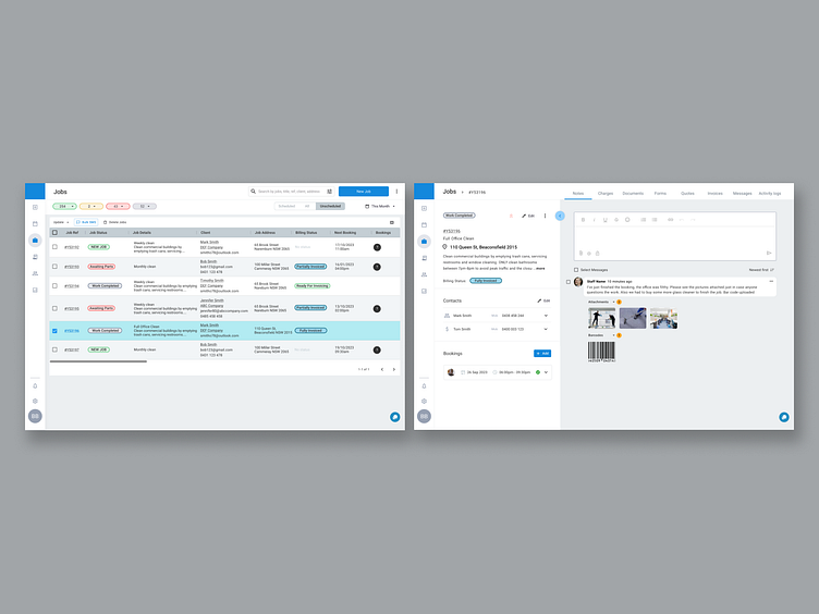
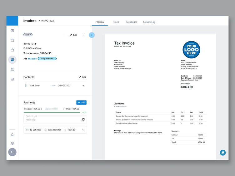
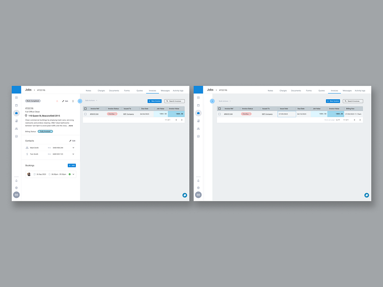
✅ Consistent Interface Views
Changing from 'list views' to now a 'data grid view' (Macro view) and then with one click tunnel into a more 'detailed view' where all job details could be found without having to dig deeper. User could now hide/ expand core job details from a drawer (micro view) that remained accessible as they tabbed through other job details - all to drive consistency and learnability - so allow users to get familiar and comfortable with the product.
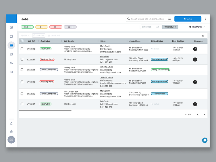
✅ Making the Flat Data
Here we re-organised data that was previously buried or hard to find and bought it to the forefront. Thanks to the new interface, navigational structure that included tabbed screens and leveraging data grid behaviours - everything was at a similar level of hierarchy.
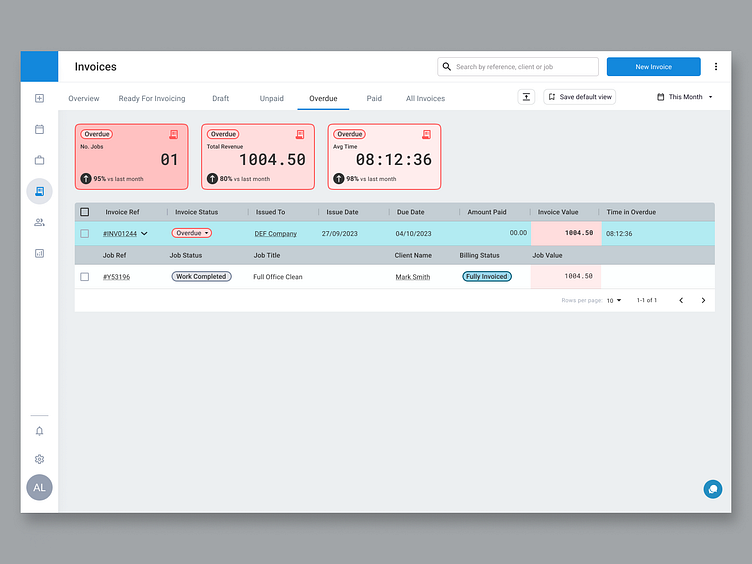
✅ Data Grid behaviours
Here we utilised behaviours and interactions you would typically find in a proper data grid; cells and columns - to drive scannability and usability - to speed up the users ability to quickly keep up-to-date with where their jobs were at and move their their tasks.
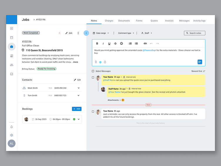
✅ New Features. More Granularity.
Here we developed new objects and new features to fill in the gaps to help users achieve the outcomes they were looking for - to drive the point of standardised workflows - so they had a quicker and more efficient path to the outcome they needed.