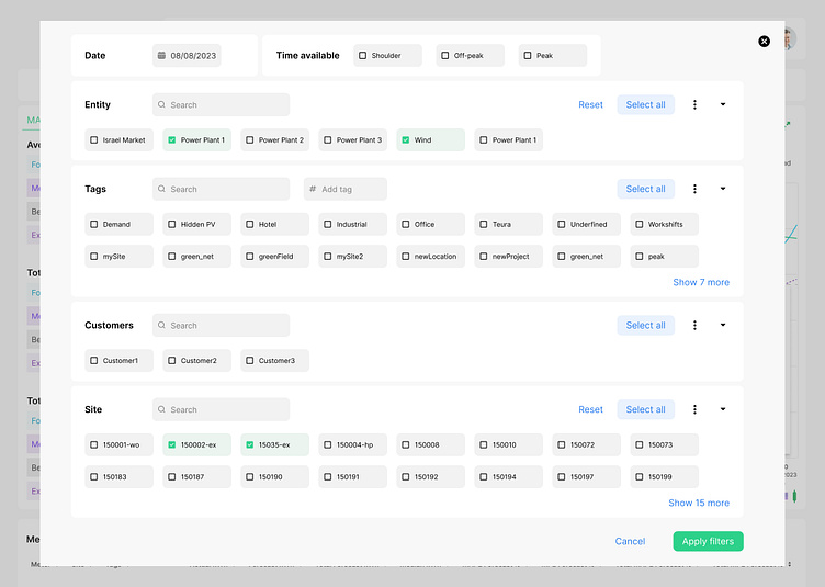
Filter UI Component for Module Level Power Electronics platform
Hello, everyone! Some ideas about filter design.
As we know, filtering helps to narrow down a large amount of information based on specific criteria.
In a large-scale and high-end application, filtering plays an important role in displaying specific results according to the user's request.
When designing a new filter for the dashboard, I decided to use a batch filtering method when a user needs to select multiple filters and then click the "Apply Filter" or "Show Result" button.
The modal window provides more space for multiple filters, but also allows the user to focus on specific criteria in large amounts of data provided by the application.
Highly recommend these articles about filters: https://uxmovement.medium.com/the-best-filter-ui-design-for-large-scale-apps-45921e823f38
https://vosidiy.medium.com/designing-filter-sort-for-better-ux-9b88f40081db
