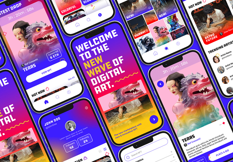
Moon - An NFT App Case Study
Introduction
Hello! My name is Kristin, and I recently completed UI Design 101 class here on Dribbble. As a student, we were tasked with not only designing an app, but also creating libraries and style guides within Figma. The primary goal of this project was to learn the extensive design process that is UI, and more importantly (for me at least!) to understand how to actually use Figma. Although this app is not real, I do hope it shows what I’ve learned in these six weeks of class!
The Brief
Establish visual language of this new NFT marketplace app (Moon) that is ready to revolutionize the digital art scene. Lock a visual aesthetic and then scale the design on multiple (5) screens, based on the wireframes and the flow that is provided from the client. Build a UI Library of the final UI and create a functional prototype.
Design Process
• Moodboard
• Wireframes
• Visual exploration
• Why this direction & Scaling
• Design System
• Prototyping
• Results & Takeaway
Moodboards
As exploration began, I narrowed a lot of my designs towards two types concepts: One that is techy, modern, dark, while the other is lighter, fun, and bold. These boards are a good concept of what I wanted, and it took me a while to decide between the two. After a discussion with my Mentor, we settled on the second version.
Wireframes
After the main moodboard was chosen, it was off to the races—but not so fast. Before I can get too far in development and exploration, I had to build a wireframe for which these designs will be contained. Luckily we were provided with the wireframes below, so I could focus strictly on the design process and concepting of this design.
Visual Exploration
With the wires established, now I had creative freedom to do as I pleased. Again, I wanted to focus on the fun, bright colors of the second concept, so I tried to focus on balancing this bright, loud design with things like white space, an effective typeface, and some fun little "surprise and delight" moments along the way. Obviously this is just a snippit of my exploration, but I want to acknowledge there was a lot of trial and error with this concept, as this palette is deceptive in how to play with it.
In the end, I think I chose the right version to move forward with.
Direction and Scaling
Although there are some similarities between some of these screens, in the end I think the splash screen being so bold, and then the other screens letting the white space talk, really helped balance the fun with, well, legibility. I also wanted to continue with the white background as opposed to a dark one, mostly because I wanted this app to feel light and cheery. The colors are already so pronounced and bold, I think letting the white takeover in these other screens helped to let the unique colors pop out more. Using colors is about being effective.
Design System
With these designs created above, it was now time to create a system for consistency between all the screens. Not only was this part of the project great for my organization, but it also helped me learn Figma better. There were even some tricks I never knew about until trying to define and create a design system for this class! We mostly focused on building things up: Typography, Colors, and Guides were defined, and then create an "atom > molecule > compound" system for the modules. Doing something like this now definitely helps down the line if I ever consider creating other screens in the future.
Prototyping
The last (and the most exciting!) thing we were tasked with was connecting and prototyping the app to really make it feel real. Static images are well and good, but as a UI designer, there is an importance in understanding flow and screen considerations as well. Although there were only 5 screens, there were a lot of overlapping connections and small interactions! But doing all these flows really breaths life into the design of the app. This part of the project was both very fun and extremely fulfilling with the final results.
(Sadly my prototype example video is too big for Dribbble right now, so here you can see all the connections I made just between these 5 screens. Crazy!!)
Results
After the entire process, and learning Figma tips and tricks along the way, here are a few screens to show off the designs I created :)
Takeaway
This project was a great exploration in understanding UI, the design process, and honestly learning about Figma! Thanks to my lovely mentor (Shoutout to Kristina!), I learned the importance of scaling content, created flows within design, and refined my skills within the world of UI design. This class definitely helped me improve as a designer, and I hope these designs speak to the right audience. Even though this app was for a project and wasn't real, I think it is a great (at least starting) demonstration of what I can do in the UI world. Here's to many more UI projects!
Connect with me!
If you like what you see, why don't we connect? I am always available for freelance work and projects. Check out my portfolio here :)


