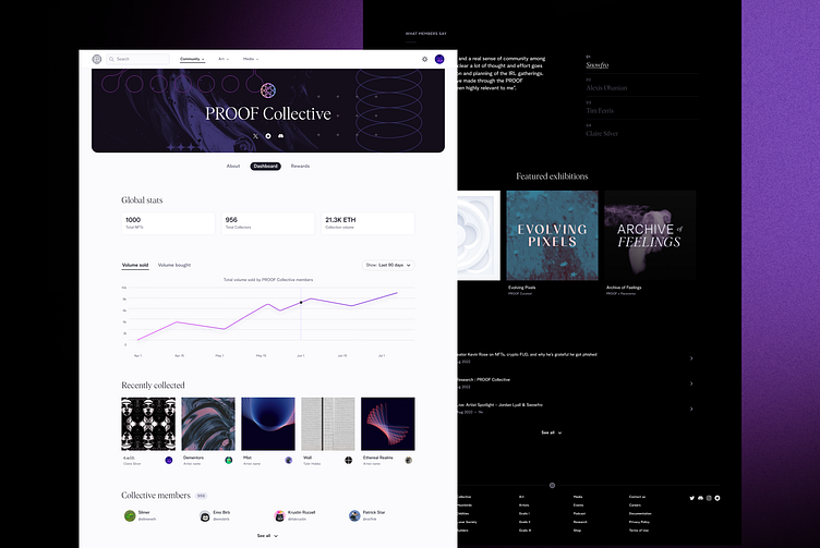
PROOF Collections Layout
When I dived into the project, it became clear that the lack of web information architecture was causing a bit of chaos. Each NFT collection had its own unique charm, but the website failed to provide a unified and seamless experience for users exploring these pages.
Objectives:
Simplify Navigation
Create specific user flow for Non Holders (Orientation) and Holders (Onboarding, Engagement & Retention)
Facilitate exploration by unifying all PFP collections in a browser page with a Lore-immersive experience
I started by conducting a thorough audit of the existing collections, understanding their individual stories, themes, and artistic nuances. This laid the foundation for creating a design that would not only showcase each collection's distinctiveness but also tie them together in a coherent manner.
Interactive elements were strategically implemented to enhance the user experience and make the collections exploration an engaging journey. Clear and concise labels, coupled with intuitive navigation menus, guided users seamlessly from one collection to another, fostering a sense of continuity and connection.
Feedback loops were crucial in this process. Iterative testing and user feedback allowed us to refine the design further, ensuring that the final product not only met the functional requirements but also resonated with the community.
By the end of the project, proox.xyz had undergone a transformation. The once-disjointed NFT collections now stood together in a virtual gallery, each telling its own story yet contributing to the overarching narrative.


