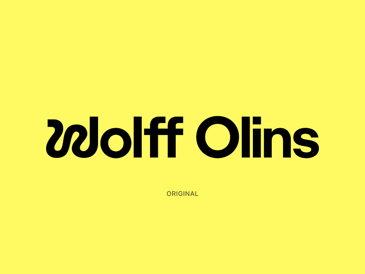
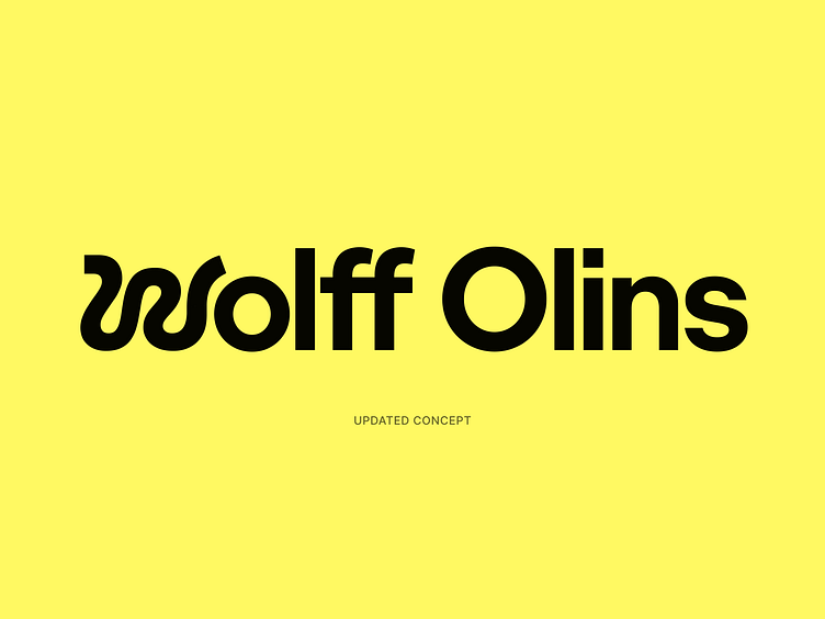
Wolff Olins — Updated Concept
Wolff Olins have recently rebranded and the new brand looks great overall however the wordmark could have been slightly improved.
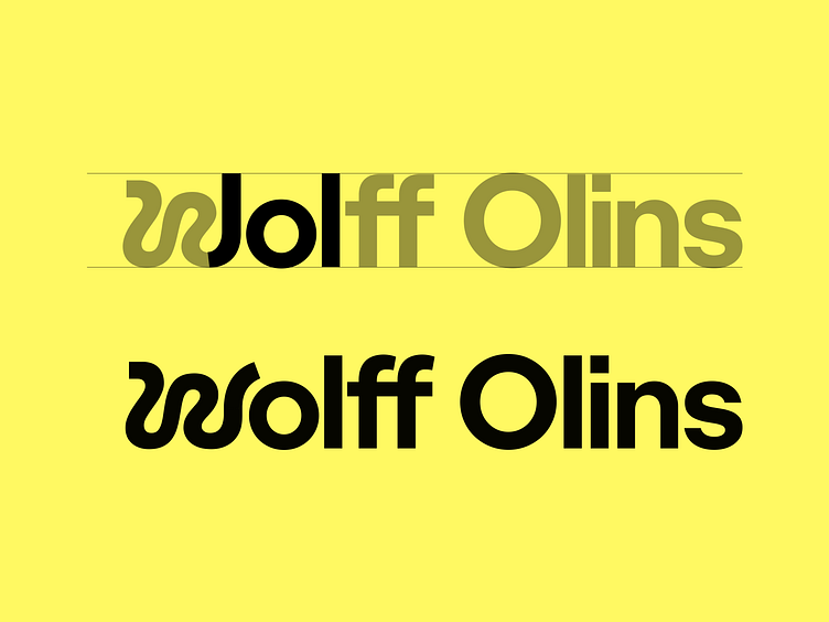
The 'W' could have been tweaked to look more like a 'W' + the sequence 'wol' reads like 'lol' / 'jol'
The distinction in height between the ascender and the cap height could have been slightly more pronounced to increase legibility.
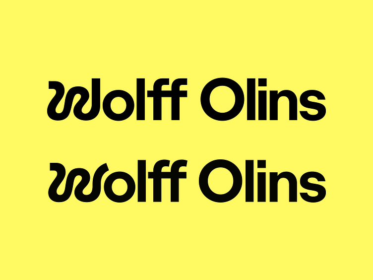
Another suggestion: Maybe the 'ff' could have used the same aesthetic of the 'W' to make the wordmark more consistent
Thoughts on this?