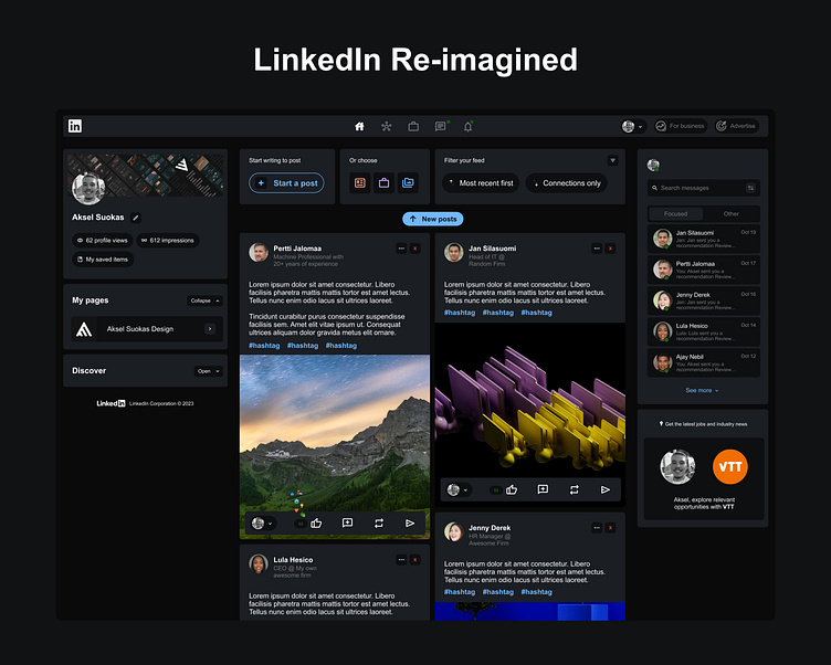
LinkedIn Redesigned & Reimagined
I've always thought of how LinkedIn would look if it weren't so cluttered.
Well yesterday evening I decided to play around for an hour and find out 😂
➡️Tried out 50/50 grid for the posts. What do you think about this?
➡️I made collapsable contents to focus the users attention to the main content
➡️Layered the UI more and also fixed some UX Flaws (Dont double check mine, there is probably many in this one too) 🤣
➡️Added more detailed filtering possibility to the feed
➡️Designed a generally more modern and sleek UI
Overall, I really think cutting down on some not used features and texts (for example on the profile section) makes the UI look much more simple and usable.
Would you use this version of LinkedIn?
More by Aksel Suokas View profile
Like
