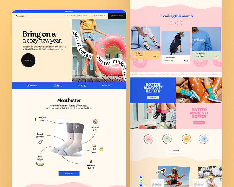
SockSplash E-commerce with Vibrancy, UX Case Study & UI Design.
Challenge:
The challenge was to design a user-centric e-commerce website, SockSplash, specializing in colorful and vibrant socks. The goal was to create a seamless user experience for purchasing, fabric comparison, exploring vibrant colors, and emphasizing the eco-friendly nature of the products. The unique aspect was the UI, designed with a vibrant color palette to resonate with the product theme.
Research:
In-depth market research and user interviews were conducted to understand the preferences of consumers looking for vibrant and eco-friendly socks. The study revealed a demand for a visually engaging platform that not only facilitates easy purchases but also emphasizes the uniqueness of fabrics and the eco-conscious nature of the products.
Design Solution:
Vibrant UI Design:
A bold and vibrant color palette was chosen to reflect the essence of the product – colorful and lively socks.
The design incorporated lively graphics and illustrations, creating an immersive and visually appealing environment.
Seamless Purchasing Experience:
An intuitive and user-friendly interface for easy navigation and a hassle-free shopping experience.
Quick-view options, wish lists, and one-click purchasing to streamline the buying process.
Fabrics Comparison:
A dedicated section allowing users to compare fabrics, highlighting the unique features and benefits of each material.
Interactive visuals and simple language to make the comparison process accessible to all users.
Vibrant Colors Showcase:
An interactive color palette tool enabling users to visualize how different vibrant colors look on the socks.
High-quality images showcasing the products from various angles and in different lighting conditions.
Eco-Friendly Emphasis:
Clear communication about the eco-friendly and sustainable aspects of the socks.
Integration of eco-friendly badges and certifications for transparency and trust-building.
Testing and Iteration:
User testing sessions were conducted to gather feedback on the overall user experience, color preferences, and the effectiveness of the fabric comparison tool. Iterative changes were made to enhance the UI, improve navigation, and address any usability concerns.
Outcome:
SockSplash was launched to positive feedback, with users appreciating the vibrant design and the emphasis on sustainability. The website's unique UI not only reflected the product theme but also contributed to a memorable and enjoyable shopping experience. SockSplash became a go-to destination for users seeking lively and eco-friendly socks.
Conclusion:
SockSplash's success highlights the impact of a unique and vibrant UI in enhancing the e-commerce experience. By focusing on user preferences, fabric comparison tools, and transparent communication about sustainability, the website stands as a testament to the importance of thoughtful design in capturing and retaining a niche market. This case study showcases the effectiveness of user research and iterative design in creating a visually appealing and user-friendly e-commerce platform.


