Finito. Logo Design
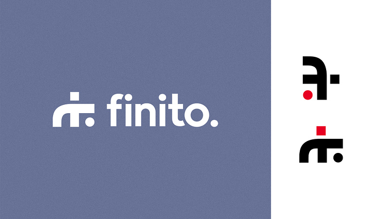
The logo features the mirrored letter "F" with a special feature: the right-hand side bar is square, while the dot below on the left is round.
The use of a square bar for the "F" gives the logo a robust, solid, and assertive appearance. This symbolic representation draws attention to the tough side of the work done by the graphic design studio. It suggests that we are able to meet challenges with precision, attention to detail and de- termination. This aspect represents our dedication to delivering quality results and a professional approach to graphic design.
On the other hand, the round point and sinuosity of the letter adds a note of softness and flexibility to the logo. This element suggests that we are able to adapt to the different styles, needs and desires of our clients. The roundness of the dot also symbolizes a welcoming and open approach, inviting collaboration and exploration of new ideas.
A unique element of our logo is the ability to interchange the two dots of different styles. This feature represents some of the company's core values, such as flexibility, creativity and adaptability. It also symbolizes the ability to adopt different perspectives, to explore in- novative solutions, and to customize our work according to clients' needs.
One of the fascinating aspects of our logo is its versatility and the ability to take on different perspectives. When the logo is inverted, it creates a creative and fun perspective reminiscent of a person playing basketball.
The mascot can become a recognizable element of our brand, used to communicate with the public in an appealing and engaging way, showing our passion for design and playful spirit. Its playful image can be applied to various promotional materials and animated .
The representation of the logo as a person playing basketball conveys a sense of joy, dina- mity and team spirit.
This playful representation fits our creative approach in design and allows us to make an emotional connection with the audience.


