Shuddle Design System

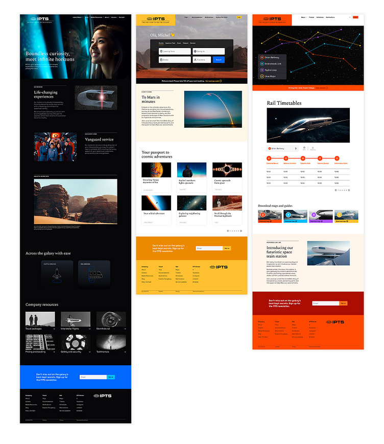
As a capstone exercise for Dan Mall's Scaling Design Systems course I was given a hypothetical space travel brand called IPTS (Inter Planetary Travel Syndicate) to create a design system for. We were also given 3 web properties to build our system for: the IPTS corporate site, and a subsidiary travel booking site and space train scheduling site.
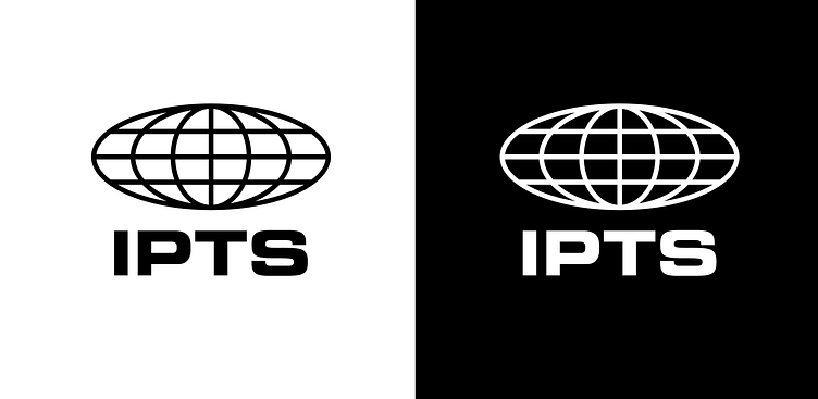
The brand elements provided were just a logo:
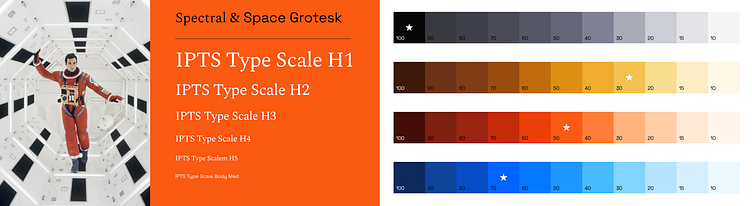
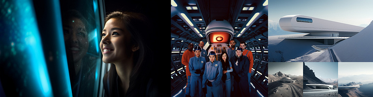
Now, this is not a class on branding, but I am a brand designer. So, I had to fight the urge to deliberate over all the identity choices that go into picking colors and fonts and overall art direction. I used an iconic image from the classic film 2001: Space Odyssey as a jumping off point.
I used typescale.com to generate my type sizes and tailwind's uicolors.app to build an accessible palette using some base colors I'd chosen.
I also used Chat GPT to generate some copy and Midjourney to create some stock imagery.
The Challenge
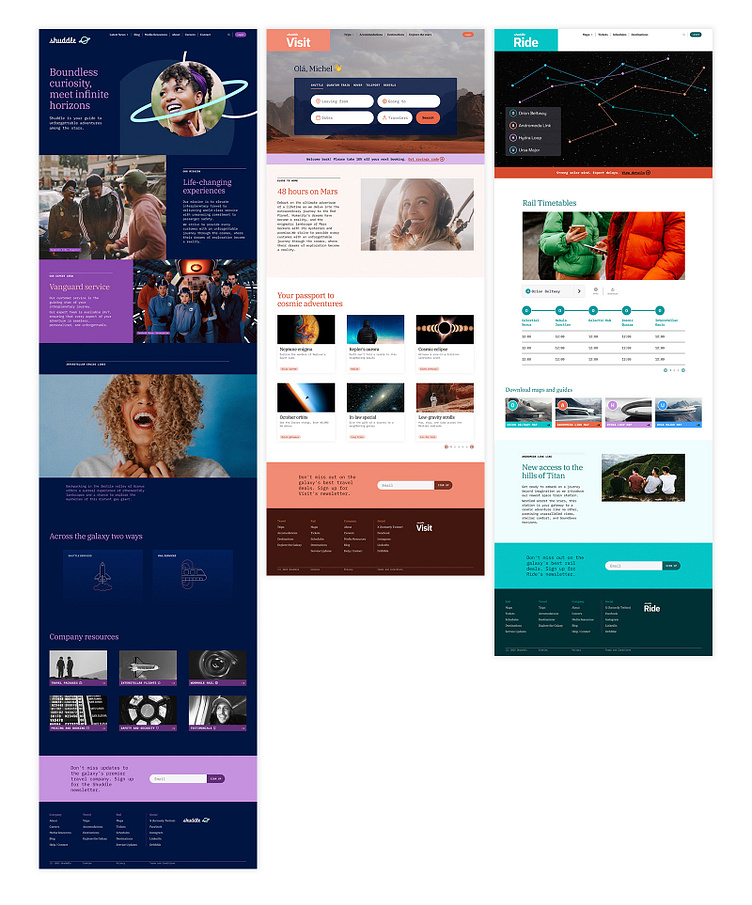
With basic brand elements (primitives) in place, the real work of creating a design system lay ahead. The challenge was to make at least 5 reusable components that are flexible enough to be shared across the 3 sites.
My Process
I sketched out, with paper and pen, some basic "wireframes". Remember, this is a design systems class, not a UI/UX class.
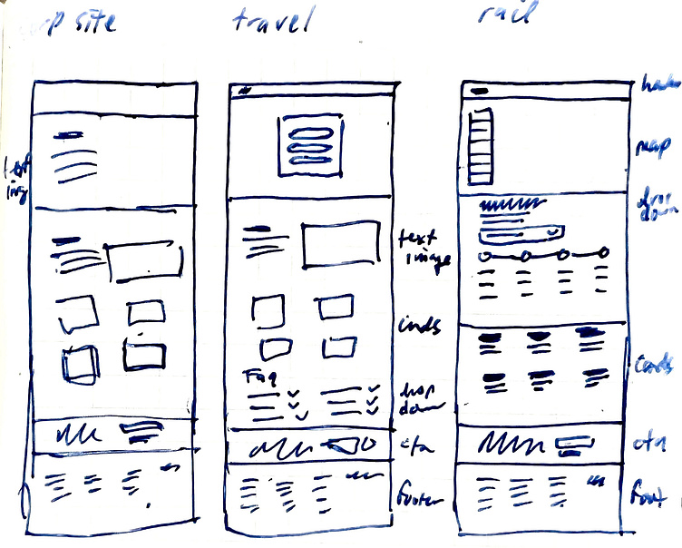
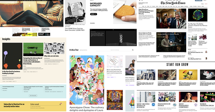
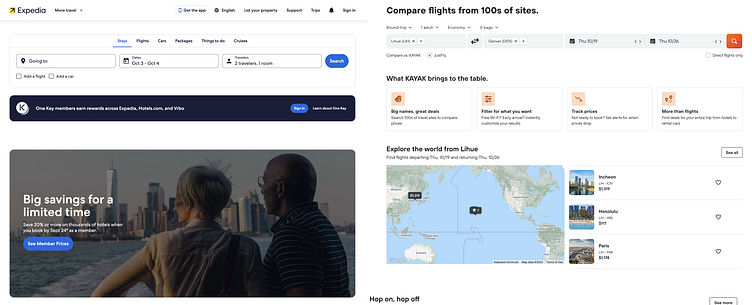
I also browsed some blogs, travel sites, and train schedule sites for ideas on what to include.
Sketching helped me determine which components would make sense to repeat across the 3 sites. A few obvious ones included the nav bar, a footer, some sort of card. I moved into Figma, blocking things out, and started to see what kinds of cards I could use. As I refined my layouts patterns emerged—such as how eyebrow, headlines, and body copy could be repeated to time-saving effect. And smaller components like carousel indicators, pagination buttons and alert messages started popping up often enough to codify into the system. Using Dan's rule, I made reusable components for my system out of elements that were repeated roughly 3 or more times. In the end, these are the components I reused across the 3 sites:
Navigation bar
What I'm calling a Text Package Block
A couple of card styles
Some extras that include carousel indicators, pagination buttons, alert messages and CTAs
Footer
Plot twist
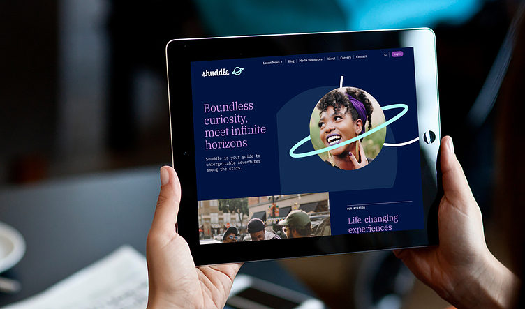
No sooner had I finished the IPTS exercise than we received news that IPTS had rebranded to Shuddle and I was given some new assets to adjust my designs around:
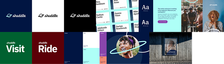
Of course the point of that was to demonstrate how easy it is to make such large scale changes with an organized system in place. I found swapping colors and type styles to be fairly straight-forward. Changing the layouts to evoke a more expressive vibe using the new imagery to good effect was more of a challenge because in some cases I felt it required restructuring layouts.