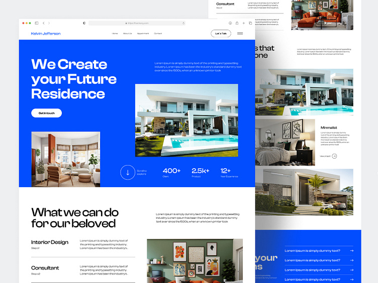
Kelvin Architecture Landing page
Hello Creative Peoples!!
I am introducing a new Landing page design "Kelvin architecture"
This Architecture Landing page design is sleek, modern, and functional. The hero section showcases a stunning architectural image that sets the tone for the entire page. The color scheme is neutral with pops of White and Blue to add visual interest and create a calming ambiance. The typography is clean and easy to read, making it effortless for visitors to navigate and find the information they need. The page is designed to be responsive and optimized for all devices, ensuring that it looks great on desktops, laptops, tablets, and smartphones. Overall, this design effectively communicates the professionalism and creativity of the architecture firm, while providing visitors with an enjoyable user experience.
Download my UIKIT


