Case Study: How to Build Scalable Design System

This case study focuses on generic design system development aspects, excluding product-related tasks. It provides insights into tools, processes, and the overall vision for structuring a design system adaptable to any product, especially in a challenging environment of high uncertainty.
Problem statement
IPTS seeks to establish a versatile foundation for its design system, intended for application across multiple web services. This system should scale effectively over time, accommodating the design needs of a company promotion site, a trip booking platform, and a routes schedule tracking site. The challenge is to create a unified, adaptable design infrastructure that ensures consistency and a seamless user experience across these three key websites and future services.
Scope
This case study focuses on developing a system for front-end developers and designers to create mobile landing pages for three sites. It intentionally excludes product-specific tasks and emphasizes building scalable design systems applicable to any product. The insights gained can be a reference for creating design systems in highly uncertain environments.
Gathering Requirements
Before tool selection and structural definition, we must outline critical requirements for our scalable design systems.
Flexibility: Integrating new components or introducing entirely new services utilizing our design system should not compromise the ease of development, ensuring minimal effort is required for implementation.
Developer-Friendly: The utilization of the design system by developers should be straightforward, requiring minimal configuration and setup to streamline the development process.
Customizability: While design systems aim to unify design elements, they should also offer flexibility for customization, allowing adjustments to typography, fonts, and colors tailored to specific services when necessary.
Eagle View
While the bottom-up approach (also known as atomic design) is a popular method for creating design systems, it can sometimes lead to the generation of numerous unused components while overlooking the creation of essential ones. For this project, I've opted for a top-to-bottom approach, developing components in the design system exclusively for elements used in multiple instances. This Kanban-like strategy ensures that our design system includes only the required components.
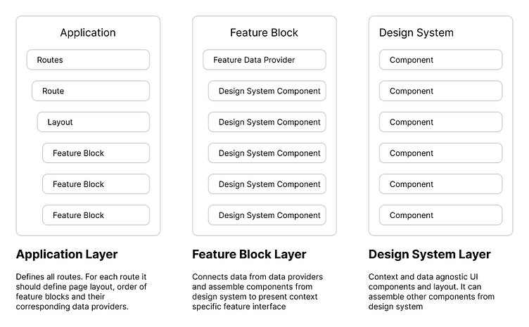
Let's delve into the web application's architecture from top to bottom, establishing clear expectations of responsibilities for each layer in the system.
Toolbox
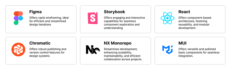
While various tools are available for constructing scalable design systems, the following list represents my curated selection, chosen for specific and informed reasons.
Getting started
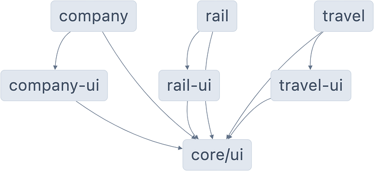
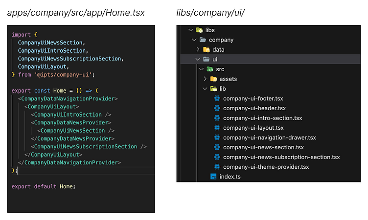
In configuring the infrastructure, NX Monorepo became the backbone—structuring applications, feature packages, and the vital core UI component package. Not delving into landing page-specific features at this juncture ensures an organized setup, prioritizing scalability, and the adept management of our design system components.
At this point, I don’t need any feature blocks defined for each landing page, but I can define dependencies package levels.
Using Wireframes
I used Figma to create wireframes of landing pages and brainstorm what feature blocks I might need for each landing page.
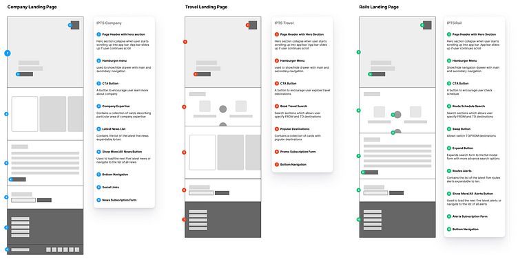
With a detailed grasp of the unique feature blocks essential for each landing page, I proceeded to intricately construct these blocks as components within feature packages. Once seamlessly integrated into the application, subsequent adjustments to the landing pages for my sites were notably minimal, if not altogether unnecessary.
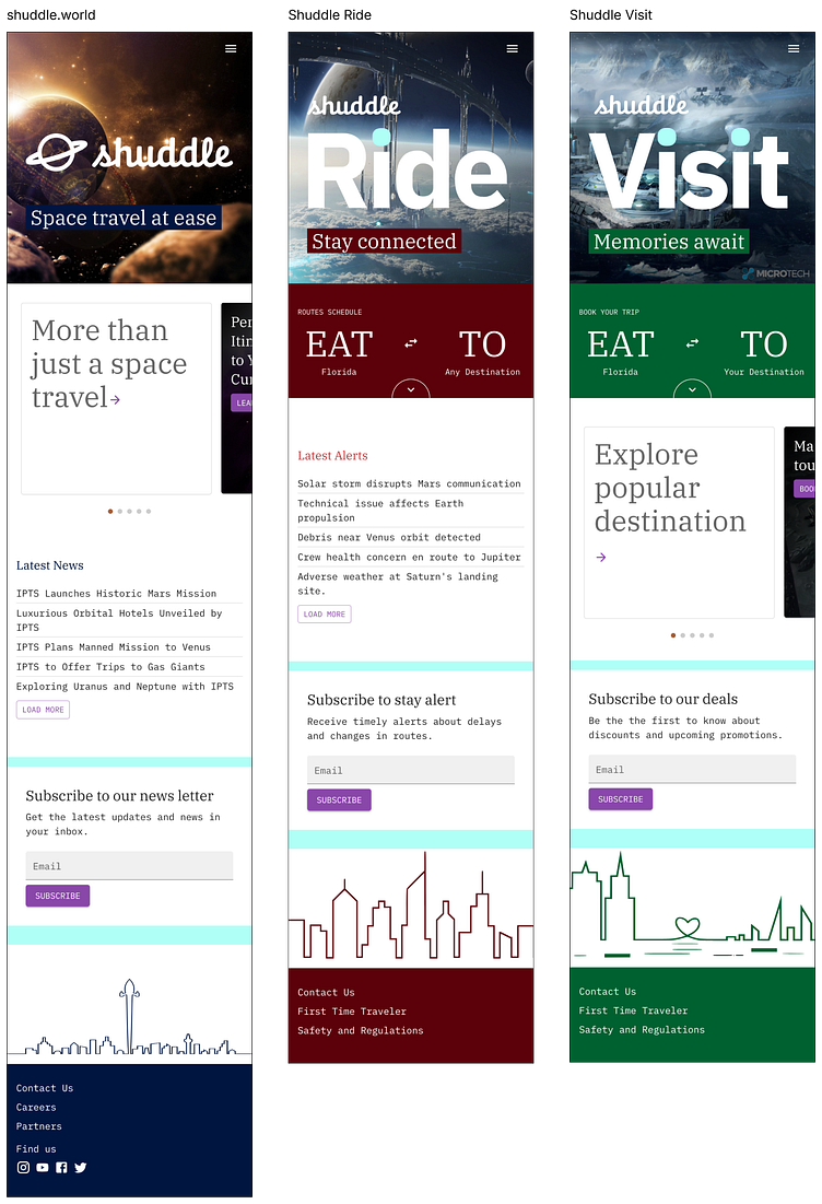
Landing page for Company Site
I initiated the assembly of Material-UI (MUI) components within my feature blocks for the company-ui package, aligning them with the specific requirements of the corresponding block. Developing additional components within the design system's core-ui package was initially unnecessary.
However, upon thoroughly examining the UI elements implemented on the landing page, I identified various types of containers employed to structure different sections. This analysis prompted the realization that certain container types should be integrated into the design system for enhanced consistency and scalability.
Landing page for Travel Site
As I curated UI elements for the landing page, I systematically identified shared features across the company site and transformed them into core-ui components. Despite variations in context and data, I adopted a context-agnostic approach during extraction. This ensured that each component in the design system possessed a distinct purpose, such as collecting user email while remaining oblivious to the specific application or use case. Although I successfully transposed most UI elements into design system components, I intentionally retained the integrity of the search block.
Landing page for Rail Site
Given the comprehensive components already present in the design system, assembling the landing page for the rail site required minimal effort. Despite this, I extracted the rail and travel search sections into a dedicated UI component within core-ui. While the fundamental purpose of this UI element remained consistent — facilitating the selection of destinations — the contextual nuances varied between picking destinations for rail travel and general travel scenarios.
Reference site
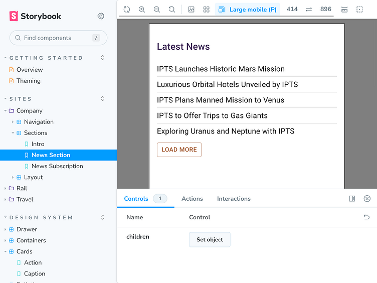
Establishing a reference site is a pivotal step in facilitating the practical utilization of design systems, allowing users to interact with and view each component in isolation. In the documentation, feature blocks are often overlooked. Yet, in my approach, I incorporated featured blocks from the entire landing site as illustrative examples of the practical application of the design system. This enhances the comprehensiveness of the documentation and provides valuable insights into the practical usage of the design components.
It’s alive
Ensuring the adaptability of a design system as it scales is a critical challenge. It must seamlessly accommodate evolving user flows and corporate rebranding with minimal effort for designers and developers. Recently, a test of this adaptability occurred when new branding requirements emerged, underscoring the necessity for our design system to swiftly and effectively implement the needed changes.
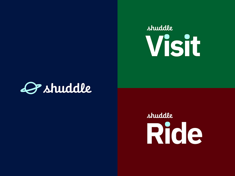
Proactively incorporating theming in the early stages streamlines the challenge of adapting to changes. Despite this foresight, certain issues have surfaced that require careful attention and resolution.
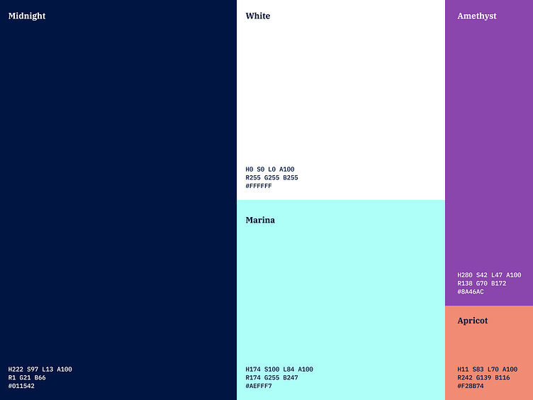
Color scheme
Introducing new custom branding colors necessitates a reassessment of their combination within components to ensure accessibility. As a result, modifications were made to core components, while feature components remain untouched as they inherently adopt the visual appearance of core components.
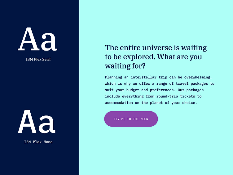
Typography
The replacement of typography prompted a comprehensive review of width and line height adjustments for various text blocks throughout the entire design system. This was essential to ensure appropriateness and visual appeal in alignment with the updated typographic elements.
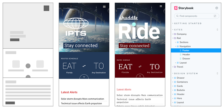
Landing Pages of Rebranded Sites
Lessons Learned
Rushing optimization and premature component extraction into the design system can notably extend development and design timelines with minimal gains.
Leveraging Storybook as a reference tool ensures alignment between the design team and developer usage of design system components. While modifying documentation may pose challenges requiring basic development skills, the benefits outweigh the difficulties.
Key Insights:
Creating a scalable design system is a cross-functional collaborative effort.
A deep understanding of the development process for design system components empowers designers to craft reusable, replaceable, and customizable elements.