Rockford
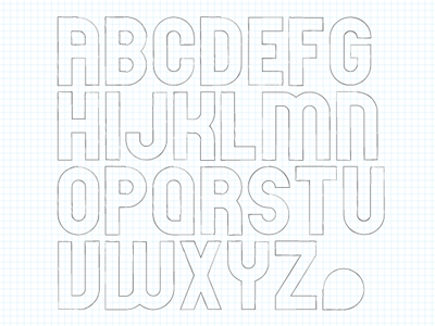
Whenever I attempt type design, I always seem to gravitate towards something based on large units and symmetry similar to the structure of a pixel font. Its use is limited, but it functions well as a headline. I call it Rockford as a tribute to my hometown.
If anyone wants to turn this into an OTF, I'd be happy to send the vector file and complete the character set or create additional weights.