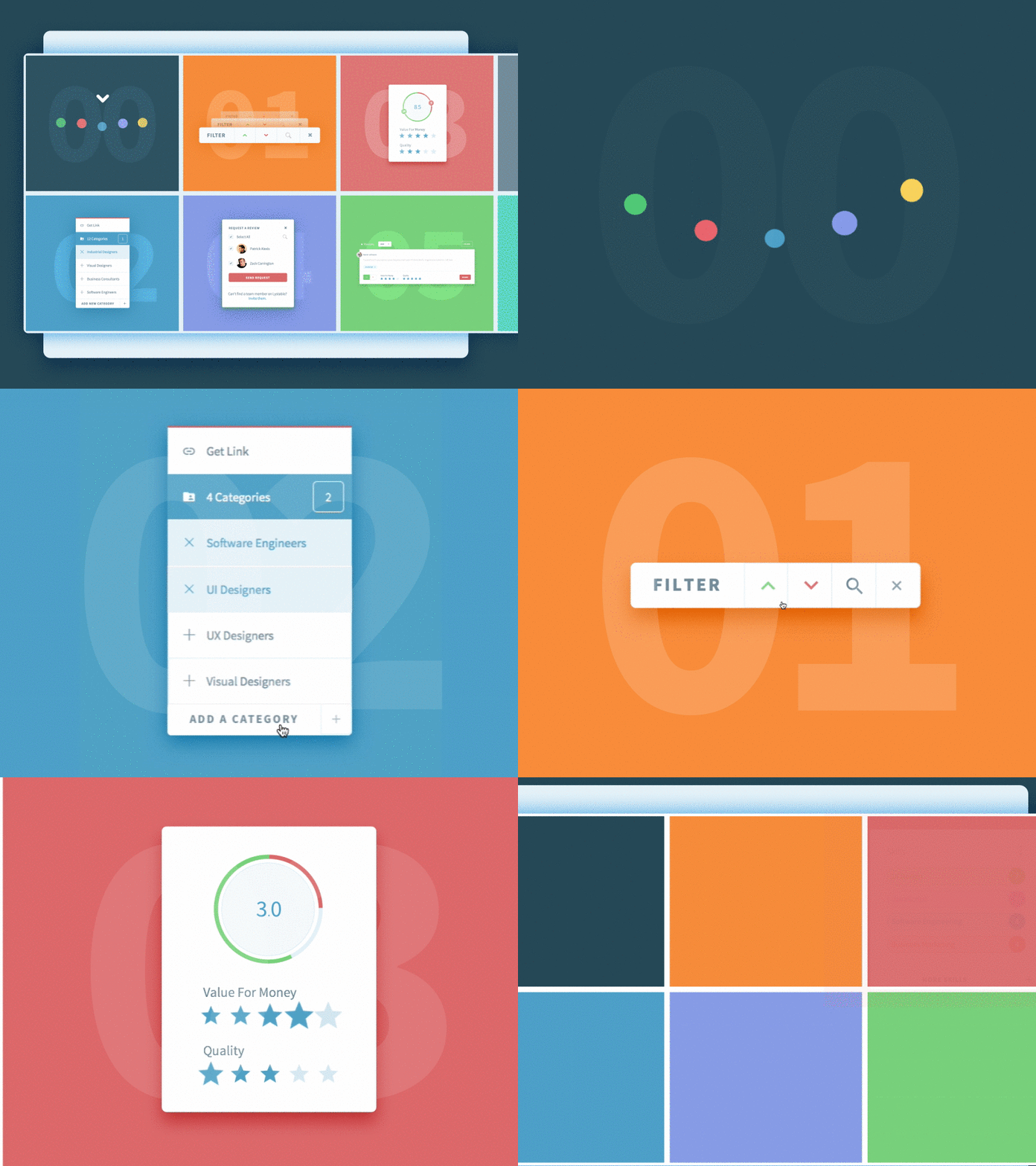
Lystable Interactions
Hey guys,
During the past 6 months, I’ve been having a blast working with the talented team over at Lystable and wanted to share what I’ve been working on so far. It’s been an incredible (and challenging :)) journey having the opportunity to flex my skills in UI, UX, prototyping, interaction and animation!
This shot contains examples of interactions between different components of the app. My goal was to create a visual language that was intuitive, easy to understand and delightful to use by guiding the user with feedback using motion. Inspired by material design, the structure is very modular as my aim was to minimise cognitive load by masking non primary actions inside of compact modules disguised as buttons. I applied modularity as a design principle to help the user focus on the task at hand.
Lystable aims to create the universal way that companies connect with freelancers, businesses and services. If you’re interested in learning more about the company, have a look at the TechCrunch article here. It’s exciting times as they’ve recently received funding from Peter Thiel and already have awesome clients in the line up :)
Don’t forget to check out the attachments to see longer previews of the interactions. Let me know what you think and in the meantime, have an awesome day! :)
