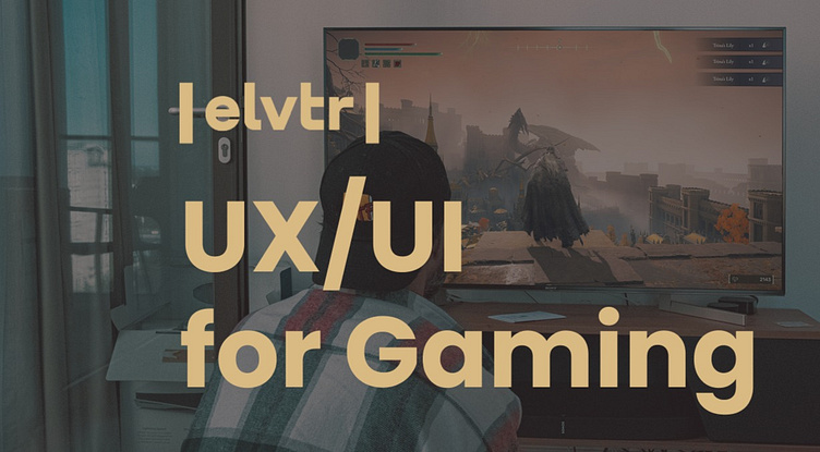
New take on Elden Ring's UI!
Project Overview
I have just completed ELVTR's course on UI/UX for gaming where I studied the UX/UI fundamentals of a chosen game, Elden Ring. Process would involve conducting case studies, wireframing, all to create high-fidelity UI mockup designs. This was my first gaming related project and it was a fantastic time to dive into this particular field. From the project I got a greater undersanding of game design while learning the importance of player accessibility.
I conducted player journeys and established the players goals, to create high fidelity UI Mockups. These mockups made simple, but effect changes to the Elden Ring UI to improve the gameplay experience!
Role
UX/UI Design Student
Tools
Figma, Photoshop
Duration
8 weeks
Challenges
Discovering the fundamentals of what affects the player experiences and emotions.
Designing wireframes on an already preestablished game.
Coordinating and complete usability tests.
Learning more about Photoshop to help create defining redesign of UI Mockups of the game.
Player Journey
To understand what player's where feeling I mapped out a player journey to get a better perspective the game's natural flow.
I made sure to view a few key details:
• What does the player see, hear, think, feel and say?
• Descision the player will be making?
• Any opportunities to help to create a better understanding for player and where to make it easier to achieve their goals?
Flow Chart
By creating Flowe
Wireframes
Based off the concepts of my Flow Chart I was able to create serveral wireframes based off the Title Screen, Character Creation, Inventory and Gameplay HUD screen.
Wireframes
Based off the concepts of my Flow Chart I was able to create serveral wireframes based off the Title Screen, Character Creation, Inventory and Gameplay HUD screens.
Style Guide
I broke down the core elements of the Elden Ring through its text, color and icons to better organize myself when changing components around.
High Fidelity UI Mockups
When developing the High-Fidelity UI Mock-ups, I used a combination of both Photoshop and Figma to complete the redesigning screens.
Although it was difficult to make gratifying changes to the Elden Ring UI, I did make several efforts to help improve the look of certain areas for better design look and feel.
Color Blindness Test
Something I wanted to account for was accessibility in the UI Design. I used Colbis, a color blind checker, to ensure best experience for the mockups to help eliminate any potential confusion or frustration for players.
Outcomes
I was able to get a better undertsanding of process need to convey certain bits of infomation
Learned the importance on positoning of UI elements based on wide audience of players
Was able to adpat previoulsy known UX/UI practices into a game related project to open new skill opportunies.
Final Reflections
This is my first UX/UI related project to the game industry! I was able to learn more about players, expectations and options. Throughout this assignment, I was able to not only understand the importance of current elements of the UI already there, but trying to see what would work for styles.
In the end I was able to successfully redesign certain UI elements of Elden ring to see where I could improve upon the original. I’m excited to finally show off my first game related project to see how it carries me into the next one!


